How to Make a Presentation Interesting: Tips to Engage Your Audience

Let’s be honest. You’ve sat through countless presentations that felt like a complete waste of time. The speaker drones on, flipping through slide after slide packed with dense text, and the only thing you remember afterward is how badly you wanted a coffee.
That’s the all-too-common reality of presentations, but it doesn't have to be your reality when you're the one at the front of the room.
Why Do So Many Presentations Miss the Mark?
The core problem is that most presentations are built on a flawed premise. They’re treated as a one-way transfer of information, not a genuine conversation. To get this right, you have to nail the fundamentals of effective communication strategies, which are the bedrock of any successful interaction.
A great presentation is a performance, a story, and a conversation all rolled into one. It’s about connection, not just information.
Stop Dumping Data. Start Creating an Experience.
The issue usually isn't a lack of good information; it's a lack of human connection. Your audience is swimming in content and has an incredibly short attention span. The old-school approach of a presenter simply reading their slides out loud is dead. It's time to stop talking at your audience and start creating an experience for them.
This requires a mental shift in how you see your role:
- You're a Guide, Not a Lecturer: Don't be a talking textbook. Your job is to lead your audience on a journey of discovery.
- Slides are Your Backdrop, Not Your Script: They should support what you say, not be what you say. They're the scenery, not the main event.
- It's a Dialogue, Not a Monologue: Even in a formal setting, you can create a conversational feel through polls, questions, and relatable stories.
This infographic really drives home the challenges—and opportunities—we face in modern presentations.
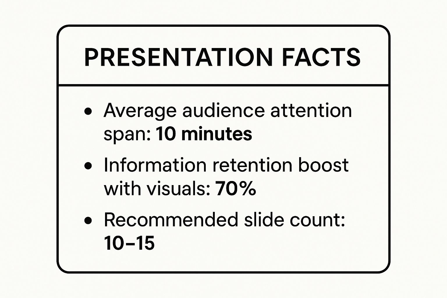
The numbers send a clear message: keeping it brief, visual, and focused is non-negotiable if you want your message to actually land and stick around.
What Today's Audience Expects
With audience attention spans plummeting, the need for concise, impactful delivery is more critical than ever. Research shows that most people check out after 10 to 15 minutes. This trend really underscores the importance of sharp, clear design to maximize every second you have.
This table breaks down the essential strategies we'll be diving into. Think of it as your cheat sheet for transforming a snoozefest into a standout session.
Core Strategies for an Interesting Presentation
| Strategy | Why It Works | Key Action |
|---|---|---|
| Storytelling | Taps into emotions and makes complex ideas relatable and memorable. | Frame your core message within a narrative with a clear beginning, middle, and end. |
| Visual Design | Captures attention and improves information retention by 65%. | Use high-quality images, clean layouts, and minimal text on each slide. |
| Interactivity | Turns passive listeners into active participants, boosting engagement. | Incorporate polls, Q&As, and direct questions to foster a two-way conversation. |
| Clear Structure | Helps the audience follow along without getting lost or overwhelmed. | Open with a hook, present key points logically, and close with a strong call to action. |
These pillars—storytelling, visuals, and interactivity—are what separate the talks people forget from the ones they talk about for weeks.
Your job as a presenter isn't just to get through your slides. It's to make the audience feel that their time listening to you was time well spent.
In the next sections, we'll get into the nitty-gritty. I'll walk you through actionable techniques to master your narrative, design slides that captivate, and engage your audience from the very first minute.
Build a Narrative That Connects Emotionally
Let’s be honest. Facts and data are the skeleton of your presentation, but a story is what gives it a heart. If you want your audience to do more than just nod along, you have to build a narrative that actually connects with them on an emotional level. This is the secret to making a presentation not just interesting, but truly memorable.
So, forget simply listing your points. It’s time to think like a storyteller.
Every great story has a hero, a conflict, and a resolution. Here’s the twist: in your presentation, the hero isn't you or your product—it’s your audience.
That simple shift in perspective is incredibly powerful. It transforms your presentation from a one-sided sales pitch into a shared journey. Suddenly, your audience is the protagonist facing a real challenge, and your idea is the key that helps them win the day.
Frame the Audience as the Hero
First things first, you need to get inside their world. What are their goals? What keeps them up at night? When you frame your content around their problems, it instantly becomes relevant. They stop being passive listeners and become invested participants looking for an answer you might just have.
For example, instead of saying, "Our software increases efficiency by 30%," try flipping the script: "You’re constantly battling tight deadlines and an overflowing inbox, struggling to find time for the strategic work that matters. What if you could reclaim nearly a third of your day?"
See the difference? This approach accomplishes two critical things:
- It shows empathy: You’re proving you understand their specific pain points.
- It creates intrigue: You’re positioning your message as the solution they’ve been actively seeking.
Your presentation's true purpose isn't to show off how brilliant you are. It’s to make your audience the hero of their own story and hand them the key to overcoming their challenges.
Weave in Anecdotes and Case Studies
Raw data on its own rarely inspires anyone to act. To give your numbers meaning, you have to wrap them in a human story. A personal anecdote or a compelling case study can turn an abstract concept into something tangible and deeply relatable.
Think about a time you or a client faced a similar problem. Sharing a brief, authentic story of a struggle or even a failure builds trust and makes you more human. That vulnerability is what creates a powerful connection.
For instance, when you're presenting a new marketing strategy, don't just throw up projection charts. Tell the story of a specific client who was struggling, walk through the exact steps you took together, and then reveal the triumphant result. To really make it land, you can even master video storytelling techniques for impact, because a strong narrative is the foundation of engagement, no matter the medium.
The goal is to make your audience feel the story, not just hear it. To see how visuals can amplify this, check out our guide on powerful visual storytelling techniques that will perfectly complement your narrative. When you build a strong, emotionally resonant story, your message will stick around long after the final slide disappears.
Design Slides That Clarify and Captivate

Let's be honest. Your slides are the visual backbone of your presentation, but they are not the main event. You are. Their job is to support your message, not to become a teleprompter for you or a dense textbook for your audience. The most common pitfall I see is people trying to cram an entire script onto a single slide. It’s an instant engagement killer—it forces people to read instead of listen to you.
Remember, a presentation is a visual medium. In fact, research shows that presentations with visual aids are a staggering 43% more persuasive than those without. This isn't just about making things look pretty; well-designed slides actively help you connect with your audience and get your point across. They act as a visual anchor, reinforcing your key points with clarity and impact.
My best advice? Treat your slides like a billboard, not a document. Imagine someone driving past a billboard on the highway. They should be able to absorb the core message in just a few seconds. That’s the kind of instant clarity you should aim for.
The One Idea Per Slide Rule
This is my absolute favorite rule for a reason: it flat-out works. When you dedicate each slide to a single, focused idea, you make it impossible for your audience to get lost. It’s a simple constraint that forces you to be disciplined, which in turn makes your entire presentation flow more smoothly.
Sticking to this principle naturally leads to cleaner, more powerful slides. You avoid the dreaded "wall of text" and guide your audience through your narrative one clear step at a time. It’s a game-changer.
Beautiful slides are a way to say, 'This is important.' I took the effort to put it into a clean and beautiful form because it matters.
This simple act communicates respect for your audience's time and attention. Instead of making them work to decipher your slides, you're guiding them effortlessly.
Crafting Visually Compelling Slides
You don’t need a graphic design degree to create slides that captivate. It all comes down to a few fundamental principles that put clarity and readability first.
Here are some practical tips you can use right away to elevate your slide design:
- Use High-Impact Imagery: Forget cluttered clip art. A single, high-quality photograph is far more powerful than a list of bullet points. Great images evoke emotion and can communicate complex ideas in an instant.
- Maintain a Consistent Color Scheme: Stick to a simple palette of two or three complementary colors. This gives your entire presentation a professional, cohesive look and feel.
- Choose Readable Fonts: Pick a clean, sans-serif font like Helvetica or Arial. Critically, make sure it’s large enough to be read from the back of the room. A good rule of thumb is a minimum font size of 30 points.
These elements work together to create a seamless visual experience. If you want to go deeper, our guide on how to create presentation slides offers more detailed, step-by-step instructions. By focusing on these core design principles, you can transform your slides from a distraction into a powerful tool that clarifies your message and keeps your audience hooked.
Bring Your Presentation to Life with Multimedia and Interactivity
Let's be honest: a static presentation is basically a monologue. But when you make it dynamic, it transforms into a conversation. If you really want to make your presentation interesting, you have to get your audience to stop being passive listeners and start being active participants.
This is where multimedia and a dash of interactivity work their magic. They break up the monotony and instantly inject some much-needed energy into the room.
Think of these elements as strategic interruptions. A well-placed video or a quick poll can completely reset the room's attention. You're not just talking at them anymore; you're creating a shared experience that reinforces your key points in a fresh, memorable way.
Use Video to Drive Your Point Home
Video is easily one of the most powerful tools in your arsenal for grabbing and holding attention. A short, impactful video can explain a complex idea, show off a product in action, or tell an emotional story far more effectively than a slide crammed with bullet points ever could.
And the data backs this up. Presentations that include video see a 37% longer average viewing time. Even more telling is the sales data: using video can increase the odds of a customer buying by as much as 85%. This shows that video doesn't just make your presentation more engaging—it makes it more persuasive. Learn more about how video elevates presentations from the full report on presentation statistics.
Here are a few ways I've seen video used brilliantly:
- As an opener: Kick things off with a high-energy clip to set the tone right away.
- For a case study: Instead of just quoting a happy customer, show their video testimonial. It's so much more authentic.
- To explain a process: A quick animation or screencast can demonstrate how something works in a fraction of the time it would take you to explain it.
Just remember to keep it brief. A video should be a punctuation mark, not a whole chapter. I've found the sweet spot is between 30 and 90 seconds—long enough to make an impact but short enough to keep the momentum going.
Turn Your Audience into Participants
Interactivity is my secret weapon for keeping people off their phones. When you directly involve your audience, you make them part of the show. It creates a two-way street that builds a real connection and makes your message stick. You're giving them a role to play.
A truly interesting presentation doesn’t just happen to an audience; it happens with them. The moment they participate, they become invested in the outcome.
This simple shift changes your role from a speaker to a facilitator. You’re no longer just pushing information out—you're guiding a collaborative discovery.
Ready to make your sessions more interactive? Here are some simple but incredibly effective ideas:
- Run a Live Poll: Use a tool like Mentimeter or even a simple show of hands. Ask a question tied to your topic, like, "How many of you have struggled with [the problem you’re solving]?" It’s an instant way to get everyone involved.
- Ask Direct Questions: Don't wait until the end for Q&A. I like to pause and ask, "What are your initial thoughts on this?" or "Has anyone experienced something similar?" This breaks up the flow and makes it feel much more like a natural conversation.
- Incorporate Quick Activities: In smaller group settings, try a "turn and talk." Ask them to discuss a specific question with their neighbor for 60 seconds. This simple act re-engages the entire room and generates fresh energy.
These tactics are just the start. For a deeper look at creating compelling audience experiences, check out our guide filled with more engaging content ideas. By blending powerful multimedia with smart, interactive moments, you'll learn how to make a presentation interesting from the first slide to the last.
Use Modern Tools to Your Advantage

In a world filled with remote teams and hybrid work, technology isn't just a "nice-to-have" anymore. It's absolutely essential if you want your presentation to cut through the digital noise. The right tools can be your co-pilot, saving you time on tedious tasks so you can pour your energy into what really matters: your message and your audience.
This isn’t about letting technology take over and erase your personality. Far from it. It's about using it to amplify your strengths. Think of it as having a dedicated assistant for brainstorming, polishing your script, and handling design—letting you create professional-quality work in a fraction of the time.
The move to remote work has completely changed the presentation game. Today, over 70% of professionals feel comfortable presenting remotely, and more than half find themselves creating presentations at least once a week. With that frequency, we all need to work smarter, not harder. A striking 72% of presenters are already using AI tools for content generation and slide design, which shows a massive shift in how we approach this work.
Embrace AI for Efficiency and Creativity
I'll be the first to admit that AI-powered platforms are fantastic for getting past a creative block. I often use them to generate a few initial ideas or find a better way to phrase a clunky sentence. They can help organize your jumbled thoughts into a logical flow or even suggest visual concepts for your slides.
But here’s the secret: use these tools as a launchpad, not a crutch. AI can give you a solid foundation, but it's your unique voice and personal stories that will make your presentation compelling and authentic.
Here’s a practical workflow I've developed:
- Brainstorming: I’ll feed the AI my core topic and ask for a few different angles or narrative structures to consider.
- Scripting: After writing a rough draft, I use an AI tool to check it for clarity, conciseness, and tone. It's like having a second pair of eyes.
- Design: I turn to platforms that suggest layouts or create visuals, like Lumeo, to quickly transform text into engaging carousels.
Master Your Virtual Presentation Setup
Presenting virtually has its own set of rules, and your tech setup is your new stage. A smooth, flawless broadcast is non-negotiable for keeping a remote audience tuned in. Always, always do a full tech rehearsal before you go live.
In a virtual setting, technical glitches are the new "heckler in the front row." They completely derail your momentum and break the connection with your audience. A simple tech check is one of the easiest ways to ensure a smooth, professional delivery.
Beyond the visuals, modern tools also offer critical features for managing your content securely. For instance, if you're sharing sensitive information, you need to know how to password protect your PowerPoint files. By mastering both the creation and delivery tools at your disposal, you can elevate your presentations from simple slide decks to truly impactful experiences—whether your audience is across the table or across the globe.
Common Questions About Engaging Presentations
Even with the best game plan, you're bound to run into a few curveballs. Let's walk through some of the most common questions I get asked about making presentations genuinely interesting. Think of this as your go-to guide for handling anything, from a spreadsheet-heavy topic to a less-than-enthusiastic audience.
These are the real-world problems presenters face, and the answers are all about practical steps you can take right away.
How Can I Make a Data-Heavy Presentation Interesting?
This is a big one. The trick is to stop thinking about showing data and start thinking about telling the story the data reveals. Don't just dump a wall of charts on your audience. Instead, find the single most important insight on each slide and build a simple narrative around it.
It's a classic three-act structure:
- The Problem: Start with the data that highlights a challenge. What was going wrong?
- The Action: Briefly explain what you or your team did to address it.
- The Result: Unveil the new data that shows a clear, positive change. This is your payoff.
Following this path transforms those raw numbers from a snooze-fest into a compelling story of progress. It answers the "So what?" question before anyone even has a chance to ask it.
Your job isn’t to show all the data you have; it’s to show the data that proves your point. Filter mercilessly and highlight only what truly matters to the story you’re telling.
What Is the Best Way to Practice for an Important Presentation?
Good practice isn't just about memorizing your lines—it’s about getting so comfortable with the material that you can deliver it naturally.
Your first step? Record yourself. I know, it can be cringe-worthy, but watching yourself on video is the single fastest way to spot where you're rambling, check your pacing, and see if your body language screams "confident expert" or "nervous wreck."
Next, do a dry run in front of a trusted colleague or friend. And don't let them off the hook with a simple, "That was good!" Ask them pointed questions. What was the one big takeaway? Was any part confusing or boring? Their honest feedback is gold.
Here’s my most important tip: memorize your first and last 30 seconds. Nail them until they feel like second nature. A strong opening grabs the room and instantly calms your nerves, while a powerful closing makes sure your core message is the last thing they think about. It’s a simple technique that gives your whole presentation a rock-solid frame.
Ready to turn your ideas into visually stunning, interactive presentations that captivate your audience? With Lumeo, you can effortlessly create engaging carousels from any content, perfect for making your message stand out online. Start creating for free today at Lumeo.me and see the difference for yourself.