Master Visual Storytelling Techniques to Engage Your Audience

Unlocking the Power of Visual Storytelling
Want to captivate your audience and boost engagement? Visual storytelling techniques are key. This listicle delivers eight essential techniques to elevate your content, from using the rule of thirds to understanding color psychology and mastering visual hierarchy. Learn how to integrate symbolic metaphors, craft sequential narratives, leverage contrast, visualize data, and tap into emotional arcs. These visual storytelling techniques empower you to create compelling content that resonates and leaves a lasting impact.
1. The Rule of Thirds
The Rule of Thirds is a foundational principle in visual storytelling techniques and a compositional guideline that can significantly enhance the impact of your images and videos. It's a simple yet powerful technique that helps you create balanced, dynamic, and visually engaging content that captures attention and guides the viewer's eye. This technique works by dividing the frame into nine equal sections using two equally spaced horizontal lines and two equally spaced vertical lines. Rather than placing your subject dead center, the Rule of Thirds encourages you to position key elements along these lines or, ideally, at the points where they intersect. These intersection points are often referred to as "power points" because they naturally draw the viewer's attention.

This grid-based composition framework acts as a blueprint for arranging elements within your visual space. It moves away from static, centered compositions, which can often feel predictable and lack visual interest. By placing your subject off-center, you create negative space, leading to a more natural and engaging visual experience. This principle is deeply rooted in how we naturally observe the world. Our eyes tend to gravitate towards these off-center points, making the Rule of Thirds a highly effective way to guide the viewer's gaze and control the narrative flow of your visual story.
The effectiveness of the Rule of Thirds can be observed across a wide range of visual mediums, from classic paintings to modern cinematography. Leonardo da Vinci’s masterpiece, “The Last Supper,” uses this technique to position key figures, creating a balanced and harmonious composition. National Geographic photographers often employ the Rule of Thirds to capture stunning wildlife images that draw the viewer's eye directly to the animal in its natural habitat. Even the fast-paced action sequences of the Marvel Cinematic Universe utilize this principle to frame heroes and villains, adding a sense of dynamism and drama. If you scroll through Instagram, you'll notice that many of the most engaging posts also adhere to this rule, demonstrating its continued relevance in the age of social media.
For content creators, social media marketers, and anyone working with visuals, understanding and applying the Rule of Thirds is crucial. It’s an easily learned technique that can immediately elevate the quality of your visual content. Whether you're shooting photos for a product launch, creating a video tutorial, or designing a social media graphic, this technique can help you communicate your message more effectively.
Here are some practical tips for incorporating the Rule of Thirds into your workflow:
- Enable grid lines: Most cameras and smartphones have a built-in grid overlay that you can activate in the settings. This allows you to see the Rule of Thirds grid in real-time, making it easier to compose your shots.
- Horizons: When capturing landscapes or seascapes, place the horizon line along either the upper or lower third line, rather than directly in the center. This adds depth and visual interest to your composition.
- Subject Placement: Position your main subject at one of the intersection points for maximum impact. This naturally draws the viewer's attention to the most important element in the frame.
- Flexibility: While the Rule of Thirds is a valuable guideline, remember that it's not a rigid rule. Use it as a starting point, and don’t be afraid to adjust your composition based on your specific artistic intentions and the story you’re trying to tell. Sometimes, a centered composition might be the best choice.
While the Rule of Thirds offers numerous advantages, it's essential to acknowledge its limitations. Overusing it can lead to predictable and formulaic compositions. Not every visual scenario benefits from this approach. For instance, symmetrical compositions or portraits focusing on emotional intensity might be more effective with a centered subject. The key is to understand the principles and apply them thoughtfully, rather than blindly following the rule in every situation. By recognizing both the pros and cons, you can leverage the Rule of Thirds effectively as a powerful tool in your visual storytelling arsenal.
2. Color Psychology and Palette Storytelling
Color psychology and palette storytelling is a powerful visual storytelling technique that leverages the strategic use of color to evoke specific emotions, convey meaning, and guide narrative flow. It's more than just picking pretty colors; it's about understanding the psychological and cultural impact of color choices and using them intentionally to enhance your message. Different colors trigger subconscious responses and associations that can significantly impact how your audience perceives your story, creating mood, indicating character development, or symbolizing broader themes. This technique is essential for anyone seeking to connect with their audience on a deeper, more emotional level, making it a vital tool in any visual storyteller's arsenal.

This technique works by tapping into pre-existing associations we have with color, both culturally learned and psychologically ingrained. For instance, red is often associated with passion, excitement, or danger, while blue evokes feelings of calmness, trust, and stability. By carefully selecting and combining colors, visual storytellers can create a specific atmosphere, highlight key elements, and even influence the audience's interpretation of the narrative. This allows for a richer, more immersive experience that transcends the purely visual. The evolution of a color palette over the course of a story can also signify character development, plot progression, or shifts in emotional tone, adding another layer of depth to the narrative.
Successful implementation of color psychology can be seen across various media. Wes Anderson's films are instantly recognizable for their distinctive pastel palettes, which contribute significantly to their whimsical and nostalgic atmosphere. Coca-Cola's consistent use of red in its branding reinforces its image of energy and excitement. Pixar's "Inside Out" masterfully utilizes color to represent different emotions, making complex psychological concepts easily understandable for children. The evolution of Instagram's logo from a retro-inspired brown camera to a vibrant gradient reflects the platform's shift towards a more modern and diverse visual identity. These examples demonstrate the versatility and impact of color psychology in visual storytelling across different platforms and industries.
To effectively incorporate color psychology into your own visual storytelling, consider these tips: Create a color script before production, outlining the dominant colors and their intended emotional impact for each scene or section. Use complementary colors for dynamic contrast and to draw attention to specific elements. Always consider your target audience's cultural background, as color interpretations can vary significantly. For example, while white is associated with purity and weddings in Western cultures, it symbolizes mourning in some Eastern cultures. Finally, test your content for colorblind viewers to ensure accessibility and inclusivity.
Color psychology and palette storytelling offers several advantages. It allows for immediate emotional impact, influencing the audience's feelings at a subconscious level. It uses universal yet culturally specific meanings, allowing for both broad appeal and targeted communication. It can significantly enhance brand recognition and create a cohesive brand identity. Learn more about Color Psychology and Palette Storytelling This resource can provide valuable insights into developing a comprehensive brand style guide, further enhancing your visual storytelling efforts.
However, there are also some potential drawbacks. Cultural interpretations of color can vary, requiring careful consideration of your target audience. Overuse or improper balancing of colors can overwhelm the audience and detract from the message. Furthermore, it’s crucial to address color blindness accessibility issues to ensure your message reaches everyone.
Despite these challenges, the benefits of color psychology in visual storytelling are undeniable. By understanding and applying the principles of color psychology, social media marketers, content creators, digital marketing agencies, small business owners, and corporate professionals can create visually compelling and emotionally resonant narratives that effectively communicate their message and leave a lasting impact on their audience. This is why it deserves a prominent place in the list of essential visual storytelling techniques.
3. Visual Hierarchy and Flow
Visual hierarchy and flow are crucial visual storytelling techniques that arrange elements in order of importance, guiding the viewer's eye through the narrative. This technique leverages fundamental design principles—size, contrast, color, and positioning—to create a clear path for absorbing information and understanding the story. By strategically placing elements, you control the narrative's pacing and ensure viewers focus on key information first, enhancing comprehension and leaving a lasting impact. This is essential for any visual medium, whether it's a social media graphic, a website landing page, a video, or even a presentation.
Think of your visual content as a conversation. You wouldn't start a story with the climax, would you? Visual hierarchy and flow ensure you introduce information logically and build towards a compelling conclusion. By prioritizing certain elements, you create a visual roadmap, preventing your audience from feeling lost or overwhelmed by a chaotic presentation.
Visual hierarchy uses several mechanisms to achieve this structured flow:
- Visual Weight: Larger elements, brighter colors, and high-contrast areas naturally draw the eye first. These become anchor points for the viewer, establishing the starting point of the visual journey.
- Scanning Patterns: Understanding how people naturally scan content is essential. Common patterns, such as the Z-pattern (scanning across the top, diagonally down, and then across the bottom) and the F-pattern (scanning across the top and then down the left side) inform placement strategies for key elements.
- Contrast and Scale: These principles work together to create emphasis. A large headline in a bold font against a muted background immediately grabs attention, while smaller, less contrasting elements provide supporting details.
- Narrative Progression: Visual hierarchy guides the viewer's eye through the story in a deliberate sequence, revealing information in a structured way that builds understanding and maintains engagement.
The benefits of effectively using visual hierarchy and flow are numerous:
- Improved Comprehension and Retention: Clear visual cues help viewers process information more easily, leading to better understanding and recall.
- Controlled Narrative Pacing: You dictate the speed and order in which information is consumed, building suspense, creating anticipation, or delivering a punchline at just the right moment.
- Reduced Cognitive Load: A well-structured visual narrative requires less mental effort to process, making the experience more enjoyable and preventing viewer fatigue.
- Increased Engagement Rates: By capturing and maintaining attention, visual hierarchy and flow encourage viewers to stay longer and interact more with your content.
However, like any powerful tool, visual hierarchy and flow require careful consideration:
- Careful Planning and Testing: Implementing effective visual hierarchy requires thoughtful planning and testing across different devices and screen sizes to ensure consistent impact.
- Potential for Manipulation: Overly aggressive or misleading visual cues can feel manipulative, potentially damaging trust with your audience.
- Cross-Device/Format Compatibility: What works well on a desktop might not translate effectively to mobile or other formats, necessitating adjustments for different platforms.
Many successful brands masterfully employ visual hierarchy and flow:
- Apple's product presentations: Known for their minimalist approach, Apple uses stark contrasts, impactful imagery, and strategic placement of product features to create a sense of elegance and focus.
- New York Times digital storytelling: They expertly combine text, images, and interactive elements to create immersive narratives that guide readers through complex stories.
- TED Talk slide designs: Simple yet impactful slides often utilize visual hierarchy to highlight key points and maintain audience engagement.
- Netflix's interface design: The platform's intuitive interface uses size, color, and placement to prioritize recommended content and simplify navigation.
Applying these visual storytelling techniques to your own content can significantly improve its effectiveness. Here are a few practical tips to get started:
- Start with the Most Important Element: Identify the key message you want to convey and give it the most visual weight.
- Use the 'Squint Test': Squint your eyes and look at your design. The elements that stand out first are at the top of your visual hierarchy.
- Maintain Consistent Spacing and Alignment: Consistency creates a sense of order and professionalism.
- Test on Different Screen Sizes: Ensure your visual hierarchy works effectively across various devices.
Consider the design of forms on your website as well. Well-designed forms play a vital role in guiding users through the process of providing information. If you are interested in learning more about optimizing this process, explore some insightful user interface form design techniques. Thoughtful form design improves user flow and can contribute to better visual storytelling, ultimately leading to improved conversion rates. By understanding and implementing these techniques, you can transform your visual content into powerful storytelling tools that capture attention, enhance comprehension, and drive results.
4. Symbolic Visual Metaphors
Visual storytelling techniques are essential for capturing attention in today's saturated media landscape. Among these techniques, symbolic visual metaphors stand out as a powerful way to connect with audiences on a deeper level. This method leverages the inherent power of symbols and metaphors to communicate complex ideas, emotions, and narratives visually, making your stories more engaging, memorable, and universally understood. This technique transforms abstract concepts into concrete visuals, effectively transcending language barriers and forging strong emotional connections with viewers. This is why symbolic visual metaphors deserve a prominent place in any visual storyteller's toolkit.
Symbolic visual metaphors work by associating a visual element with a particular meaning or concept. Instead of literally depicting an idea, this technique uses symbolism to represent it visually. This could involve utilizing culturally recognized symbols, creating new symbolic representations, or combining familiar symbols in innovative ways. The key lies in establishing a clear connection between the visual element and the intended meaning, ensuring your audience can readily decipher the message.
This approach offers a powerful way to add depth and sophistication to your visual narratives. By using symbolism, you can convey nuanced meanings and evoke strong emotions without explicitly stating them. This allows for a more subtle and suggestive form of storytelling, encouraging audience engagement and interpretation.
The benefits of using symbolic visual metaphors in your visual storytelling techniques are numerous:
- Transcends Language Barriers: Symbols often hold universal meanings, making them effective communication tools across diverse cultures and languages. A simple image can convey a complex message without relying on words.
- Creates Memorable Associations: Visual metaphors create strong, lasting impressions in viewers' minds. By associating your brand or message with a powerful symbol, you increase the likelihood of recall and recognition.
- Adds Narrative Depth and Sophistication: Symbolic visual metaphors enrich your storytelling by adding layers of meaning and interpretation. They allow you to communicate abstract concepts and emotions in a more engaging and evocative manner.
- Enables Subtle Storytelling: Instead of explicitly stating your message, you can subtly suggest it through symbolism, encouraging audience participation and interpretation. This fosters a deeper level of engagement and creates a more memorable experience.
However, it's crucial to be mindful of the potential drawbacks:
- Risk of Misinterpretation: The meaning of symbols can vary across cultures and individual interpretations. It's essential to research and carefully select symbols to avoid unintended messages.
- Cultural Symbols May Not Translate: A symbol that resonates with one culture might be meaningless or even offensive in another. Thorough research is paramount when targeting a global audience.
- Can Become Clichéd if Overused: Overused symbols lose their impact and can appear unoriginal. Strive for fresh and innovative applications of symbolic visual metaphors to maintain audience interest.
Numerous successful examples demonstrate the power of symbolic visual metaphors:
- Apple's bitten apple: Symbolizes knowledge and the forbidden fruit, instantly recognizable and associated with innovation and design.
- Dove's peace symbolism in campaigns: The dove, a widely recognized symbol of peace, effectively communicates the brand's values and mission.
- Breaking Bad's color symbolism: Throughout the series, colors are strategically used to represent different characters, themes, and emotional states, adding depth to the narrative.
- Pixar's lamp: Representing creativity and innovation, the iconic lamp has become synonymous with the studio's playful and imaginative storytelling.
To effectively utilize symbolic visual metaphors in your visual storytelling techniques, consider these actionable tips:
- Research Cultural Meanings Before Using Symbols: Ensure your chosen symbols carry the intended meaning within your target audience's cultural context.
- Combine Familiar Symbols in New Ways: Create unique and memorable metaphors by combining existing symbols in fresh and unexpected combinations.
- Maintain Consistency Throughout Your Story: Use your chosen symbols consistently throughout your visual narrative to reinforce their meaning and create a cohesive experience.
- Test Metaphors with Your Target Audience: Before launching a campaign or publishing your story, gather feedback from your target audience to ensure your metaphors are clearly understood and resonate as intended.
By understanding the nuances of symbolic visual metaphors and applying these tips, you can elevate your visual storytelling, creating more engaging, memorable, and impactful content that resonates deeply with your audience. From social media campaigns to corporate presentations, this powerful technique can transform your communication, making complex ideas accessible and leaving a lasting impression.
5. Sequential Visual Narrative (Storyboarding)
Sequential visual narrative, better known as storyboarding, is a powerful visual storytelling technique that brings narratives to life through a series of sequential images. It involves breaking down a story into individual frames, much like a comic book, depicting the progression of events, emotions, and actions over time. While initially a staple in animation and filmmaking pioneered by the likes of Walt Disney Studios, Alfred Hitchcock, Akira Kurosawa, and Pixar Animation Studios, storyboarding has now become an invaluable tool across diverse fields, including digital marketing, presentations, and social media, for crafting compelling narrative arcs that resonate with audiences.
Storyboarding allows creators to visualize their story before production begins. Its core features include frame-by-frame story progression, offering meticulous control over visual pacing and timing. It also facilitates character and plot development tracking, ensuring a cohesive and engaging narrative. Moreover, it serves as an efficient pre-production planning tool, allowing for potential issues to be identified and addressed early on, saving valuable time and resources. This technique clarifies complex narratives by making them visually accessible and digestible. It fosters collaboration and feedback among team members as the visual representation provides a concrete foundation for discussion. A major advantage is its versatility, working seamlessly across multiple mediums, from traditional film to dynamic social media campaigns.
However, storyboarding isn't without its drawbacks. It can be time-intensive to create, especially for complex narratives. The structured nature of storyboarding might, at times, limit spontaneous creativity, particularly for those who thrive on improvisation. It also requires some drawing or design skills, although the level of polish needed depends on the project’s purpose. Simple stick figures can often be as effective as highly rendered illustrations in conveying the core narrative.
Successful implementations of storyboarding are abundant. Think of the meticulous storyboards behind Disney's animated films, or the detailed visualizations that translate Marvel's comic book narratives to the big screen. In the digital marketing sphere, Instagram Stories campaigns often utilize storyboarding principles to map out engaging sequential content. Even companies like Airbnb use storyboards to visualize user journeys, improving their platform’s user experience.
When crafting your own storyboards, start with rough sketches to capture the essential flow of the narrative. You can refine the visuals later. Remember to include notes about camera angles and movement to add dynamism to your story. Highlight key emotional beats and transitions to enhance the emotional impact. Maintaining consistent character representations throughout your storyboard will ensure clarity and audience recognition.
The following infographic illustrates the typical three-step process involved in storyboarding:
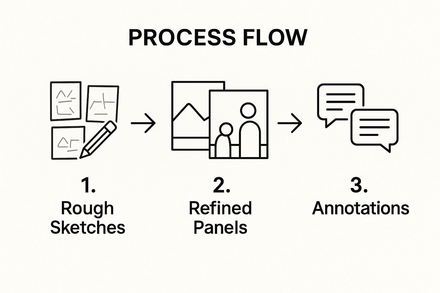
This simplified process flow demonstrates the progression from initial ideation through rough sketches, to more refined panels incorporating camera angles, and finally to adding annotations and details. The sequential nature of this process emphasizes the iterative development inherent in storyboarding, allowing for constant refinement and improvement.
Learn more about Sequential Visual Narrative (Storyboarding) This link offers further insights into how storyboarding principles can be applied to create compelling carousel posts, a popular format for visual storytelling on platforms like Instagram and LinkedIn.
Storyboarding deserves its place among essential visual storytelling techniques because it provides a tangible framework for building narratives. Whether you are a social media marketer planning a campaign, a content creator developing a video, or a business professional preparing a presentation, storyboarding empowers you to craft visually compelling stories that captivate your audience, communicate your message effectively, and achieve your communication goals. By understanding and applying the principles of sequential visual narrative, you can elevate your visual storytelling prowess and create truly impactful content.
6. Contrast and Juxtaposition
Contrast and juxtaposition are powerful visual storytelling techniques that leverage the placement of opposing elements to create compelling narratives. By deliberately positioning contrasting colors, sizes, textures, subjects, or even concepts within a visual composition, storytellers can create tension, highlight key differences or unexpected similarities, evoke emotional responses, and ultimately, emphasize important story elements. This technique grabs the viewer's attention immediately, making a lasting impression and efficiently communicating complex ideas in a digestible format. This makes it an invaluable tool for visual storytelling techniques, especially in the fast-paced world of digital content.

The effectiveness of contrast and juxtaposition lies in its ability to create visual and conceptual tension. This tension arises from the unexpected pairing of dissimilar elements, forcing the viewer to pause and consider the relationship between them. This process of active engagement deepens the impact of the visual story and encourages a more thoughtful consideration of the message being conveyed. For example, a small, delicate flower growing from a cracked pavement creates a visual contrast that speaks to the resilience of nature. This simple juxtaposition tells a story of survival and hope in the face of adversity, resonating with viewers on an emotional level.
Numerous successful examples demonstrate the power of this technique. Steve McCurry's iconic "Afghan Girl" photograph, with its piercing green eyes against a backdrop of weathered fabric, utilizes contrast to convey the harsh realities of refugee life. The striking difference between the girl's youthful gaze and the hardship surrounding her creates a powerful emotional impact, making the image instantly memorable. Apple's "Mac vs PC" advertising campaign effectively used juxtaposition to humorously highlight the differences between the two operating systems, clearly communicating the advantages of Mac in a lighthearted manner. Banksy's street art often incorporates juxtapositions of playful imagery with serious social commentary, prompting viewers to reflect on societal issues. Similarly, National Geographic's environmental storytelling frequently uses contrasting images of pristine nature and human-induced environmental damage to emphasize the urgency of conservation efforts.
While powerful, contrast and juxtaposition require careful consideration. One must ensure that the contrasts serve the overarching story purpose. A visually stunning contrast that doesn't contribute to the narrative can distract from the core message. A delicate balance between dramatic contrasts and more subtle elements is crucial. Overusing dramatic contrasts can create a jarring experience, potentially overshadowing nuanced aspects of the story. Furthermore, cultural sensitivity is paramount when employing juxtaposition. Careless pairing of culturally significant elements can lead to unintended controversy and misinterpretations.
To effectively use contrast and juxtaposition in your visual storytelling, consider the following tips:
- Purposeful Contrast: Ensure the chosen contrasts directly relate to and enhance the narrative you are trying to convey. Ask yourself, "How does this contrast contribute to the story?"
- Balance and Harmony: Strive for a balance between impactful contrasts and subtle supporting elements. Avoid overwhelming the viewer with excessive contrasts.
- Cultural Awareness: Be mindful of cultural sensitivities and potential misinterpretations when juxtaposing elements, especially those with cultural significance.
- Guided Viewing: Use contrast strategically to guide the viewer's eye through the visual composition, directing their attention to the most important story elements.
- Experiment and Iterate: Don't be afraid to experiment with different contrasts and juxtapositions. Analyze the results and refine your approach based on audience feedback.
By understanding the nuances of contrast and juxtaposition and applying these practical tips, social media marketers, content creators, and businesses can create visually compelling stories that resonate with their target audiences, leaving a lasting impression and driving meaningful engagement. This technique, when used effectively, elevates visual storytelling beyond simple imagery, transforming it into a powerful communication tool that informs, persuades, and inspires.
7. Data Visualization Storytelling
Data visualization storytelling is a powerful visual storytelling technique that transforms complex data and statistics into compelling visual narratives. It bridges the gap between raw information and human understanding, making data accessible, memorable, and actionable. Instead of presenting dry numbers and spreadsheets, data visualization uses charts, graphs, infographics, and other visual elements to tell stories that inform, persuade, and inspire decision-making. This technique effectively combines design principles with statistical accuracy, ensuring the narrative is both engaging and truthful. Its inclusion in any list of essential visual storytelling techniques is undeniable because it offers a uniquely effective way to communicate complex information clearly and concisely.
This approach works by leveraging the human brain's natural affinity for visual information. We process visuals much faster than text, and a well-designed visualization can communicate complex trends and patterns at a glance. By carefully selecting the right chart type and visual elements, data visualization storytellers can highlight key insights and guide their audience through a compelling narrative, making the data come alive and resonate with viewers. This resonates particularly well in today's data-saturated world where capturing and holding attention is a significant challenge.
Numerous examples showcase the successful implementation of data visualization storytelling. Hans Rosling's Gapminder presentations brilliantly demonstrate how animated bubble charts can illuminate global trends in health and economics, making complex datasets understandable and engaging for a broad audience. The New York Times consistently utilizes interactive charts and maps to explain complex topics like election results and demographic shifts, providing readers with an immersive and informative experience. Spotify Wrapped, a popular end-of-year campaign, leverages personalized data visualization to tell individual users about their listening habits, creating a personalized and shareable narrative. Finally, the ubiquitous COVID-19 dashboards, while sometimes criticized, demonstrated the power of data visualization in conveying critical information during a global crisis, informing public health decisions and individual behavior.
For those looking to leverage data visualization in their own storytelling efforts, here are some actionable tips:
- Start with the story, then find supporting data: Resist the urge to simply visualize existing data. Instead, begin with a clear narrative you want to convey and then find the data to support it. This story-first approach ensures that the visualization serves a clear purpose.
- Choose appropriate chart types for your data: Different chart types (bar graphs, line charts, scatter plots, etc.) are suited for different types of data and narratives. Choosing the correct chart is crucial for conveying the information accurately and effectively.
- Maintain data integrity while enhancing aesthetics: While aesthetics are important for engagement, they should never come at the cost of accuracy. Ensure the visualization represents the data truthfully and avoids misleading interpretations.
- Test comprehension with your target audience: Before publishing your data visualization, test it with your target audience to ensure it's easily understood and conveys the intended message. This feedback is invaluable for refining the visualization and maximizing its impact.
Data visualization storytelling is particularly valuable in scenarios where you need to:
- Explain complex data to a non-technical audience: It simplifies complex information, making it accessible to individuals who may not have a strong analytical background.
- Persuade stakeholders with data-driven arguments: Visuals can be more compelling than raw data when trying to make a case or influence decision-making.
- Identify trends and patterns in large datasets: Visualizations can reveal insights that might be missed when looking at raw data alone.
- Make abstract concepts tangible: Visual representations can help concretize abstract ideas and make them easier to grasp.
While the benefits are significant, it's essential to be mindful of the potential drawbacks. There's a risk of misrepresenting data if the visualization is poorly designed or intentionally manipulated. Creating effective data visualizations often requires specialized skills in data analysis, design, and software tools. Furthermore, oversimplification can be a concern, especially when dealing with highly nuanced or complex issues.
Data visualization storytelling, championed by pioneers like Edward Tufte, Hans Rosling, David McCandless, and Alberto Cairo, has revolutionized how we communicate with data. By combining the rigor of data analysis with the power of visual storytelling, this technique provides a compelling and effective way to make data meaningful and impactful for any audience.
8. Emotional Arc Visualization
Emotional Arc Visualization is a powerful visual storytelling technique that elevates content beyond simple information delivery and transforms it into an immersive experience. It involves strategically designing visuals to mirror the emotional journey you want your audience to experience. This technique leverages elements like composition, lighting, color progression, and visual rhythm to map emotional highs and lows, creating narratives that resonate deeply and forge lasting connections. By understanding and implementing Emotional Arc Visualization, you can significantly enhance audience engagement and drive meaningful action. This is a crucial technique for anyone aiming to master visual storytelling techniques.
This method works by deliberately aligning visual elements with specific emotional states. Think of it as a visual representation of a story's emotional peaks and valleys. For instance, a scene depicting joy might utilize bright, warm colors, dynamic composition, and fast-paced visuals. Conversely, a moment of sadness could be portrayed with desaturated colors, static composition, and slow, deliberate movements. This intentional manipulation of visual cues guides the audience through the desired emotional arc, making the story more impactful and memorable.
Many successful brands utilize Emotional Arc Visualization to connect with their audience on a deeper level. Pixar's "Up" masterfully uses this technique. The opening montage, depicting Carl and Ellie's life together, uses vibrant colors and upbeat music to portray joy and love. As the story progresses and Ellie passes away, the colors become muted, reflecting Carl's grief and loneliness. This powerful contrast amplifies the emotional impact of the narrative, leaving a lasting impression on viewers. Similarly, Nike's inspirational athlete journey campaigns often depict the struggles and triumphs of athletes through visually evocative storytelling. We see the sweat, the tears, the moments of doubt, followed by the exhilarating victory, all meticulously crafted through visuals that mirror the emotional trajectory. Dove's "Real Beauty" campaign evolution also showcases this technique by progressively showcasing more diverse and authentic representations of beauty, visually reflecting a shift towards inclusivity and self-acceptance. Even John Lewis' Christmas advertisements, known for their heartwarming narratives, carefully orchestrate visuals to evoke feelings of joy, nostalgia, and the spirit of giving.
For social media marketers, content creators, and businesses, understanding the power of Emotional Arc Visualization is essential. It allows you to craft content that resonates deeply with your target audience, builds brand loyalty, and drives action through emotion. Learn more about Emotional Arc Visualization and see how others are leveraging this technique on platforms like LinkedIn.
Here are some actionable tips to effectively implement Emotional Arc Visualization in your visual storytelling:
- Map the Emotional Journey: Before creating any visuals, outline the emotional arc you want your audience to experience. Identify the key emotional points and plan how you'll visually represent them.
- Use Color Temperature to Reflect Emotional States: Warm colors like reds, oranges, and yellows can evoke feelings of happiness, excitement, and energy. Cool colors like blues, greens, and purples can convey calmness, sadness, or isolation.
- Vary Pacing to Match Emotional Intensity: Fast-paced visuals can amplify feelings of excitement and urgency, while slow pacing can create a sense of tension, reflection, or sadness.
- Include Moments of Relief in Intense Narratives: Just as a musical score uses dynamics, your visual narrative should offer moments of respite to balance intense emotional sequences, preventing viewer fatigue and enhancing the impact of the overall arc.
While Emotional Arc Visualization offers significant advantages, it’s important to be mindful of its potential drawbacks. One key consideration is the need for a deep understanding of your audience. Misjudging their emotional sensitivities can lead to ineffective or even counterproductive messaging. Additionally, this technique can be manipulative if misused, so it’s crucial to employ it ethically and responsibly. Finally, the subjective nature of emotional interpretation means that there’s always a risk of the intended message being misconstrued.
Despite these challenges, the benefits of Emotional Arc Visualization far outweigh the risks when implemented thoughtfully. It creates deep audience engagement, builds brand loyalty and connection, and produces memorable and shareable content. By strategically guiding your audience through a carefully crafted emotional journey, you can forge deeper connections, inspire action, and ultimately achieve your communication goals. This is why Emotional Arc Visualization deserves its place among the most effective visual storytelling techniques.
Visual Storytelling Techniques Comparison
| Technique | Implementation Complexity 🔄 | Resource Requirements ⚡ | Expected Outcomes 📊 | Ideal Use Cases 💡 | Key Advantages ⭐ |
|---|---|---|---|---|---|
| The Rule of Thirds | Low – simple grid overlay | Low – minimal tools needed | Balanced, dynamic compositions | Photography, cinematography, social media | Easy to learn; naturally guides viewer's eye |
| Color Psychology and Palette Storytelling | Medium – requires color planning | Medium – color tools, cultural research | Evokes emotional responses, mood setting | Branding, film, marketing | Strong emotional impact; enhances recognition |
| Visual Hierarchy and Flow | Medium to High – planning required | Medium – design/testing tools | Clear information flow, improved engagement | Web design, presentations, digital storytelling | Improves comprehension and retention |
| Symbolic Visual Metaphors | Medium – requires cultural knowledge | Medium – research and design time | Adds narrative depth and universal meaning | Branding, advertising, storytelling | Transcends language; creates memorable meaning |
| Sequential Visual Narrative (Storyboarding) | High – frame-by-frame planning | High – drawing/design skills | Clear story progression, production efficiency | Animation, film, digital campaigns | Clarifies narratives; saves production time |
| Contrast and Juxtaposition | Medium – deliberate element placement | Low to Medium – depends on medium | Creates tension and highlights differences | Social impact photography, branding campaigns | Captures attention; communicates complex ideas |
| Data Visualization Storytelling | High – combines design and data skills | High – data analysis & design tools | Accessible, memorable data presentation | Journalism, business intelligence, education | Enhances data comprehension and decision-making |
| Emotional Arc Visualization | Medium to High – deep audience insight | Medium – requires research and design | Engages deeply; builds emotional connection | Advertising, brand storytelling, campaigns | Drives emotional engagement and action |
Transform Your Content with Visual Storytelling
From the rule of thirds to emotional arc visualization, the visual storytelling techniques outlined in this article offer a powerful toolkit for content creators. Mastering these concepts—color psychology, visual hierarchy, symbolic metaphors, and data visualization, among others—allows you to communicate more effectively and resonate deeper with your audience. By understanding how to construct a sequential visual narrative and utilize contrast and juxtaposition, you can transform ordinary information into compelling stories that capture attention and inspire action. These visual storytelling techniques are crucial for cutting through the noise of today's digital landscape, whether you're a social media marketer, a small business owner, or a corporate professional.
The ability to weave compelling visual narratives is no longer a luxury, but a necessity for successful communication. By implementing these strategies, you can elevate your content, boost engagement, and ultimately achieve your marketing goals. From increasing brand awareness to driving conversions, the power of visual storytelling is undeniable.
Ready to simplify the creation of stunning visual content and put these techniques into action? Explore Lumeo, a platform designed to help you build dynamic carousel presentations optimized for various social media channels, transforming static posts into engaging visual stories. Visit Lumeo today and discover how you can effortlessly leverage the power of visual storytelling.