How to Create Presentation Slides That Actually Engage

Why Most Presentations Fall Flat (And How Yours Won't)
Let’s be honest: you’ve sat through your fair share of presentations that felt more like a hostage situation than an engaging discussion. We all have. The presenter clicks through slide after slide of dense text, and within minutes, the audience’s attention drifts to their phones, their to-do lists—anywhere but the screen.
This isn’t a new problem; in fact, a staggering 99% of professional presentations have far too much text. The real issue is that most presenters mistake their slides for a teleprompter, a place to dump every single thought. This common "spray and pray" approach, where you throw as much information as possible at the audience hoping something sticks, backfires spectacularly.
It creates what psychologists call cognitive load, a fancy term for overwhelming the brain's working memory. When an audience is forced to read a wall of text and listen to you speak simultaneously, they can’t do either effectively. They end up confused, bored, and ultimately, they forget your message entirely. The goal of designing a presentation isn't to prove how much you know; it's to make your message understood.
Shifting from Information Dump to Guided Journey
The most successful presenters—the ones who secure funding or change minds—understand this psychological barrier. They don't use their slides as a script. Instead, they treat each slide as a billboard. A billboard has one clear message, impactful visuals, and just enough text to spark curiosity and support the main point. Think about it: you’d never see a billboard with ten bullet points in tiny font on the side of a highway. It wouldn't work.
This shift in mindset is crucial. Your role is not to read your slides aloud but to guide your audience on a journey. Your slides are the signposts, not the entire road map. Each one should reinforce a single idea, making it easier for your audience to process and remember.
The Booming Business of Better Slides
The need for clear, compelling presentations has never been greater. With the rise of remote work and digital communication, the presentation software market has seen huge growth. Valued at $7.04 billion in 2024, it’s projected to hit $8.29 billion by 2025.
This explosive growth shows how vital effective presentations are in today’s business and educational settings. You can discover more insights about the presentation software market growth to understand the trends. This investment in tools highlights a universal truth: a well-crafted presentation is a powerful asset. Your ability to create slides that inform without overwhelming is a key skill that will set you apart and ensure your message resonates long after you've left the stage.
Building Your Message Before Opening PowerPoint
When you're asked to create a presentation, the first instinct is often to jump straight into PowerPoint, Google Slides, or Canva and start playing with templates. But here's a pro-tip: the most powerful presentations are thought out long before you pick a font. Diving into the software first is like trying to build a house without a blueprint. You might end up with something, but it probably won't be logical or stand up to scrutiny.
The real work starts with architecting your message. Think of yourself as a storyteller first and a slide designer second. Your primary goal is to nail down the single, most important idea you want your audience to remember. This is your core message. Every story, every statistic, and every slide must support this one central theme. Without it, your presentation risks becoming just a jumble of facts, leaving your audience wondering, "So what was the point?"
Mapping the Audience Journey
Once you've defined your core message, it’s time to map out the journey you'll take your audience on. They aren't just sitting there to listen; you need to guide them from where they are now (maybe skeptical, uninformed, or just plain busy) to where you want them to be (convinced, informed, and ready to act). A great way to do this is by outlining the key points that will build your case logically. For more on this kind of narrative planning, our guide on creating a content strategy offers frameworks that are easily adapted for presentations.
A strong presentation needs a hook to grab attention, a logical flow to build your argument, and a powerful conclusion that drives your core message home. It’s about creating a narrative, not just a series of slides.
This infographic provides a simple roadmap for planning your slide content before you get anywhere near a design tool.
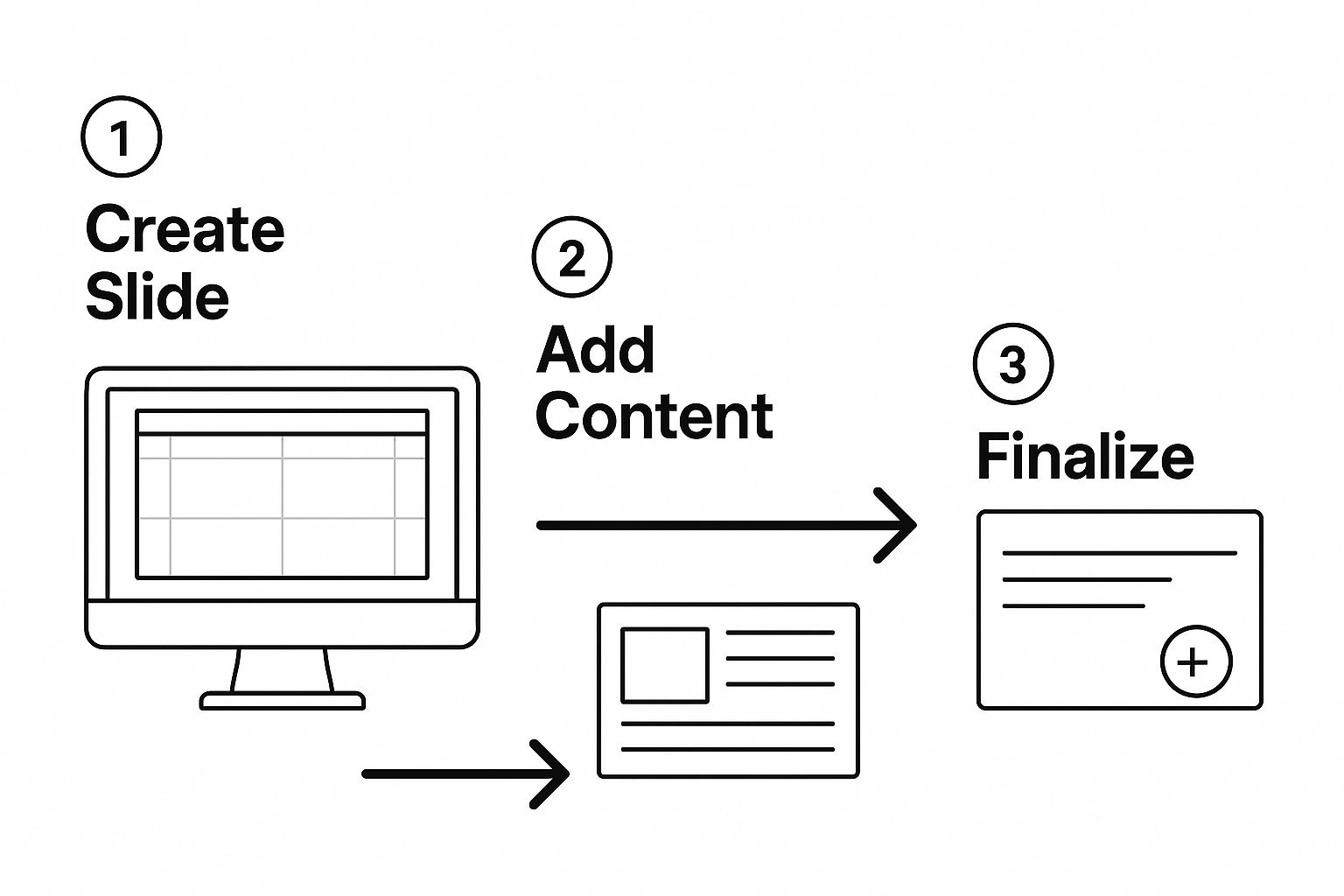
As you can see, the process starts with the message and structure. The design software is the final step, not the first. This approach isn't just about creating a better presentation; it's also more efficient. Modern tools like Microsoft Copilot can generate slides from a document, but they need a well-organized brief to produce anything useful. Planning your content first gives you a stronger narrative and makes the actual slide creation process smoother, ensuring every element has a clear purpose.
Visual Design That Supports Your Story
Once your message is solid, it's time to bring it to life visually. But this is where many presentations take a wrong turn. People often mistake design for decoration, aiming to make slides look "pretty." The real goal of great visual design isn’t about flair; it’s about clarity. Its job is to guide your audience's attention and make your core message easier to understand and remember.
This is where the concept of visual hierarchy becomes your best friend. It’s the art of arranging elements on a slide to signal their importance. A big, bold headline naturally gets noticed before the smaller body text. A bright pop of color draws the eye before a muted one. When you get this right, you can direct your audience’s focus exactly where you want it, ensuring they see the most critical information first.
Less Is More: The Power of Simplicity
One of the most common design mistakes is clutter. We’ve all sat through presentations with slides so packed with text, logos, and competing images that we don't know where to look. This creates a high cognitive load, forcing the audience to work way too hard just to figure out your point. The fix is surprisingly simple: embrace whitespace.
Whitespace, also known as negative space, is the empty area around your text and images. It’s not wasted space; it’s an active design tool that gives your content room to breathe. Think of it like a frame around a painting—it isolates what's important and helps it stand out. When you cut down the number of elements on a slide, you amplify the impact of what’s left. A single, powerful image paired with a short headline is far more memorable than a slide crammed with ten bullet points. To truly grasp these ideas, you can explore the core principles of visual design that underpin these choices.
Choosing Fonts and Colors with Purpose
The fonts and colors you select aren't just cosmetic choices; they're functional tools that establish a mood and improve readability. Your primary goals here should always be consistency and clarity.
- Fonts: Keep it simple and stick to two fonts at most—one for your headers and another for your body text. Opt for clean, easy-to-read fonts like Helvetica, Open Sans, or Lato. Steer clear of overly decorative or script fonts that are tough to read, especially for people in the back of the room. Your aim is to make reading feel effortless.
- Colors: A focused color palette works best. Choose two to three main colors and supplement them with neutrals like black, white, and gray. Use your most prominent color for key elements like headlines or calls-to-action to create a clear visual guide for your audience. Most importantly, always make sure there is high contrast between your text and background for maximum legibility.
By making intentional decisions about hierarchy, space, and style, your slides become a powerful ally to your story. For a more detailed look into this, our guide on visual storytelling techniques can help you build an even more compelling narrative.
Turning Dense Information Into Compelling Content
We’ve all been there: the presenter clicks to a new slide, and it’s a wall of text. You can almost feel the collective sigh as the audience’s attention drifts away. This is the moment where many presentations fail, especially when dealing with technical or complex subjects. The goal isn't to oversimplify your material but to make it easy for your audience to follow along and digest.
A great way to do this is through strategic chunking. Instead of trying to cram ten ideas onto one slide, give each major point its own dedicated slide. This approach gives your audience the space to absorb one concept at a time before you introduce the next. Think of it as serving a delicious multi-course meal instead of just plopping everything onto one plate. Using a dedicated online editor can be a huge help here. For instance, a tool like tnote's editor can help you structure your thoughts and break down content into manageable pieces before you even start thinking about the visual design.
Making Data Visual and Meaningful
When it comes to numbers and statistics, a single, well-designed chart can be far more powerful than a list of bullet points. The trick is to use visuals to highlight the one key insight you want your audience to remember, not just to show off all your data. Steer clear of "chart junk"—those distracting 3D effects, unnecessary gridlines, and cluttered labels that do more harm than good. Instead, use bold text and color to guide your audience's eyes directly to the most critical information.
For example, this collection of data visualizations shows how the same information can be presented in various ways.

What this image shows is that your choice of chart can completely change the story your data tells. Whether you need to illustrate a trend over time with a line chart or compare different categories with a bar chart, choose the format that makes your point most clearly and quickly.
The Art of Progressive Disclosure
Another effective technique for managing complex content is progressive disclosure. This simply means revealing information piece by piece on a single slide. Instead of displaying a full list of product features all at once, you can have each one appear with a click.
This simple animation builds a little anticipation and keeps everyone focused on what you are saying in that exact moment. It prevents them from reading ahead and getting lost. Learning how to create presentation slides with this method keeps your audience perfectly in sync with your story, making even the most intricate topics feel clear and engaging.
Interactive Elements That Actually Add Value
Static slides can quickly bore an audience, especially during longer presentations. Introducing the right interactive features can shift your audience from passive viewers to active participants. But there's a catch: these elements must add real value, not just serve as a distraction. A poorly timed poll can feel like a gimmick, while a well-placed Q&A can re-energize the room and make your message unforgettable. The goal is to create meaningful participation, not turn your professional presentation into a game show.
Choosing the Right Tools for Interaction
The first step is picking the perfect moment to engage your audience. A live poll, for instance, is a fantastic way to gauge the room's knowledge on a topic right before you dive deep. Imagine you're about to discuss a new marketing strategy. You could kick things off by asking, "Which of these platforms do you feel is most underutilized?" This simple question immediately grabs attention and gives you real-time data to help you adjust your talking points on the fly. Suddenly, the audience is part of the story.
Another powerful tool is the moderated Q&A. Instead of holding all questions until the end, try pausing after a key section to address them. This breaks up your monologue and clears up any confusion before it can grow. It shows that you're not just reciting a script but are confident in your material and genuinely invested in your audience's comprehension.
A few popular interactive tools can help you achieve this. To help you choose, here’s a quick comparison of some popular options:
Interactive Presentation Tools Comparison
Analysis of popular interactive presentation tools and their key features
| Tool Name | Key Features | Best For | Pricing Model | Ease of Use |
|---|---|---|---|---|
| Mentimeter | Live Polls, Word Clouds, Quizzes, Q&A, Audience Reactions | Large conferences, workshops, and educational settings to gauge real-time audience feedback. | Freemium (Free basic plan, paid plans for advanced features) | Very High |
| Slido | Q&A with upvoting, Live Polls, Quizzes, Surveys | Corporate meetings, panel discussions, and events where structured Q&A is critical. | Freemium (Free basic plan, paid plans for more participants and features) | Very High |
| AhaSlides | Polls, Quizzes, Spinner Wheel, Open-ended Questions, Word Clouds | Interactive training sessions, team-building activities, and engaging classroom lectures. | Freemium (Free plan for small audiences, paid plans for larger groups) | High |
| Kahoot! | Gamified Quizzes, Polls, Puzzles, Word Clouds | Educational environments, corporate training, and icebreakers to make learning fun and competitive. | Freemium (Free basic plan, paid plans for business and school use) | High |
This table shows that while many tools offer similar features like polls and Q&As, they each have their strengths. For example, Slido is excellent for managing audience questions in a formal setting, while Kahoot! brings a fun, competitive spirit to training sessions. Choosing the right one depends entirely on the tone and goals of your presentation.
Making Interaction Meaningful, Not Mandatory
The best interactions feel like a natural part of the conversation and serve to reinforce your core message, not overshadow it. If you're presenting data on social media trends, you could transition from a slide on LinkedIn growth to a quick poll asking your audience about their own engagement habits. You can find more information about how to get more engagement on LinkedIn to build on these ideas.
Ultimately, when you're figuring out how to create presentation slides that truly connect, remember that interaction is about fostering a two-way dialogue. It transforms your presentation from a speech into a shared experience. When used thoughtfully, these elements make your content more memorable and your delivery more dynamic, keeping everyone locked in from start to finish.
Platform Selection That Actually Matters
Choosing your presentation software can feel like a small decision, but picking the wrong one is like showing up to a construction site with only a screwdriver. You might be able to assemble a few things, but you definitely can't build the house you envisioned. The tool you use shapes your entire workflow, how you collaborate, and the final look of your slides. It's not about which platform has the most features, but which one has the right features for what you're trying to accomplish.
For example, Microsoft PowerPoint is still the heavyweight champion for detailed, offline presentations. If your slides are packed with data, its smooth integration with Excel is a lifesaver. Need granular control over every animation and transition? PowerPoint gives you that power. The trade-off, however, is that real-time collaboration can feel clunky compared to more modern, cloud-based options.
Collaboration and Accessibility
This is exactly where Google Slides comes into its own. The platform was built from the ground up for seamless, real-time teamwork. Multiple people can jump into the same deck, leave comments, and see changes happen live. Forget about the nightmare of tracking file versions or emailing massive attachments back and forth. If you’re working with a team on a tight deadline, Google Slides is almost always the answer.
You can see how its simple, web-based interface is designed for easy access and collaboration.

The ability to access it from any device is a huge plus for remote teams, and its straightforward design makes learning how to create presentation slides a breeze for beginners.
Beyond the Traditional Slide
If you're looking to escape the predictable slide-by-slide format, other platforms offer unique approaches. Prezi provides a dynamic, zooming canvas that turns your presentation into a cinematic journey, guiding your audience through ideas in a non-linear way.
On the other hand, Canva has become a favorite for its gigantic library of beautiful templates and design elements. It's the perfect choice when aesthetics are a top priority, allowing you to create visually stunning presentations for marketing or social media without needing a degree in graphic design. The best platform is simply the one that removes friction from your creative process and helps you tell your story most effectively.
Delivering With Confidence That Shows
You could design the most visually stunning slides in the world, but they won't make an impact if your delivery falls flat. The final, critical piece of the puzzle is understanding that your slides are your backup, not your script. Their real job is to support your message, not to be read aloud. Once you truly absorb this, you can focus on what really matters: connecting with your audience.Turning Anxiety into Energy
We’ve all felt it—that flutter of nerves before stepping up to speak. Presentation anxiety is real, but it doesn't have to control you. A battle-tested technique is to consciously reframe your nervousness as excitement. Think about it: the physiological symptoms are nearly identical, from a racing heart to a rush of adrenaline. By telling yourself, "I'm excited to share this," instead of "I'm so nervous," you can transform that jittery energy into genuine enthusiasm.
Rehearsal is your other secret weapon, but I don't mean memorizing every single word. That often leads to a robotic delivery. Instead, practice your key transitions. Know exactly what you'll say to bridge the gap from one major point to the next. This creates a safety net, allowing your delivery to feel natural and conversational while ensuring you never lose your place.
Reading the Room and Handling Mishaps
True confidence isn't about being perfect; it's about being adaptable. Whether you're in an intimate boardroom or on a massive conference stage, pay close attention to your audience's body language. Are they leaning in and nodding along? Or are their eyes starting to glaze over? Being able to read these cues lets you adjust on the fly—maybe you need to boost your energy, slow down, or inject a quick story to pull them back in.
Even with flawless preparation, things can go wrong. The projector might fail, or your clicker could die at the worst possible moment. Your reaction is what defines the situation. A graceful presenter will smile, acknowledge the issue with a brief, calm comment ("Well, it seems technology has other plans for us!"), and move forward. Having a printed copy of your speaker notes can be a lifesaver in these moments. It shows you’re prepared for anything and keeps the presentation moving, demonstrating a level of professionalism that builds instant credibility with your audience.
Turn your content into high-impact visual assets and build a powerful digital presence. Start creating stunning carousels effortlessly with Lumeo today.