9 Data Visualization Best Practices for 2025

In a world saturated with information, raw data is no longer enough. The ability to transform complex datasets into clear, compelling visual stories is a critical skill for marketers, analysts, and leaders alike. But effective data visualization is more than just creating pretty charts; it's a discipline grounded in principles of design, psychology, and communication. Without adhering to established data visualization best practices, even the most valuable insights can be rendered confusing, misleading, or completely ineffective.
This guide cuts through the noise to provide a definitive roundup of core principles that will elevate your work from simple graphs to strategic assets. We will explore nine actionable techniques designed to drive understanding and action, covering everything from choosing the right chart and using color meaningfully to ensuring accessibility and telling a clear narrative. By mastering these methods, you will learn how to create visualizations that are not only accurate and insightful but also accessible and engaging for your intended audience. This isn't about theory; it's a practical roadmap for turning your data into clear, confident decisions.
1. Choose the Right Chart Type for Your Data
The foundation of any effective data visualization is selecting the correct chart type. The chart you choose is the primary vehicle for your message, and a poor choice can obscure insights or even mislead your audience. This practice isn't just about making data look good; it's about matching the visual format to the underlying data relationship and the specific story you aim to tell.
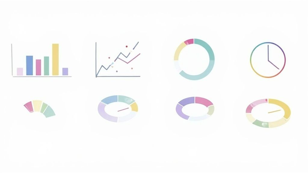
Pioneers like Edward Tufte and Stephen Few have long advocated for this purpose-driven approach. The core idea is that different chart types are built to highlight specific data relationships. Bar charts excel at comparing distinct categories, while line charts are ideal for showing trends over a continuous period, like time. Scatter plots reveal correlations between two variables, and pie charts should be reserved for showing simple parts-of-a-whole compositions.
Actionable Tips for Implementation
- Define Your Goal First: Before you even look at a chart menu, clearly articulate the single most important message you want your audience to take away. Is it "sales grew by 20% last quarter" or "our top three products account for 80% of revenue"? Your message dictates the chart.
- Match Type to Data Relationship: Use a simple framework: use a bar chart for categorical comparisons, a line chart for time-series data, and a scatter plot for exploring relationships. Avoid using a pie chart if you have more than five categories, as it becomes difficult to read accurately.
- Consider Your Audience: A financial analyst might expect a candlestick chart for stock movements, but a general audience would find a simple line chart more intuitive. Tailor the complexity to your audience’s literacy.
This fundamental step is one of the most critical data visualization best practices because it ensures clarity and accuracy from the start. To further understand the foundational elements of visual representation, an in-depth resource on exploring various chart types can provide valuable insights.
2. Maintain Consistent Color Schemes and Meaningful Color Usage
Color is one of the most powerful tools in a data designer's toolkit, but its misuse can quickly lead to confusion. Strategic and consistent color usage is essential for creating visualizations that are not just aesthetically pleasing but also intuitive and accessible. Colors should serve a clear function, guiding the audience's attention and reinforcing the data's message, rather than distracting from it.
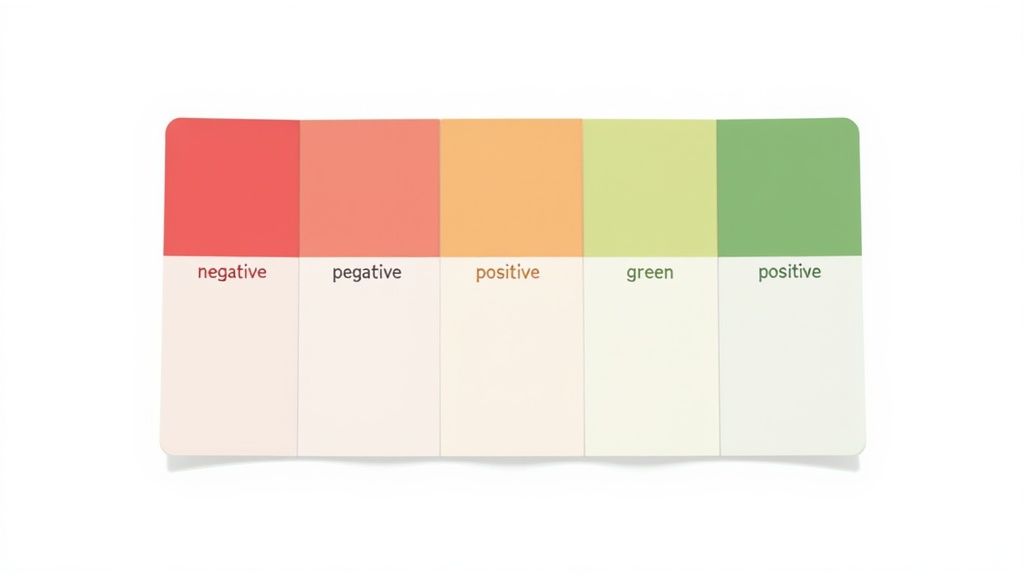
Experts in this field, like Cynthia Brewer and Maureen Stone, have established that color should encode meaning. This means using specific colors to represent specific categories or values consistently across all related charts. For instance, using red for negative trends and green for positive ones leverages common cultural associations. Similarly, ensuring color schemes are accessible to users with colorblindness is a critical aspect of inclusive design. The goal is to make color a functional element that enhances comprehension, a key component of effective data visualization best practices.
Actionable Tips for Implementation
- Assign Meaning to Colors: Don’t use colors randomly. Create a logical system where each color has a purpose. Use a single hue to represent the same variable across multiple graphs, and use sequential palettes for ordered data and diverging palettes to show a range with a central point.
- Prioritize Accessibility: Use tools like ColorBrewer or Viz Palette to select colorblind-safe palettes from the start. A crucial step is to test your finished visuals using a colorblindness simulator to ensure they remain legible for all users.
- Limit Your Palette: Resist the temptation to use too many colors. A simple palette of 3 to 5 colors is often sufficient for most visualizations. This minimizes cognitive load and keeps the focus on the data itself, not the decoration.
- Maintain Brand Consistency: When creating visualizations for an organization, aligning the color palette with its established brand identity builds recognition and trust. A well-defined brand style guide can be an invaluable resource for maintaining this consistency.
3. Minimize Chart Junk and Embrace White Space
Effective data visualization is as much about what you remove as what you include. The practice of minimizing "chart junk" involves stripping away any visual element that does not directly contribute to the viewer's understanding of the data. This includes excessive gridlines, unnecessary 3D effects, ornamental backgrounds, and redundant labels. It’s a principle of elegant simplicity, designed to let the data speak for itself.
This concept was famously championed by Edward Tufte, who introduced the idea of the "data-ink ratio." The goal is to maximize the proportion of ink used to present actual data versus decorative fluff. Organizations like Apple and The Economist are masters of this, creating clean, uncluttered charts that focus attention squarely on the insights. By embracing white space and removing distractions, you create a visualization that is both easier to read and more impactful.
Actionable Tips for Implementation
- Audit Every Element: For each visual component on your chart, from gridlines to borders, ask yourself: "Does this element help the audience understand the data?" If the answer is no, remove or de-emphasize it. Lighten gridlines so they are barely visible, or remove them entirely.
- Eliminate Fake Dimension: Avoid 3D effects, shadows, and gradients. These elements distort the visual perception of data points, making accurate comparisons difficult and introducing unnecessary visual noise that detracts from the core message.
- Use Direct Labeling: Whenever possible, place labels directly on the data points (e.g., at the end of a line or on top of a bar) instead of using a separate legend. This reduces the cognitive load on the viewer, who no longer has to look back and forth to interpret the chart.
Implementing this minimalist approach is one of the most powerful data visualization best practices for achieving clarity and authority. For further exploration on creating clean and impactful visuals, FlowingData offers a wealth of resources on modern, functional chart design.
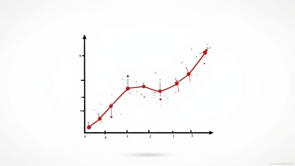
4. Start Axes at Zero When Appropriate
One of the most debated data visualization best practices is the rule of starting a quantitative axis at zero. The principle is rooted in visual integrity; beginning an axis at zero ensures that the length or height of a visual element, like a bar, is directly proportional to the value it represents. Truncating the axis can dramatically exaggerate differences and mislead the audience into perceiving minor changes as significant shifts.
This practice, championed by data pioneers like Edward Tufte and Stephen Few, is about honest representation. For bar charts, where the length of the bar encodes the value, a zero baseline is non-negotiable. However, experts like Alberto Cairo advocate for a more nuanced approach. In some cases, such as visualizing stock price fluctuations or temperature changes where the absolute magnitude is less important than the change itself, a non-zero baseline can be acceptable and even more insightful, as long as it is done transparently.
Actionable Tips for Implementation
- Prioritize Zero for Bar Charts: When comparing magnitudes (e.g., sales by region, website traffic by source), always start the axis of a bar or column chart at zero. This maintains the visual accuracy of the proportions between categories.
- Use Line Charts for Non-Zero Baselines: If you need to show small variations in a dataset with large values (like a stock price moving between $200 and $210), a line chart is more appropriate. The focus is on the slope of the line, not the distance from the baseline.
- Be Transparent with Truncation: If you must truncate an axis, use a clear visual indicator like a broken axis line or a subtle jagged cut. Always explicitly label that the scale has been adjusted to avoid any accusation of misleading the reader. This transparency is crucial for maintaining trust.
5. Prioritize Accessibility and Universal Design
Truly effective data visualization communicates with everyone, regardless of ability. Prioritizing accessibility means designing for users with visual, motor, or cognitive impairments. This practice extends beyond simple compliance; it embodies universal design principles, creating a better, more intuitive experience for all users. A visualization that is accessible is inherently clearer and more robust.
Advocates like Amy Cesal and Frank Elavsky have championed this human-centric approach, pushing the field beyond aesthetics to genuine inclusivity. The goal is to ensure that insights are not locked away from a segment of your audience. This involves providing alternative ways to perceive information, such as through text descriptions for screen readers or using patterns to distinguish data series for those with color vision deficiencies. Platforms like DataWrapper now automatically generate accessible descriptions, showcasing how technology can support these crucial data visualization best practices.
Actionable Tips for Implementation
- Use More Than Color: Don't rely solely on color to differentiate data categories. Supplement hues with distinct patterns, textures, or clear labels to ensure your chart is legible for users with color blindness.
- Provide Detailed Alt Text: Write alternative text that describes the chart's main takeaway, not just its appearance. For instance, instead of "bar chart," write "Bar chart showing Q3 sales increased by 20% over Q2, driven by the North region."
- Ensure Keyboard Navigability: All interactive elements, like tooltips or filters, must be fully accessible and operable using only a keyboard. This is critical for users who cannot operate a mouse.
- Test with Accessibility Tools: Use screen readers and color contrast checkers to test your visualization. This helps you experience your work from a different perspective and catch issues you might otherwise miss. These principles extend beyond charts; for broader impact, consider strategies for making your website accessible to all users, enhancing universal design principles.
6. Use Direct Labeling and Clear Annotations
An effective visualization should stand on its own, conveying its message without forcing the audience to hunt for context. Direct labeling is a powerful technique that achieves this by placing labels directly on or near their corresponding data points, eliminating the need for a separate legend. This practice drastically reduces cognitive load, allowing viewers to process information faster and more accurately.
Experts in storytelling with data, like Cole Nussbaumer Knaflic and Alberto Cairo, champion this approach. Instead of making users look back and forth between a line and a key, a label placed right on the line makes the connection instant. The same principle applies to annotations, which are the explanatory text elements like titles, axis labels, and notes that provide crucial context. Clear annotations guide the audience, highlight key insights, and build credibility by citing sources.
Actionable Tips for Implementation
- Place Labels Intuitively: Position labels directly next to the data points they describe. For crowded charts, use subtle leader lines to connect labels to their elements without creating visual clutter.
- Guide with Annotations: Use a clear, descriptive title that states the main finding of the chart. Add a concise text box to highlight a specific data point or explain an anomaly, telling the story behind the numbers.
- Maintain Credibility: Always include a small, unobtrusive note at the bottom of your visualization citing the data source and the date the data was collected. This is a critical step in establishing trust with your audience.
By integrating clear labels and thoughtful annotations, you transform a simple chart into a self-explanatory and persuasive narrative. This is one of the most impactful data visualization best practices for creating graphics that communicate with precision and authority. For a deeper dive into crafting compelling visual stories, Nightingale, the journal of the Data Visualization Society, offers extensive resources.
7. Tell a Clear Story with Progressive Disclosure
Effective data visualization is not about showing everything at once; it's about telling a compelling story. Progressive disclosure is a powerful technique that guides your audience through a narrative by revealing information step-by-step. Instead of overwhelming viewers with a dense dashboard, you start with a high-level summary and allow them to explore deeper layers of detail as they become more engaged.
This approach, championed by visionaries like Hans Rosling and Ben Shneiderman, respects the user's cognitive load. Shneiderman's mantra, "overview first, zoom and filter, then details-on-demand," perfectly encapsulates this idea. It turns a static chart into an interactive journey, transforming viewers from passive observers into active participants. The New York Times' interactive election maps are a prime example, starting with a national overview before allowing users to drill down to state, county, and precinct levels.
Actionable Tips for Implementation
- Start with the "So What?": Your initial view should present the single most critical insight or conclusion. This is the headline of your data story. Subsequent views or interactions should provide the supporting evidence and context for that main point.
- Guide Attention with Visual Cues: Use animations, transitions, and clear visual hierarchy to smoothly guide the user's focus from one piece of information to the next. Highlighting a specific data point before revealing its underlying components is a classic example.
- Provide Intuitive Navigation: Ensure users can easily move between different levels of detail. Clear buttons, tooltips, or clickable chart elements should signal that more information is available, preventing users from getting lost in the data.
This narrative-driven approach is one of the most impactful data visualization best practices for creating engaging and memorable experiences. By turning complex data into a structured story, you ensure your message is not just seen, but understood. To explore this concept further, you can find more information about effective visual storytelling techniques.
8. Optimize for Mobile and Responsive Design
In today's multi-device world, assuming your audience will view your visualization on a large desktop monitor is a critical oversight. Optimizing for mobile and responsive design ensures that your data story is clear, accessible, and functional regardless of screen size. This practice goes beyond simply shrinking a chart; it involves fundamentally rethinking the layout, interactions, and complexity to suit the constraints and advantages of smaller, touch-based interfaces.
Pioneers like Luke Wroblewski have championed the "mobile-first" approach, a principle that is now central to effective data visualization best practices. The core idea is to design for the most constrained environment first (a smartphone) and then progressively enhance the experience for larger screens. For example, a complex dashboard might stack elements vertically on mobile, use simple tap interactions for tooltips, and then expand into a multi-column layout with hover effects on a desktop. News organizations like The Guardian and Bloomberg excel at this, creating responsive charts that seamlessly adapt from detailed desktop views to streamlined, scrollable mobile versions.
Actionable Tips for Implementation
- Design Mobile-First: Start your design process on a small canvas. This forces you to prioritize the most critical information and simplify interactions from the outset, leading to a cleaner design on all platforms.
- Embrace Vertical Layouts: Mobile users are accustomed to scrolling vertically. Instead of forcing horizontal scrolling or cramming too much into a narrow width, stack chart elements and use vertical space to guide the user through the data narrative.
- Increase Touch Target Sizes: Fingers are less precise than mouse cursors. Ensure all interactive elements like buttons, filters, and data points have a minimum touch target size of 44x44 pixels to prevent user frustration.
- Test on Actual Devices: Browser-based mobile simulators are useful, but they cannot fully replicate the performance and touch experience of a real device. Always test your visualizations on a variety of actual smartphones and tablets to catch usability issues.
This approach is crucial because it guarantees a consistent and positive user experience for your entire audience, not just those on desktops. For content creators working across various platforms, understanding how visual elements adapt to different screen dimensions is key. You can learn more about optimizing visuals for different platforms to further improve your design strategy.
9. Validate Data Accuracy and Provide Context
A visually stunning chart is worthless if its foundation is built on flawed or misunderstood data. The integrity of your visualization hinges on the accuracy of the underlying information and the context you provide for its interpretation. This practice involves rigorous data validation, cleaning, and the transparent communication of its origins and limitations, ensuring the audience understands not just what the data shows, but what it means.
This principle is a cornerstone of modern data journalism and statistical communication, championed by figures like Nate Silver and Amanda Cox. Their work emphasizes that communicating uncertainty and providing context, like margins of error in polling data or historical baselines for economic indicators, is as crucial as the visualization itself. A chart without context is just a collection of shapes; with context, it becomes a credible piece of evidence.
Actionable Tips for Implementation
- Always Cite Your Sources: Include clear and accessible notes on where the data came from, when it was collected, and the methodology used. This transparency builds trust and allows for independent verification.
- Include Error and Uncertainty: When visualizing data from samples or projections, such as polling results or scientific studies, use error bars or confidence intervals. Clearly explaining these elements helps prevent misinterpretation and overconfidence in the results.
- Provide Relevant Baselines: Data rarely tells a full story in isolation. Compare current figures to historical averages, industry benchmarks, or previous periods to give your audience a frame of reference. For example, show this year's sales not just as a number, but in relation to the last five years' performance.
- Be Honest About Limitations: No dataset is perfect. Transparently acknowledge any potential biases, missing information, or other limitations. This honesty reinforces your credibility and is a hallmark of responsible data visualization best practices. For deeper insights into data integrity, exploring resources on statistical literacy can be highly beneficial.
Best Practices Comparison: 9 Data Visualization Principles
| Item Title | Implementation Complexity 🔄 | Resource Requirements ⚡ | Expected Outcomes 📊 | Ideal Use Cases 💡 | Key Advantages ⭐ |
|---|---|---|---|---|---|
| Choose the Right Chart Type for Your Data | Moderate - requires deep chart knowledge | Medium - time to evaluate and design | Clear, accurate communication of data stories | Data with varied analytical purposes (trends, comparisons, relationships) | Improves comprehension and engagement through appropriate visuals |
| Maintain Consistent Color Schemes and Meaningful Color Usage | Moderate - requires color theory and accessibility skills | Medium - testing and palette selection | Improved accessibility and intuitive understanding | Visualizations needing clear semantic color coding and brand consistency | Enhances accessibility, reduces cognitive load, supports brand recognition |
| Minimize Chart Junk and Embrace White Space | Low to Moderate - focuses on simplification | Low - mainly design effort | Cleaner, more readable charts with focus on data | Any visualizations aiming for professionalism and clarity | Reduces cognitive load and highlights data effectively |
| Start Axes at Zero When Appropriate | Low - straightforward, but requires judgement | Low - minor adjustments in axis setting | Honest and accurate data proportion perception | Bar charts, quantitative data where zero baseline is meaningful | Prevents misleading visuals, builds trust |
| Prioritize Accessibility and Universal Design | High - needs specialized accessibility knowledge | High - development, testing, and maintenance | Inclusive designs usable by people with disabilities | Visualizations targeting diverse user abilities and legal compliance | Expands reach, ensures legal compliance, improves usability |
| Use Direct Labeling and Clear Annotations | Moderate - careful placement and design needed | Medium - annotation design and positioning | Faster data comprehension, self-explanatory visuals | Charts where reducing legend lookups enhances clarity | Reduces cognitive load and enhances accessibility |
| Tell a Clear Story with Progressive Disclosure | High - involves narrative structuring and interactivity | High - design, development, user testing | Engaging, memorable visualizations guiding users logically | Interactive dashboards and storytelling with complex datasets | Supports varied user expertise; improves engagement and understanding |
| Optimize for Mobile and Responsive Design | High - requires adaptable layouts and testing | High - development across devices | Visualizations accessible and usable on all devices | Visualizations accessed on mobile phones and varying screen sizes | Increases reach; often yields cleaner, focused designs |
| Validate Data Accuracy and Provide Context | Moderate - involves thorough data cleaning and contextualization | Medium to High - data preparation and documentation | Builds credibility and informed interpretation | Critical decision-making and trusted reporting visualizations | Prevents misinterpretation; builds audience trust |
From Insight to Impact: Putting Practices into Action
We've journeyed through nine fundamental data visualization best practices, each a critical pillar in building visuals that not only inform but also persuade and inspire. From the foundational choice of the right chart type to the nuanced application of color and the ethical imperative of starting axes at zero, these guidelines serve as your blueprint for transforming raw data into resonant insights. The goal is to move beyond simply presenting numbers and instead, craft a compelling visual narrative.
Mastering these techniques means embracing a mindset of intentional design. It's about prioritizing clarity by minimizing chart junk, using direct labeling, and embracing white space to let your data breathe. It's about building trust through data validation and providing essential context. Most importantly, it's about connecting with your audience by telling a clear story and ensuring your creations are accessible and optimized for every device.
The Power of Practice and Powerful Tools
Consistently applying these principles is what separates a forgettable graph from a decision-driving dashboard. The more you practice these skills, the more intuitive they become. You'll start to see data not just as a collection of facts but as an opportunity for communication. By focusing on these data visualization best practices, you ensure your work is not only seen but truly understood, remembered, and acted upon.
To fully harness the power of your data, understanding how it's presented in tools like Mindstamp's new Insights Dashboard is crucial for driving impact. Seeing these principles applied in a real-world analytics environment reinforces their value and demonstrates how effective visualization can turn complex metrics into a clear path for strategic action. Your ultimate aim is to create a seamless bridge between data and decision, making complex information accessible and actionable for everyone, from stakeholders to social media followers.
From Good to Great: Your Next Steps
The journey to mastering data visualization is ongoing. Your next step is to consciously apply one or two of these principles to your next project.
- Audit Your Next Chart: Before you publish, run through this list as a final check. Is the chart type optimal? Is the color scheme meaningful and accessible?
- Seek Feedback: Ask a colleague or someone outside your team if they can understand the main takeaway from your visual in under five seconds. Their perspective is invaluable.
- Embrace Storytelling: Don't just show the "what." Use annotations and progressive disclosure to explain the "why" and "so what" behind the data.
By putting these data visualization best practices into consistent action, you elevate your role from a mere data presenter to an influential data storyteller. You build credibility, drive engagement, and empower your audience with the clarity needed to make informed decisions. This is where data finds its true purpose: creating meaningful change.
Ready to put these best practices into action without the manual effort? Lumeo uses AI to instantly transform your data, articles, and ideas into stunning, share-ready visual carousels for social media. Stop wrestling with design tools and let Lumeo help you create compelling, effective data stories in minutes.