Mastering Carousels on Instagram for Engagement

Instagram carousels are posts that let you string together up to ten photos or videos, which users can explore by simply swiping left. I've found this multi-slide format to be a game-changer for storytelling and breaking down complex topics. It consistently drives higher engagement than a standard single-image post or video because it allows you to build a real narrative, educate your audience, or showcase a product from every angle.
Why Carousels Are Your Secret Engagement Weapon

While a single image might stop someone mid-scroll for a second, a carousel invites them to actually do something. That simple act of swiping signals to the Instagram algorithm that your content is holding their attention, which is a massive win. This extended "dwell time" is a key metric that can seriously boost your content's visibility on the platform.
Think of it this way: a single photo is like a billboard. It makes one quick impression. A carousel, on the other hand, is like a brochure. It encourages you to open it up, turn the pages, and absorb more information at your own pace. They reward curiosity with more value on each slide.
The Psychology Behind the Swipe
The magic of a great carousel is that it knows how to tell a story or build a case, slide by slide. Each swipe is a little micro-commitment from the user. You start with a powerful hook on the first slide—a burning question, a bold statement, or a stunning visual—and you promise a payoff if they keep swiping.
This format taps directly into our natural curiosity. When you structure your content as a step-by-step guide, a list of pro-tips, or a dramatic before-and-after, you create an "information gap." People feel a natural pull to close that gap by swiping through to the end. This interactive journey builds a much stronger connection than a passive glance at a photo ever could.
This principle is a core part of many general social media engagement strategies, and it works wonders here.
The Data Backs It Up
The power of carousels isn't just a feeling; it's backed by hard data. When you look at the numbers, this format consistently comes out on top for key engagement metrics.
A study from Sprout Social found that Instagram carousels have an average engagement rate of 1.92%, which is significantly higher than single-image posts (1.74%) and videos (1.45%).
This data reveals a huge opportunity. While carousels are proven winners for engagement, they still only make up a fraction of all content posted. Here's a quick look at how they stack up.
Carousel Performance vs Other Post Types
This table gives a side-by-side comparison of average engagement rates, making it clear why carousels are worth the extra effort.
| Post Type | Average Engagement Rate (Sprout Social) | Relative Performance |
|---|---|---|
| Carousel Posts | 1.92% | Highest |
| Single Image Posts | 1.74% | Medium |
| Video Posts | 1.45% | Lowest |
As you can see, carousels don't just edge out other formats; they lead the pack. By making them a regular part of your content mix, you're tapping into the most engaging format Instagram has to offer.
Beyond Likes and Comments
The benefits don't stop at likes and comments. Because carousels are perfect for educational, evergreen content, they are one of the most saved post types on all of Instagram.
Saves are what I like to call a "super-like." They're a powerful signal to the algorithm that your content is so valuable, someone wants to come back to it again and again. This can dramatically increase the lifespan and reach of your post, as Instagram will be more likely to show it to new audiences. A well-crafted carousel full of tips, tutorials, or key resources becomes a long-term asset for your brand, not just a blip on the feed.
Developing Your Carousel Story and Strategy
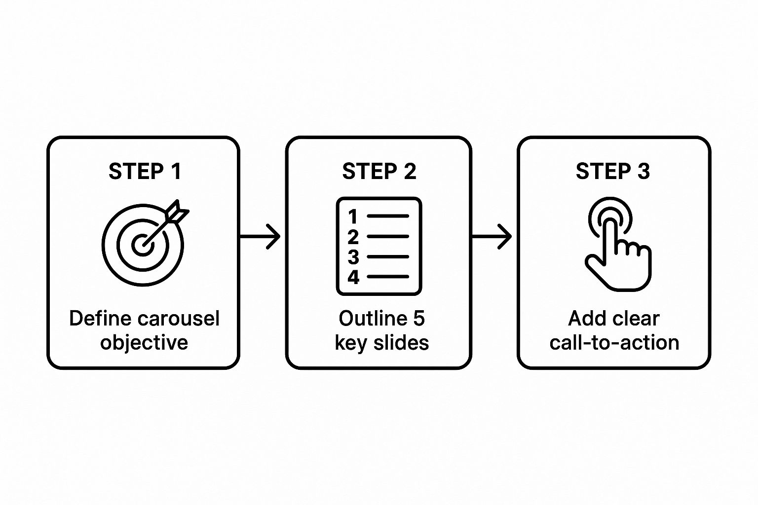
A standout carousel doesn't just happen in a design tool. It starts with a solid plan. I’ve seen it time and time again: the most successful carousels on Instagram are built on a strategic foundation. Every single swipe delivers value and guides the user toward a specific goal.
Before you even think about colors or fonts, you need to answer one question: What is the single, clear objective of this post?
Are you trying to teach your audience something complex? Maybe you want to inspire them with a brand story or a customer success journey. Or perhaps it's purely commercial—driving sales for a new product. Nailing down this primary objective is the most important part. It dictates the entire narrative, from the first slide to the last. Without a goal, your carousel will feel random. With one, every element works together to create something cohesive and persuasive.
Brainstorming Your Narrative Arc
Once you've got your objective, it's time to brainstorm the story. Think of your carousel like a mini-presentation with a clear beginning, middle, and end. The idea is to build momentum and keep people curious from the moment they see it.
Let's say your goal is to educate. For example, "5 Common Skincare Myths." Your story arc is pretty straightforward:
- The Hook (Slide 1): A bold, myth-busting headline like, "Is Your Skincare Routine Secretly Harming Your Skin?"
- The Content (Slides 2-6): Dedicate one slide to each myth. Explain why it’s false and what to do instead.
- The Conclusion (Slide 7): Quickly summarize the key takeaways.
- The Call-to-Action (Slide 8): Encourage people to save the post or share their own skincare questions in the comments.
This simple structure keeps the user engaged by creating a predictable yet valuable flow. The same principles apply whether you're showing off a product's features or telling your brand's origin story.
The key takeaway here is that structure creates clarity. When you define your objective, outline your slides, and add a CTA, your message becomes powerful and incredibly easy to follow.
Crafting an Irresistible Hook
The first slide of your carousel is everything. Seriously. It's your one shot to stop the scroll and convince someone that you're worth their time. You have less than three seconds to grab their attention, so your hook has to be powerful.
Here are a few proven formulas for a killer first slide:
- Ask a provocative question: "Are You Making These Common Financial Mistakes?"
- Make a bold statement: "This One Habit Will Double Your Productivity."
- Promise a specific outcome: "Learn How to Design a Logo in 5 Simple Steps."
- Use a surprising statistic: "93% of people make purchase decisions based on visuals."
Your headline needs to create an "information gap," making users feel like they have to swipe to find the answer. For an even deeper dive into the mechanics of creation, you can explore our detailed guide on https://www.lumeo.me/en/blog/how-to-make-a-carousel from start to finish.
Building a Coherent Flow and CTA
With your hook in place, the middle slides have to deliver on its promise. Each slide should connect logically to the next. I like to use visual cues like arrows, numbers, or graphics that bleed onto the next slide to encourage that swipe. Think of it as leaving breadcrumbs for your audience.
The final slide is just as important as the first. It's where you convert attention into action. A weak call-to-action (CTA) wastes all the effort you put into the preceding slides.
Your CTA should be direct, clear, and perfectly aligned with your initial objective. Don't be vague. Instead of "Learn more," try something specific like "Save this post for your next project."
Here are some effective CTAs for different goals:
- Education: "Save this for later!" or "Share this with a friend who needs it."
- Community Building: "Comment below with your favorite tip!"
- Conversion: "Tap the link in our bio to shop the collection."
A great strategy is to turn existing content, like a blog post or video, into a high-value carousel. To get the most out of your efforts, check out this complete guide to repurposing content for social media. This approach saves a ton of time while ensuring your carousel is packed with proven, valuable information.
Designing Carousels That Stop the Scroll
 Once your story and strategy are locked in, it's time for the fun part: bringing it to life with design that actually stops people from scrolling. Let’s be real—on a platform as visual as Instagram, great design isn’t a nice-to-have. It’s the price of entry.
A slick, well-designed carousel grabs attention immediately. More importantly, it makes your information easy to absorb and cements your brand identity with every single swipe.
The whole point is to create a visual journey that feels cohesive and guides your audience without them even realizing it. They should get your message effortlessly while feeling that natural pull to see what’s on the next slide. This magic happens when you nail the combination of color, typography, and layout.
Establishing a Cohesive Brand Look
Consistency is your best friend when it comes to building a recognizable brand. Your carousels on Instagram should scream "you" long before someone sees your logo. This is exactly why having a brand kit is non-negotiable. And a good brand kit is more than just your logo; it’s the rulebook for your entire visual identity.
Your kit should clearly define:
- Primary and Secondary Colors: A consistent color palette is your shortcut to instant brand recognition. Use primary colors for the big stuff like headlines, and save your secondary colors for accents and backgrounds.
- Typography: Don't go crazy with fonts. Stick to one or two brand fonts—one for headlines, one for body text. This creates a clean visual hierarchy and makes your content look professional and scannable.
- Logo Variations: Figure out when to use your full logo versus a simplified icon or wordmark.
If you use a tool like Lumeo, you can set up your brand kit once and just apply it to every carousel. This means every post you create, from the colors down to the fonts, perfectly reflects your brand without you having to think twice about it. Your feed will thank you.
Guiding the Eye with Visual Hierarchy
Visual hierarchy sounds technical, but it’s simple: it’s how you arrange things to show what's most important. When you get it right, you guide your viewer's eyes exactly where you want them to go, making your message land with a punch.
Think of each slide as having one main character. What's the single most important piece of information? That needs to be the biggest, boldest, or most eye-catching element on the screen.
Key Takeaway: Don't make your audience work to figure out what you're saying. Use size, color, and placement to create a clear path for their eyes to follow, from the main point down to the smaller details.
Here’s a quick trick: try the "squint test." Squint your eyes and look at your design. The most important parts should still pop out, while the less critical bits fade away. If it all just blurs into a single blob, you need to crank up the contrast.
Balancing Text and Imagery
One of the trickiest parts of carousel design is finding that sweet spot between text and visuals. Too much text, and you’ll send your audience running. Too little, and your message gets lost. The best carousels use visuals to support the text, not fight with it.
If you have a slide that's heavy on text—like a detailed tip or a quote—keep the surrounding design super clean and simple. Embrace white space, which is the empty area around your text and images. It isn't wasted space; it's a powerful design tool that cuts down on clutter and makes everything easier to read. In fact, smart use of white space can boost comprehension by up to 20%.
Encouraging the Swipe with Visual Cues
A truly great carousel makes swiping feel like an unconscious, natural reaction. You can give users a gentle nudge to keep going with a few clever visual tricks.
Here are a few of my favorite techniques:
- Seamless Panorama: This is where you treat all your slides like one continuous canvas. An image or graphic starts on one slide and finishes on the next, creating a powerful urge to swipe and reveal the full picture.
- Visual Connectors: Little arrows, dotted lines, or even a simple finger-swiping icon placed at the edge of a slide are direct and incredibly effective calls to action.
- Unfinished Elements: Let a photo or a graphic shape "bleed" off the right edge of the slide. Our brains hate incomplete patterns, so this creates an open loop that makes people need to swipe to see the rest.
The data backs this up. Carousels consistently outperform other post types, with an average engagement rate of 10.15%. Even better, 72% of users who interact with the first slide stick around for the entire post. This proves just how critical those initial design choices and swipe cues are. For more inspiration, check out these creative ways to use carousels in 2025 on Sked Social.
Go Beyond Static Images with Video Carousels and New Trends
Let's be honest, the carousel format is so much more than just a slideshow of static photos. If you really want to grab attention and tell a compelling story on Instagram, the next step is video.
By weaving video clips into your carousels, you create a dynamic experience that pictures alone just can't match.
Think of it this way: a video carousel can be a mini-documentary, a detailed product demo, or a captivating behind-the-scenes tour. A fitness coach can show an entire workout circuit, with each slide demonstrating a different exercise in motion. A chef can break down a complex recipe, showing you exactly how to master each step. This format is uniquely powerful for capturing and holding attention.
The Smart Shift to Video
The move towards video carousels isn't just some passing fad; it reflects a major change in how we all consume content. People love video. Brands are catching on, using multi-video posts to build immersive narratives that feel a lot like the short-form videos everyone is already watching.
This is why marketers who dedicate about 40% of their strategy to carousels (including video) are seeing better account growth and engagement. It's a strategic move to meet your audience where they are. You can dig into more stats and insights on this trend over at Recurpost.com.
Video simply has a way of conveying emotion, detail, and personality that a static image struggles to. It makes your content feel more real, relatable, and ultimately, more memorable.
A pro tip I've seen work wonders: Mix your media. Start with a hooky video, follow it up with a few informative images or graphics, and then cap it off with another video clip. This creates a rich, textured experience that keeps people swiping, which is a huge positive signal to the Instagram algorithm.
Best Practices for Video in Your Carousels
Making a great video carousel isn't quite the same as slapping a few photos together. You need to think about momentum and making the experience feel seamless as someone swipes from one clip to the next.
Here are a few pointers I’ve learned from experience:
- Keep Clips Short and Sweet: Aim for 3 to 15 seconds per video slide. Each clip should have one clear point or action. Don't try to cram too much in, or you'll lose people.
- Stay Visually Consistent: This is a big one. Try to use similar lighting, color grading, and framing across your clips. This gives your carousel a polished, professional feel instead of looking like a random collection of videos.
- Add Captions or Text Overlays: So many people watch videos with the sound off. If your message relies on audio, it's getting missed. Burn captions directly into your video or use text overlays to make sure your point gets across, no matter what.
- Hook Them Immediately: The first three seconds of your first slide are everything. Use a dramatic visual, a surprising movement, or a bold text hook to instantly stop the scroll. You have to earn their attention.
What's Next? Looking at Emerging Trends
The evolution of carousels isn't stopping at video. To really stay ahead of the curve, you should start experimenting with other interactive and mixed-media formats that are popping up.
Here are a few ideas to get you started:
- Interactive Polls and Quizzes: Use a slide in your carousel to ask a question, then direct people to an interactive poll or quiz in your Instagram Story. It’s a brilliant way to cross-promote your content and get people to engage directly.
- Showcase User-Generated Content (UGC): Why not dedicate an entire carousel to your customers? Featuring their photos or videos is a fantastic way to build community, provide powerful social proof, and solve your content creation needs all at once.
- Create Mixed-Media Masterpieces: Don't box yourself in. Build a carousel that has it all: a video, a static infographic, a customer testimonial quote, and a panoramic photo. This variety keeps the format from getting stale and makes your content far more interesting.
By embracing video and playing with these new trends, you can make sure your carousels on Instagram do more than just get views—they’ll build a real, interactive relationship with your audience. The format’s flexibility is its biggest asset, so don’t be afraid to innovate.
Publishing Your Carousel for Maximum Impact
You’ve poured your energy into planning, scripting, and designing a fantastic carousel. Now for the final, and most crucial, step: launching it into the world for maximum reach and engagement. Hitting "publish" isn't the finish line; it's the starting gate. A smart publishing strategy is what separates a post that fizzles out from one that catches fire.
Think of your caption, hashtags, and accessibility features as the support system for your visuals. They’re what provide context, help new people find you, and make sure your message connects with the biggest audience possible. Let's break down how to nail each part before your carousel goes live.
Write Captions That Spark Conversation
Your caption should be a partner to your carousel, not just a summary of it. If your slides already walk through the "how-to," don't just repeat those steps in the caption. That’s a waste of valuable real estate. Instead, use this space to inject some personality, go deeper into the story, or pose a really good question.
It's all about adding the "why" to the "what." For instance, if your carousel shares "5 time-saving design tips," your caption could tell a quick personal story about a project where those exact tips saved you hours of headache. It adds a human touch and makes your advice feel so much more relatable.
Your goal is to get a conversation going. Always try to end your caption with an open-ended question that’s easy for someone to answer. Forget the generic "What do you think?" and try something specific like, "Which of these tips are you going to try first?" This lowers the barrier to commenting and genuinely invites people in.
This one change can transform your post from a simple broadcast into a real dialogue with your community.
A Strategic Approach to Hashtags
Hashtags are your carousel’s best friend for discovery. They’re how you connect with people who don't follow you... yet. But just slapping 30 random tags onto your post is a rookie mistake. A tiered strategy is a much smarter way to reach the right people.
I’ve always found a "funnel" approach to hashtags works best:
- Broad Tags (3-5): These are the big, high-volume tags like
#SocialMediaTipsor#GraphicDesign. They'll give you an initial burst of visibility, but your post will get buried quickly. - Niche Tags (5-10): This is where the magic happens. Get more specific. Instead of
#Marketing, you might use#ContentMarketingStrategyor#SmallBusinessMarketing. This is how you find a more targeted, and often more engaged, audience. - Branded & Community Tags (2-3): You should absolutely have your own unique hashtag (like
#LumeoTips) and use any relevant community tags to build loyalty and see how people are engaging with your brand.
This mix ensures your carousels on instagram hit a wide audience right away, then settle into a more permanent home within smaller, more relevant communities. Just remember to mix up your hashtag lists regularly so Instagram doesn't flag your account for spammy behavior.
Boost Reach with Tags and Accessibility
Beyond the caption and hashtags, a few final touches can seriously amplify your carousel’s impact and make it more inclusive. These are quick wins that a surprising number of creators forget.
Use Alt Text for SEO and Accessibility
Alt text is simply a written description of your images. It’s absolutely essential for visually impaired users who rely on screen readers, making your content accessible to everyone. But it has a powerful secondary benefit: Instagram SEO. The algorithm reads your alt text to better understand what your content is about, which can help it show up in search results and on the Explore page.
It's easy to add custom alt text to every slide in your carousel:
- On the final screen before you publish, tap "Advanced Settings."
- Scroll down to "Accessibility" and choose "Write Alt Text."
- Describe each slide clearly and concisely. Don't forget to include any text that's part of the graphic.
Leverage Location and Collaborator Tags
Are you featuring a local business, a client, or another creator in your post? Use the Collaborator feature. This will make the post appear on their profile too, instantly doubling its potential reach. It’s one of the most powerful organic growth tools on the platform.
And don’t forget the Location Tag. If your content is tied to a specific city or venue, tag it! This makes your post discoverable to anyone searching for or browsing content from that location.
By systematically using these publishing best practices, you give your carefully crafted content the best possible chance to get the attention it deserves. For more inspiration on what a polished, high-performing post looks like, go check out our collection of powerful Instagram carousel examples that have mastered these techniques.
Frequently Asked Questions About Instagram Carousels

Even after you’ve got a solid plan, a few questions always seem to pop up when you're trying to get your carousels just right. Let's dig into the most common ones I hear. Getting these details sorted is what turns a decent carousel into one that truly performs.
Clearing up these small points can refine your whole approach, helping you post with total confidence.
How Many Slides Should an Instagram Carousel Have?
Instagram gives you up to 10 slides, but there's no magic number. The right length is whatever it takes to tell your story effectively. It’s all about delivering complete value without adding fluff just to hit a certain count.
For quick tips or a simple photo dump, 3-5 slides usually feels perfect. But for in-depth tutorials, brand stories, or data breakdowns, don't hesitate to use all 10. In my experience, longer carousels with 8-10 slides often drive incredible engagement, but only if every single slide serves a purpose and moves the narrative forward.
Prioritize a strong narrative arc over an arbitrary number. A compelling two-slide carousel will always beat a rambling seven-slide one. The goal is engagement, not just slide count.
What Types of Content Work Best for Carousels?
The sheer versatility of carousels on Instagram is their greatest strength. If an idea feels too big or complex for a single image, it's almost always a perfect fit for a carousel.
Here are a few formats that consistently knock it out of the park:
- Educational Guides: Think step-by-step tutorials or myth-busting posts that teach your audience something genuinely useful.
- Data Storytelling: Break down complicated stats or research findings into simple, digestible graphics that tell a story.
- Before-and-After Reveals: Nothing showcases a transformation better, whether it's a client's success story or a home renovation.
- Product Spotlights: Dedicate each slide to a unique feature, benefit, or use case for a single product. It’s a fantastic way to go deep without overwhelming people.
- Brand Narratives: Share your company's origin story, introduce the team, or pull back the curtain on your values.
If you want to see these content types in action, check out these top Instagram carousel examples to boost your strategy for a ton of inspiration.
Should I Use Video, Images, or a Mix in My Carousels?
The best choice here comes down to what you’re trying to achieve with the post. Each format has its own superpower, and sometimes, the best strategy is to combine them.
An all-image carousel is perfect for static, educational content where the focus is on sharp design and text. On the flip side, an all-video carousel is phenomenal for creating an immersive tutorial or showing a product in motion.
But a mixed-media carousel? That often gives you the best of both worlds. You can hook your audience with a powerful static cover image, drop in a video clip to demonstrate a key point, and then wrap it up with a final slide containing a clear call-to-action. This approach lets you play to the strengths of each format within a single, cohesive post.
How Do I Make My First Slide Compelling?
Think of your first slide as your digital handshake. It’s your headline and your hook, all in one. It has a single, critical job: create enough curiosity to earn that first swipe.
To make it irresistible, use a bold headline that poses a provocative question ("Are You Making These 3 Common Mistakes?") or promises a clear benefit. Kicking things off with a surprising statistic is another powerful way to stop the scroll.
Visually, that first slide needs to pop. Use a high-quality image or a striking graphic that hints at the value packed into the following slides. Don't forget to explicitly guide the user—a simple text overlay like "Swipe to see how" or a subtle arrow can work wonders.
Ready to stop wrestling with complicated design tools and start creating scroll-stopping content in minutes? Lumeo is an AI-powered platform that helps you turn any content—from articles to ideas—into stunning carousels for Instagram, LinkedIn, and TikTok. Define your brand once, and watch as every post is created with your unique colors, fonts, and logo, ensuring perfect consistency every time. Try it for free and see how simple building a powerful online presence can be. Transform your content with Lumeo today!