Visual Brand Strategy That Actually Converts Customers

Why Your Brand Needs More Than A Pretty Logo
Think your logo is your brand? Think again. Visual brand strategy is more like a language – one that speaks to your customers' emotions before they even process a single word. Think about brands like Apple. Their instant recognition isn’t about a single element, it’s about a carefully crafted visual symphony.
More Than Just a Logo: The Power of a Cohesive Visual System
Your logo is just one instrument in the orchestra. It might be the conductor’s baton – important, sure, but not the entire performance. A truly effective visual brand strategy considers everything: your color palette, your typography, the imagery, and the overall graphic style. These elements work together to create a holistic experience that truly resonates with your audience. Think of Apple again. Clean lines, a minimalist aesthetic, and the consistent use of white space define their visual identity.
This screenshot, taken directly from Apple's brand guidelines, shows their incredible attention to detail and their commitment to visual consistency. Everything contributes to the overall brand experience, from how the logo is used to the specific style of photography they employ. They even specify how their logo should appear on different colored backgrounds, ensuring its impact and instant recognizability. This meticulous control means every customer interaction reinforces the same core brand message.
Building Subconscious Trust Through Visual Consistency
Why is consistency so vital? It builds subconscious trust. When your visuals are consistent across all platforms–your website, your social media channels, even your physical products–it signals reliability and professionalism. This consistent experience fosters a positive brand perception and encourages customers to choose you over the competition. Analyzing and interpreting data is also key to a successful visual brand strategy. Want a deeper dive into understanding the metrics that matter? Check out this article on how to measure campaign success.
Aligning Your Visuals With Your Brand’s Voice
Finally, your visual brand strategy needs to be in perfect harmony with your overall brand voice and message. If your brand is playful and energetic, your visuals should be too. If your brand projects luxury and sophistication, your visual approach will be completely different. This alignment ensures your visual identity accurately represents your brand's personality and values, strengthening brand recognition and fostering customer loyalty. This harmony between visuals and messaging is what creates truly memorable brands.
The Hidden Psychology Behind Brand Recognition
Ever notice how you can spot a Starbucks from a block away, even before you see the iconic mermaid? That's the power of visual branding. Our brains are wired to process visual cues incredibly fast, forming impressions about a brand in a fraction of a second. Let's explore the science behind these snap judgments and how you can use them to your advantage.
The Power of Color
Think about the different feelings evoked by a fiery red and a serene blue. Color isn't just about aesthetics; it's intrinsically linked to our emotions. Red, for example, can signal excitement or even urgency, while blue often conveys trust and calmness. Choosing the right colors for your brand is crucial for sending the right message. Think of McDonald's and their use of red and yellow – stimulating appetite and encouraging quick decisions.
The Impact of Typography
Even your font choices speak volumes. A clean, modern sans-serif font can project a sense of innovation, while a more traditional serif font might suggest reliability and heritage. Consider the personality you want your brand to embody and choose fonts that align with that vision. Compare the elegant script of a luxury brand with the bold, blocky fonts often used by tech companies – the difference is striking.
Guiding Decisions With Visual Hierarchy
Visual hierarchy is about arranging elements to guide the viewer's eye. It dictates what people see first, second, and third. By strategically placing your logo, key messages, and calls to action, you can subtly influence behavior. This isn't about manipulation, but about clear communication. Imagine a landing page: the headline is usually the largest element, drawing attention first, followed by supporting images, and finally, a prominent call-to-action button.
The importance of visuals in brand strategy is undeniable, reflected in current marketing trends. Visual content has become a cornerstone for brands, with 95.2% of marketers recognizing its importance. Discover more insights. This trend isn't going anywhere; the global visual content market is projected to hit $19.17 billion by 2032. This emphasizes the power of a well-defined visual brand strategy in grabbing attention and driving engagement. Consider this: visual content gets 94% more views and is shared 40 times more often than text-based content. Want to amplify your message? Explore brand awareness strategies. Ultimately, understanding the psychology behind visual elements allows you to connect with your audience on a deeper level, forging stronger connections and achieving your branding objectives.
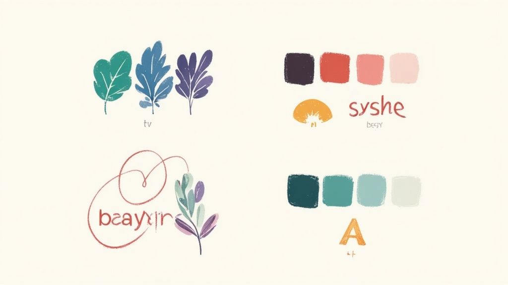
Building Blocks That Create Unforgettable Brands
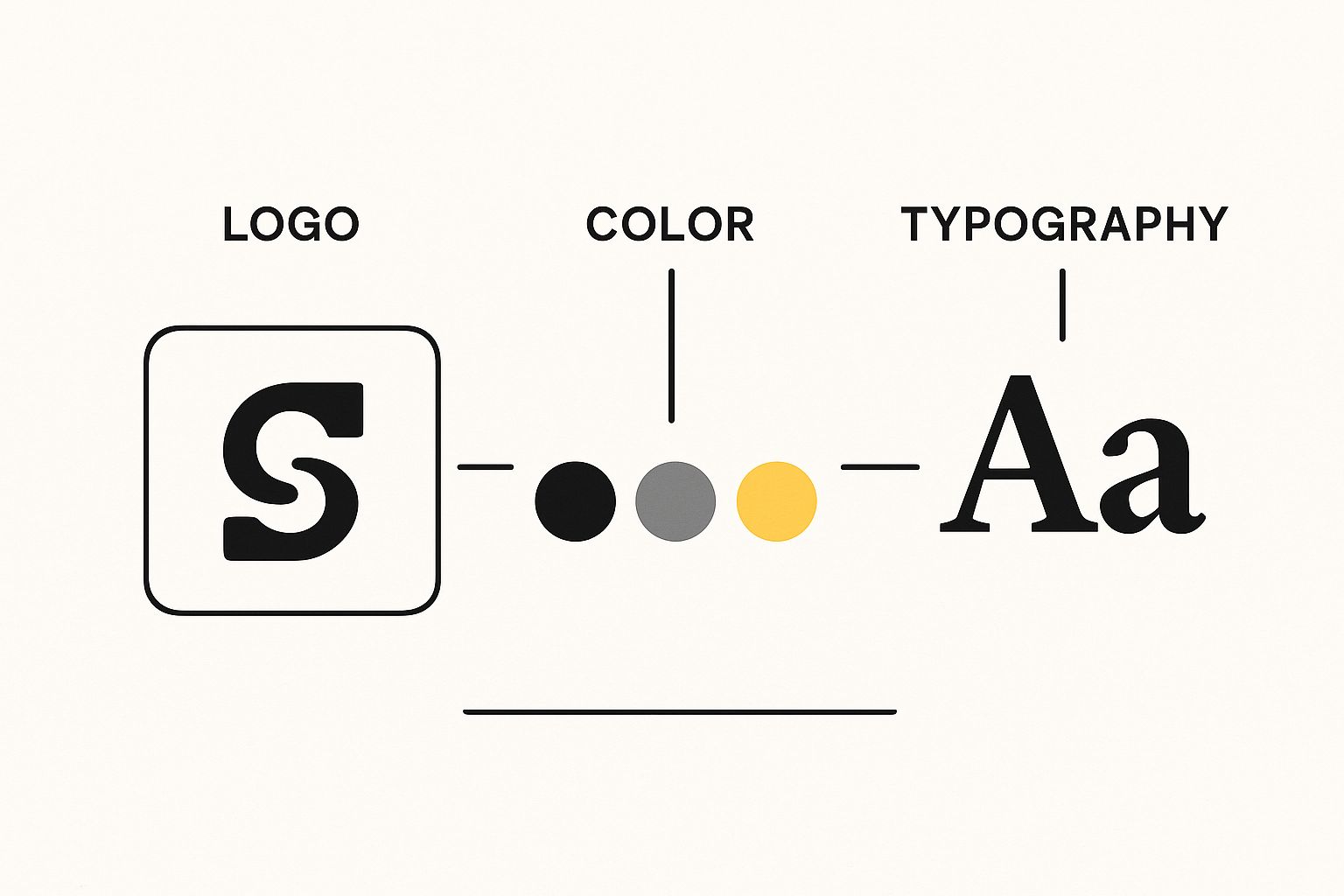
This infographic showcases the core visual elements of branding: a clean logo, color swatches demonstrating the primary palette, and a typography sample. These fundamental pieces are like the foundational ingredients of a recipe – simple on their own, yet essential to the overall flavor. When combined strategically, these elements create a unified visual identity that speaks volumes about your brand.
Beyond the Basics: The Subtleties of Visual Brand Strategy
Effective visual branding goes beyond simply selecting aesthetically pleasing colors and fonts. It’s about understanding the subtle nuances that truly set a brand apart. Think of it like interior design – it's not just about the furniture, but also the spacing, lighting, and textures that create the overall ambiance.
For example, spacing between design elements plays a crucial role. Apple's ample use of white space contributes significantly to their image of premium quality and minimalism.
Similarly, the style of imagery a brand employs tells a story. A company focused on sustainability might feature natural, earthy photography, while a tech startup might opt for sleek, futuristic visuals.
Finally, recurring visual patterns can become a brand's signature. Think of the distinctive patterns on a Burberry scarf. These patterns, whether geometric or organic, enhance brand recognition and create a unique visual language. If you’re curious about creating compelling visuals, check out this resource on visual content creation.
Building a Visual System That Works Everywhere
A robust visual system ensures consistency across all platforms. Imagine Nike’s swoosh logo. It's instantly recognizable whether you see it on a billboard, a t-shirt, or a pair of sneakers. This consistent application strengthens brand recognition and builds valuable brand equity.
This involves developing clear brand guidelines that dictate how visual elements should be used in various contexts, from business cards to social media posts. Just as a musical score guides an orchestra, brand guidelines ensure everyone is playing the same tune, visually speaking.
Understanding how people perceive visual information is also crucial. It's like knowing your audience – you need to understand what resonates with them. To delve into the psychology behind visuals, explore the fascinating world of visual storytelling social media.
A well-defined visual brand strategy guarantees that every visual element, from the smallest icon to the largest banner image, reinforces the brand's personality, values, and core message, ultimately driving long-term success.
To illustrate this further, let's examine a comparison framework:
Visual Brand Elements Comparison Framework
Comprehensive breakdown of core visual brand elements and their strategic impact on brand perception and recognition
| Visual Element | Strategic Purpose | Impact on Recognition | Implementation Priority |
|---|---|---|---|
| Logo | Represents the brand's identity and values | Primary driver of immediate recognition | High |
| Color Palette | Evokes specific emotions and associations | Reinforces brand personality and differentiates from competitors | High |
| Typography | Conveys brand personality and tone of voice | Contributes to a consistent and professional image | Medium |
| Imagery | Tells a story and communicates brand values | Creates visual interest and strengthens brand narrative | Medium |
| Patterns | Enhance brand uniqueness and create a visual signature | Builds brand familiarity and aids in quick recall | Medium |
This table highlights how each element contributes to brand recognition and its relative importance in the implementation process. A strong logo, for example, is paramount for instant recognition, while other elements like imagery and patterns contribute to a deeper, more nuanced brand experience. By strategically aligning these elements, brands can create a powerful and unforgettable visual identity.
Creating Interactive Experiences That Engage
Static visuals are just the first step. Think of them as the foundation of your house. Now, leading brands are building upon that foundation, creating experiences that invite people in and encourage them to stay awhile. They're transforming passive viewers into active brand enthusiasts. This move toward interactive engagement is a core element of a truly successful visual brand strategy.
From Passive Scrolling to Active Participation
Remember the last time you took a BuzzFeed quiz or voted in an Instagram poll? These interactive elements draw you in, making you a part of the brand's story. It's a far cry from simply looking at a picture or skimming a caption. Instead, it creates a two-way conversation between the brand and the consumer.
Imagine a skincare brand creating a quiz to help customers figure out their skin type and get personalized product recommendations. This not only provides value to the customer but also gives the brand valuable information.
Interactive Storytelling: Bringing Your Brand to Life
Animated storytelling is another powerful way to create immersive experiences. Think of short, animated videos that explain complicated ideas, show off product features, or even share the brand’s origin story in a captivating way. Headspace, the meditation app, uses charming animations to explain the benefits of mindfulness. These visuals make the concept approachable and appealing to a broad audience, boosting brand recognition and driving downloads.
Clickable Experiences: Turning Interest Into Action
Clickable experiences, like interactive infographics and 360-degree product views, let customers explore information and products at their own speed. These elements cater to today's on-demand culture, putting consumers in control of their brand experience. This personalized exploration leads to greater engagement and a deeper understanding of what the brand offers. Plus, these interactive elements offer valuable insights into customer preferences and behavior, which helps brands refine their visual brand strategy over time.
The trend toward interactivity in visual brand strategy is huge. By 2025, 62% of marketers plan to ramp up their use of interactive content like quizzes, surveys, and interactive videos. Find out more about the rise of interactive content. This shows a growing understanding of the power of interactive content to turn passive consumption into active engagement, leading to more immersive brand experiences.
Balancing Innovation and Brand Consistency
While embracing interactivity is essential, maintaining brand consistency is crucial. All interactive elements should align with the brand’s existing visual identity and messaging. This ensures a cohesive brand experience and prevents the interactive elements from feeling disconnected or overwhelming. The key is to weave these interactive elements strategically into the brand message, enhancing it rather than distracting from it. This balance between innovation and consistency is the secret sauce for creating a visual brand strategy that connects with audiences and drives meaningful engagement.
Smart Technology Integration Without Losing Authenticity

This screenshot shows OpenAI's DALL-E 2, an AI tool that creates images from text descriptions. The interface is remarkably simple, highlighting how easy it is to generate visuals using AI. This ease of use is changing the game for visual brand strategy, offering a fast and budget-friendly way to create content.
AI tools are transforming how we create visual content. But the real magic is knowing when to use these powerful tools and when to rely on human creativity. Think of it like a power tool for a carpenter: incredibly useful, but it doesn't replace the carpenter's skill and artistry. For example, AI can generate variations of a logo or create social media graphics, freeing up designers for more strategic work.
The AI Advantage: Efficiency and Scale
AI-powered tools like DALL-E 2 and Midjourney are a game-changer. They produce high-quality images and videos much faster and cheaper than traditional methods. This allows brands to create more content, experiment with different visual styles, and adapt quickly to trends. Imagine needing visuals for a social media campaign. AI can generate numerous options in minutes, allowing your team to quickly test and refine them.
Furthermore, we're seeing a growing integration of AI into visual brand strategies. One report points to the increasing use of AI-generated visuals and hyper-surrealism in visual brand strategy for 2025. Discover more insights into this trend. This highlights the importance of understanding how these tools can boost a brand's visual storytelling and overall presence.
Maintaining Authenticity in the Age of AI
While AI offers incredible efficiency, the human touch remains crucial for connecting with your audience authentically. Authenticity builds trust, and that’s something AI can’t replicate (at least not yet). It’s like the difference between a mass-produced item and a handcrafted piece. Both can be beautiful and functional, but the handcrafted item carries a unique story and emotional resonance.
The Human Element: Creativity and Connection
Smart brands are using AI strategically. They are integrating it into their workflow while keeping what makes their brand unique. They’re using AI to handle repetitive tasks, freeing up human creatives to focus on the bigger picture: crafting compelling stories, building emotional connections, and making sure every visual element reflects the brand's core values.
It’s about finding the balance between efficiency and creativity, between automation and the human touch. This means considering the ethical implications of AI-generated content and ensuring it aligns with your brand’s message and values. It’s about harnessing technology’s power without losing the human elements that make a brand truly memorable.
Making Your Visual Brand Strategy Work Everywhere
You've crafted this amazing visual brand strategy. The logo is perfect, the colors sing, the fonts are just right. But what good is it if it only lives on a mood board? Imagine a high-performance sports car that's never taken out of the garage. All that potential, going nowhere. Your visual brand needs to be on the road, working for you across every platform. This section explores how to make that happen.
Adapting Your Visuals Across Different Channels
Think about a chameleon. It blends seamlessly into different environments, changing its colors to match its surroundings. Your visual brand needs that same adaptability. It needs to maintain its core identity while flexing to fit the unique personality of each platform.
Let's break it down:
- Instagram: This is the realm of the visual. Think stunning photography, captivating videos, and stories that grab attention in a fast-scrolling feed.
- LinkedIn: Here, professionalism reigns supreme. Clean graphics, informative content, and a polished aesthetic are key.
- Email Signatures: Even the smallest details matter. A consistent email signature, with your logo, brand colors, and approved fonts, reinforces your brand every time you send a message.
- Packaging: If you have physical products, your packaging is a powerful brand touchpoint. It's a chance to make your product instantly recognizable on a crowded shelf.
This adaptation isn't about being two-faced. It's about speaking the right language in the right setting. You wouldn't use the same tone in a boardroom as you would at a backyard barbecue, would you? Your visuals should follow the same principle.
Building User-Friendly Brand Guidelines
Brand guidelines are the instruction manual for your visual brand. Think of them as a well-organized toolbox. Everyone on your team knows where to find the right tools (visual elements) and how to use them correctly. This prevents the brand from becoming a fragmented mess.
So, what should be in this toolbox?
- Logo Usage: Specify clear rules for logo size, placement, and acceptable backgrounds.
- Color Palette: Define your primary and secondary colors, providing hex codes and Pantone values for accuracy.
- Typography: List the approved fonts for headings, body text, and other design elements. Consistency is key.
- Imagery Style: Describe the overall style of photography or illustration that best represents your brand.
- Tone of Voice: While not strictly visual, your tone of voice should be documented to ensure consistent messaging across all platforms.
Clear guidelines empower your team to use the brand correctly, preventing those little inconsistencies that can chip away at your brand’s impact over time.
Avoiding Common Implementation Pitfalls
Even with the best intentions, there are some common traps that can weaken your visual brand:
- Inconsistent Logo Usage: Imagine seeing different versions of your logo scattered across your website, social media, and marketing materials. It's confusing for your audience and weakens brand recognition.
- Ignoring Platform-Specific Best Practices: Each platform has its own quirks. Ignoring these – like image size requirements on Instagram or the professional tone of LinkedIn – can make your brand look amateurish.
- Lack of Clear Brand Guidelines: Without a central source of truth, team members might improvise. This can lead to a visual mishmash that dilutes your brand’s overall image.
Channel-Specific Visual Brand Adaptation Guide
A strategic approach to maintaining brand consistency while optimizing visual elements for different marketing channels and platforms.
To help you visualize this adaptation process, let’s look at a practical example:
| Channel/Platform | Visual Adaptations Required | Consistency Priorities | Performance Metrics |
|---|---|---|---|
| Optimized image sizes, engaging video formats, eye-catching stories | Consistent color palette, prominent logo usage, cohesive overall aesthetic | Engagement (likes, comments, shares), reach (followers, impressions), brand mentions | |
| Professional, high-quality imagery, clean and informative graphics | Consistent tone of voice, clear brand messaging, standardized logo usage | Click-through rates on posts and articles, lead generation, brand awareness within the professional community | |
| Email Signatures | Concise and professional design, appropriate use of brand colors, consistent font usage | Correct logo placement, accurate contact information, clear and concise brand message | Click-through rates on links within the signature, email open rates |
| Packaging | Product-specific design that complements the item, strategic use of brand colors, clear and consistent logo placement | Strong brand recognition, clear and concise product information, consistent visual style across all product lines | Sales figures, brand awareness among consumers, customer feedback on packaging design |
This table shows how adapting to each platform's nuances, while maintaining core brand elements, creates a unified and powerful brand experience. Remember, a strong visual brand isn't a rigid, unchanging thing. It's a living, breathing entity that evolves and adapts while staying true to its core values.
Measuring What Matters and Optimizing For Growth
Building a strong visual brand strategy is a bit like constructing a building. You wouldn't just build it and walk away, right? You'd inspect the foundation, check the walls, and make sure everything is structurally sound. The same principle applies to your visual brand. Measuring and optimizing your strategy is crucial for its long-term success. It's about understanding what resonates with your audience, what falls flat, and how to constantly improve.
Beyond Vanity Metrics: Measuring Real Impact
Many brands focus on vanity metrics – likes, follows, and shares. While these numbers can offer a quick boost of confidence, they don’t always reflect the bigger picture. Think of it like a packed concert hall where everyone is cheering, but nobody buys merchandise. Lots of enthusiasm, but no real return. So, what should you be measuring?
- Engagement Rates: Are people truly interacting with your content? Are they commenting, asking questions, or clicking through to learn more? This goes beyond a simple like and shows genuine interest.
- Brand Recognition Scores: Can people identify your brand solely based on its visuals? Imagine showing someone your logo or a piece of branded content without any identifying text. Would they recognize it? This is a key indicator of a strong visual identity.
- Brand Perception: How do people feel about your brand? Surveys and focus groups can provide valuable insights into how your visuals shape overall perception. Are you projecting the brand personality and values you’re aiming for?
- Emotional Connection: Are your visuals evoking the desired emotions? This is where the real magic happens. A strong emotional connection builds brand loyalty that goes beyond simple transactions.
Setting Up Effective Testing Protocols
Developing your visual brand isn’t a guessing game. It's about taking a structured, experimental approach, much like a scientist in a lab. Here are a few ways to test and refine your strategy:
- A/B Testing: Create two versions of a visual element, whether it's a social media graphic, a website banner, or even different color palettes. Then, track which version performs better. This provides concrete data on what resonates with your audience.
- Heatmaps: Tools like Hotjar can track where people are looking on your website or clicking on your social media posts. This helps identify what's grabbing attention and what's being overlooked. Are people even seeing your call to action?
- User Feedback: Don't be afraid to ask your audience directly! Conduct surveys, run polls, and engage in conversations to understand their perspectives. After all, they are the ultimate judges of your visual brand.
For a deeper dive into measuring content effectiveness, check out this helpful guide on measuring content performance.
Interpreting Results and Making Informed Decisions
Gathering data is only the first step. The real power comes from interpreting and applying it. Look for patterns and correlations. If a specific color palette consistently underperforms, consider exploring alternatives. If your call to action is being ignored, maybe it's time to rethink its placement or design.
By consistently measuring, testing, and optimizing, your visual brand strategy becomes a dynamic and evolving entity, constantly adapting to the needs and preferences of your audience. This continuous improvement helps build lasting brand loyalty and drives sustainable growth.
Ready to create engaging visuals that captivate your audience? Visit Lumeo and transform your static posts into dynamic carousel presentations.