A Guide to Social Media Carousels That Convert

So, what exactly is a social media carousel? Think of it less like a single, static picture and more like a mini-story or a digital flipbook. It’s a single post that lets you share up to 10 images or videos, all packed into one swipeable experience that invites your audience to lean in and interact.
Why Social Media Carousels Dominate Engagement

In a world where attention spans are getting shorter by the second, social media carousels have become a secret weapon for marketers. They work because they interrupt the mindless scroll by tapping into a very human trait: our natural curiosity. When someone sees that first slide with a little hint of what’s next, they almost can’t help but swipe left to see the rest.
That simple swipe does something incredibly important for your content. It skyrockets your dwell time—the amount of time someone spends on your post. This is a massive signal to social media algorithms that people find your content interesting. The longer they stick around, the more the platform will push your post out to new audiences.
The Power of Storytelling and Curiosity
The best carousels aren't just a random collection of images; they tell a story. They have a clear beginning (the hook on slide one), a middle (where you deliver all the value), and an end (your call-to-action). This simple narrative structure gives our brains the sense of completion we crave, making the information far more memorable than a standalone image ever could.
This format is a game-changer in today's digital environment. With over 5.24 billion people on social media for an average of 2 hours and 19 minutes every day, the fight for attention is real. Carousels give you an edge by turning a fleeting glance into a focused, multi-swipe interaction. For more insights on the structure and strategy behind these posts, you can dive deeper into understanding carousel ads.
A Clear Look at Carousel Benefits
To really appreciate why carousels are so effective, it's helpful to see their advantages laid out clearly. They do more than just grab attention; they actively help you achieve your marketing goals by making your content more interactive and digestible.
This table breaks down the core benefits:
Quick Overview of Carousel Benefits
| Benefit | Impact on Marketing Goals |
|---|---|
| Increased Dwell Time | Signals high-quality content to algorithms, boosting your reach and visibility. |
| Enhanced Storytelling | Lets you build a deeper narrative, forging a stronger connection with your audience. |
| Improved Information Delivery | Breaks down complex ideas into bite-sized slides, making them easier to understand. |
| Higher Engagement Rates | Naturally encourages swipes, saves, and comments—all key engagement metrics. |
| Versatile Content Format | Perfect for tutorials, data deep dives, product tours, and behind-the-scenes stories. |
Ultimately, carousels shift your audience from being passive viewers to active participants.
The magic of a carousel lies in its ability to hold attention. By presenting information sequentially, it creates a "knowledge gap" that compels users to swipe to find the answer, significantly boosting post interaction.
This simple shift is what drives higher engagement and makes carousels one of the most powerful tools in any social media strategy.
Crafting Your Carousel Narrative From Hook to CTA

A truly great social media carousel is so much more than a collection of pretty pictures. It’s a story. Think of it like a mini-movie for your followers. Your first slide is the opening scene—it has to be compelling enough to stop their scroll. The middle slides are the heart of your story, where you build trust and deliver real value. And the final slide? That's your grand finale, the clear call-to-action that tells your audience precisely what to do next.
This structure is absolutely critical. It’s what takes your audience on a journey from "what's this?" to "I need to do that!" Without a strong narrative, people will just swipe past after the first slide or two, completely missing your message. A well-planned story, on the other hand, builds momentum and keeps them swiping right to the very end.
The whole process starts with ideas that actually resonate with your audience. What are their biggest struggles? What questions are they always asking? Forget just plugging your product; the best carousels come from a genuine desire to offer solutions and valuable insights.
The Anatomy of a High-Performing Carousel
To build a story that sticks, you need to understand the job of each slide. When you break it down, you ensure every single part of your carousel serves a purpose and pushes you toward your goal.
A simple way to think about this is a classic three-act structure:
The Hook (Slide 1): This slide is your single most important asset. It needs a bold headline, a fascinating question, or a jaw-dropping statistic to grab attention instantly. Its only job is to get that first swipe.
The Value (Slides 2-9): Here’s where you deliver on the promise you made in your hook. This is the meat of your carousel. Break your topic down into easy-to-digest, bite-sized chunks. A mix of short text, relevant images, and clear graphics is key to keeping the story flowing.
The Call-to-Action (Slide 10): Never, ever leave your audience hanging. Your last slide must give them clear directions. Whether you want them to save the post, check out your website, or drop a comment, be direct and specific.
This structured approach can turn a simple post into a seriously powerful communication tool. For a deeper dive into the nuts and bolts, you can learn more from our expert guide on how to make a carousel post.
Designing for a Seamless Swipe
Beyond the story itself, the design and copywriting are what make the experience feel smooth and professional. A cohesive visual identity is a must. Use consistent fonts, colors, and branding elements across every slide to create a polished look that builds brand recognition and trust.
A common mistake is jamming too much text onto each slide. Remember, people are scrolling fast. Each slide should focus on one, single, clear idea. Stick to short sentences, use bullet points, and leave plenty of white space to make your content easy to scan.
The ultimate goal is a frictionless swipe-through. You can use clever visual cues, like arrows or images that "bleed" onto the next slide, to hint that there's more to see. It’s a small design trick that can make a huge difference in how many people finish your social media carousels.
Let's look at a quick example.
Before and After Carousel Transformation
| Element | Basic Carousel (Before) | Narrative Carousel (After) |
|---|---|---|
| Hook (Slide 1) | "Our New Features" | "Tired of Wasting Time on Social Media? 3 Features That Give You Hours Back." |
| Middle Slides | Lists features with technical descriptions. | Each slide explains a specific user problem and how one feature solves it, using visuals. |
| Visuals | Disconnected screenshots. | Cohesive design with brand colors, icons, and a consistent layout. |
| CTA (Final Slide) | "Check it out." | "Ready to reclaim your time? Save this post and click the link in our bio to start your free trial!" |
See the difference? Moving from a dry announcement to a problem-solving story makes the content far more compelling and gets your audience to actually take action.
Optimizing Carousels for Each Social Platform
Creating a carousel that really hits the mark isn't a "one-size-fits-all" kind of deal. A design that kills it on Instagram's visual playground might completely fall flat on a professional network like LinkedIn. Real success comes from tweaking your content to fit the unique vibe, audience expectations, and algorithm of each platform.
It's a bit like being a musician. You wouldn't play a heavy metal riff at a classical concert, right? In the same way, your carousel strategy needs to change its tune to match the environment. This means tailoring your story, your visuals, and your call-to-action to connect with people where they are.
Mastering Instagram Carousels for Visual Storytelling
Instagram is the natural home of the carousel. It's a visual-first world where beautiful aesthetics and compelling stories are king. Here, carousels aren't just another post type; they're consistently one of the top performers.
This isn't just a feeling; the data backs it up. Social media carousels have a clear advantage when it comes to engagement. In fact, on Instagram, these multi-image posts have shown higher interaction rates than even video formats like Reels. This tells us that users really appreciate a well-crafted, swipeable story that pulls them in.
To really nail your Instagram carousels, focus on these key things:
- A Scroll-Stopping First Slide: Your first image or video absolutely has to grab attention and make someone stop scrolling. Think bold text, a provocative question, or a stunning photo.
- Seamless Transitions: Create a smooth, connected flow by using design elements that "bleed" from one slide to the next. This could be a continuous background or a simple arrow graphic that guides the eye forward.
- Mix Media Types: Don't just stick to photos. Weaving in short video clips can make the whole experience more dynamic and keep your audience swiping.
For an even bigger impact, think about how carousels fit into your wider Instagram marketing strategies.
Elevating Your Brand on LinkedIn with Informative Carousels
Over on LinkedIn, the game changes. The goal shifts from pure entertainment to professional education and establishing yourself as an expert. People on LinkedIn are hunting for industry insights, career advice, and valuable data. Carousels, often presented as simple slide decks (sometimes called "doc-sells"), are a fantastic way to deliver that value.
A great LinkedIn carousel is like a mini-presentation. It takes a complex topic—like a case study, a research report, or a business framework—and breaks it down into a series of clear, easy-to-digest slides. The whole point is to show you know your stuff and give your professional network something genuinely useful.
The image below compares a couple of common layout approaches, showing how different design choices can affect how people view your content.
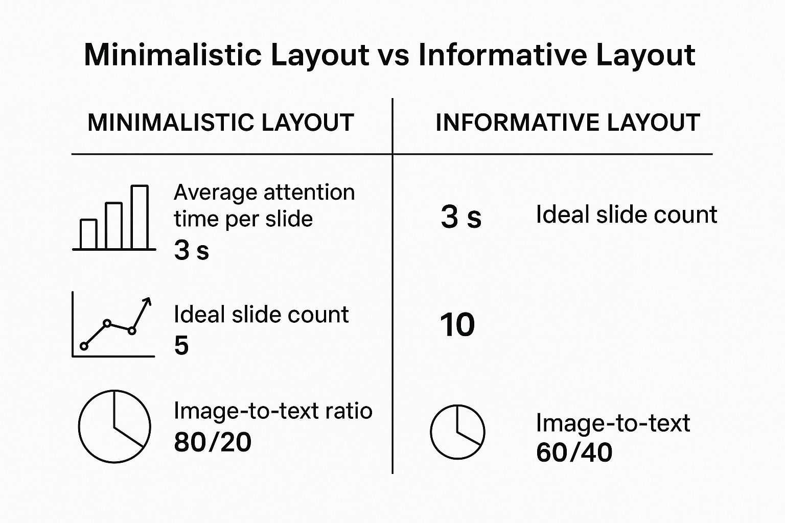
As you can see, while simpler layouts are faster to scan, more informative designs can hold a viewer's attention for longer, letting you tell a more detailed story.
Driving Action with Facebook Carousels
Facebook carousels are incredibly versatile, working well for both organic posts and paid ads. While good visuals are still important, this platform is especially good at driving direct action, like getting people to click to your website or make a purchase.
This is where carousels really shine for showcasing products or services. Each slide can feature a different item, highlight a specific feature, or share a unique benefit, complete with its own description and link. That’s why it’s a go-to format for e-commerce brands running ad campaigns.
To get the most out of your Facebook carousels, keep these tips in mind:
- Lead with Your Strongest Asset: Facebook's algorithm might automatically reorder your slides based on what performs best. Make sure every single slide is strong enough to stand on its own.
- Use Clear Calls-to-Action on Each Card: You can add a unique headline and link to every carousel card. Use this to your advantage to send traffic to specific product pages or landing pages.
- Tell a Cohesive Story: Whether you're showing a step-by-step guide or a collection of customer reviews, make sure the slides work together to build a convincing narrative.
Adapting your approach for each platform is what turns a simple carousel post into a powerful, strategic asset that gets results.
Carousel Strategy Across Social Platforms
To make it even clearer, let's break down how your carousel strategy should differ across the major platforms. Each one has its own personality, and your content should reflect that.
This table sums up the key differences to help you plan your content more effectively.
| Platform | Optimal Content Type | Key Strategic Focus |
|---|---|---|
| Highly visual stories, tutorials, reveals | Visual storytelling, aesthetics, audience engagement | |
| Educational slide decks, data, case studies | Thought leadership, professional value, building authority | |
| Product showcases, ads, step-by-step guides | Driving direct action (clicks, sales), versatility |
Ultimately, understanding these nuances is what separates a good carousel from a great one. By tailoring your content, you're not just posting; you're communicating in the language of the platform, which is how you build a real connection with your audience.
Creative Carousel Ideas and Inspiring Examples

Knowing the theory behind what makes social media carousels effective is a great start. But the real "aha!" moment comes when you see brilliant examples in the wild.
The best carousels aren't just a collection of random photos. They harness the swipe-through format to tell a story, teach a skill, and build a connection. Let's move from the what to the how by looking at some proven, creative ways brands are winning with this format. Think of these as templates you can steal and adapt for your own audience.
Transforming Knowledge into Swipeable Lessons
One of the most valuable ways to use a carousel is to educate your audience. When you break down a complicated subject into a series of simple, bite-sized slides, you instantly position your brand as a helpful expert. It's a fantastic way to build trust and give people a reason to follow you.
Here are a few ways to turn your expertise into a great carousel:
- Step-by-Step Tutorials: Walk your audience through a process, one slide at a time. This could be anything from a software guide to a quick recipe or a DIY project.
- Data Storytelling: Don't just dump statistics on your audience. Turn dry research into a compelling visual narrative. Each slide can reveal a new chart or data point, building up to a powerful conclusion.
- Quick Tip Listicles: Everyone loves a good list of tips. Dedicate a single slide to each point, making the content easy to scan, absorb, and save for later.
Shopify is a master at this. They regularly turn complex business advice into clean, infographic-style carousels that teach their audience something genuinely useful, making them a go-to resource.
Showcasing Products and Stories in Depth
A single image can only tell so much of your product's story. Carousels give you the canvas to go much deeper, whether you're launching a new item or taking people behind the scenes.
Think of a carousel as your digital storefront window, but interactive. Instead of a static display, you get to guide your customer on a mini-tour, showing off every angle, feature, and benefit.
This creates a much more immersive and convincing experience. A clothing brand, for example, could show an outfit from multiple angles on the first few slides, show it styled in different ways on the next, and even drop in a short video clip on the final slide.
Here’s how you can put this to work for your brand:
- Product Deep Dives: Use each slide to spotlight a specific feature or benefit of one product. This is way more powerful than trying to cram everything into a single, crowded graphic.
- Behind-the-Scenes Tours: Give your followers an exclusive peek into your world—your workspace, your team, or your creative process. It humanizes your brand and makes people feel like insiders.
- Customer Testimonial Spotlights: Social proof is everything. Use a carousel to feature a series of glowing reviews or user-generated photos. It’s like a highlight reel of happy customers.
Inspiring Action with Brand Narratives
Beyond just teaching and selling, carousels are an incredible tool for pure brand building. You can use the multi-slide format to share your company's mission, communicate your core values, or tell the origin story of why you exist in the first place. This creates an emotional connection that runs deeper than any product.
A "brand manifesto" carousel, for instance, can lay out your beliefs slide-by-slide, building a powerful statement that attracts people who share your worldview. You could also tell a customer's success story, using each slide to move the narrative from their initial problem to their ultimate solution.
These narrative-driven social media carousels are especially effective on professional networks. For some great ideas on this front, check out these top LinkedIn carousel post examples for 2025 to see how the pros build authority.
Ultimately, the goal is to make your carousel feel less like an ad and more like a valuable, self-contained piece of content. When you focus on telling a great story, you create posts that don't just stop the scroll—they drive real results.
Common Carousel Mistakes and How to Fix Them
Even the most brilliant concept for a social media carousel can fall flat because of a few simple, common mistakes. These little slip-ups can stop engagement in its tracks, causing scrollers to swipe right past your message before they ever get to the good stuff. But here's the good news: these issues are easy to spot and even easier to fix.
Think of this as your personal troubleshooting guide. We’re going to diagnose the most frequent mistakes that kill carousel performance and give you straightforward solutions to get your content back on the right path. By learning what to avoid, you can make sure all your creative effort translates into real, measurable results.
Mistake 1: Overloading Your Slides with Text
This is the single biggest offender. People try to cram an entire novel onto one slide. When a user is hit with a dense wall of text, their brain immediately says "nope" and they keep scrolling. Carousels are meant to be scanned quickly, not read like a textbook.
The fix is refreshingly simple: one main idea per slide. Break down your message into bite-sized, digestible pieces. Use short sentences, lean on bullet points, and embrace white space to make each slide feel light and approachable. Always remember, clarity beats complexity every single time.
Key Insight: Your goal isn't to put your entire blog post on a slide. It's to spark curiosity and deliver value one swipe at a time. The carousel should tease the core message, not tell the whole story in exhaustive detail.
For example, instead of one slide with a five-sentence paragraph explaining a business tip, try creating five separate slides. Each slide gets one sentence and a simple supporting icon. This makes the information way easier to absorb and actually encourages the user to keep swiping to get the full picture.
Mistake 2: A Weak or Confusing Opening Slide
Your first slide has one job and one job only: to stop the scroll. If that first slide is boring, vague, or doesn't make a compelling promise, you’ve lost the battle before it’s even begun. No one is going to swipe to slide two if slide one doesn't give them a powerful reason to.
To fix this, your hook needs to be crystal clear and instantly engaging. It should hit on a problem your audience faces, ask a provocative question, or drop a surprising statistic. The headline has to be bold, easy to read, and create an "information gap" that makes the viewer need to know the answer.
- Weak Hook: "Our New Marketing Tips"
- Strong Hook: "99% of Marketers Make This Mistake. Do You?"
See the difference? The strong hook immediately creates intrigue and promises a valuable payoff for anyone who swipes through the rest of the carousel.
Mistake 3: Forgetting the Call to Action
After you’ve guided your audience through a brilliant, value-packed carousel, the absolute worst thing you can do is just leave them hanging. A carousel without a clear call-to-action (CTA) on the final slide is a massive missed opportunity. You've captured their attention and earned their trust—now tell them what to do next!
The fix here is to be direct and specific. Your last slide should explicitly guide the user toward the action you want them to take.
- Save this post for later.
- Comment below with your biggest takeaway.
- Click the link in our bio to read the full guide.
- Share this with a colleague who needs it.
This final instruction is especially critical on platforms like LinkedIn. For a more detailed look at crafting effective endings, our guide on creating a LinkedIn carousel post offers platform-specific advice that can seriously boost your results. By providing a clear next step, you turn passive viewers into an active, engaged community.
Still Have Questions About Carousels? Let's Clear Them Up.
Once you start actually making social media carousels, you'll inevitably run into some very specific questions. It's a fantastic format, but it definitely has its own quirks and unwritten rules. Getting straight answers can be the difference between a post that flops and one that becomes a cornerstone of your content strategy.
Think of this as your personal cheat sheet. We've collected the most common questions that pop up when people get serious about carousels. From how many slides to use to what metrics actually matter, these answers will help you move forward with confidence.
What’s the Magic Number of Slides for a Carousel?
This is the big one, isn't it? Everyone wants to know the perfect number, but the real answer is: it depends on your story. That said, the data points in a very clear direction. While Instagram lets you use up to 10 slides, maxing it out is almost always your best bet for engagement.
Time and time again, studies show that carousels with the most slides get the highest average engagement rates. Why? Every swipe is a small commitment from your audience, telling the platform's algorithm, "Hey, this is good stuff." That extra interaction dramatically increases how long people spend on your post, which is rocket fuel for your reach.
Key Takeaway: If you're on the fence, go for all 10 slides. A longer carousel gives you the real estate to build a proper narrative, deliver serious value, and keep people hooked from start to finish.
Of course, there’s a catch. Don't add fluff just to hit the 10-slide mark. Each slide needs to pull its weight. If you can tell a powerful, complete story in seven slides, don't water it down with three extra slides of filler. The goal is a valuable, cohesive experience, not just hitting a number.
How Should I Mix Videos and Static Images?
Mixing media is a brilliant way to make your social media carousels feel more alive and keep your audience from swiping away. The ability to weave static images, sharp graphics, and short video clips into one post is a superpower—you should absolutely be using it. A well-placed video can act as a pattern interrupt, snapping a user back to attention just when they might be zoning out.
Here’s how you can blend them together without it feeling clumsy:
- Create a Mid-Carousel Surprise: Drop a short, looping video around slide 4 or 5. This breaks up the swipe-swipe-swipe rhythm and adds a burst of energy. It’s perfect for showing a quick tutorial or a product in action.
- Start or End with Motion: A video on the very first slide can be a serious scroll-stopper. On the flip side, using a video for your final slide can deliver a more personal and compelling call-to-action.
- Keep Videos Short and Sweet: These aren't YouTube deep dives. Aim for clips that are just 3-15 seconds long. They need to make sense without sound, since most people are scrolling in silence.
The secret is to make the mix feel deliberate. Your video should add another layer to the story you're telling with your static slides, not feel like a random interruption.
What Metrics Actually Matter for Carousel Success?
Likes are vanity. To really know if your carousels are hitting the mark, you need to look at metrics that signal genuine interest and value. Focusing on the right data tells you a much richer story about your performance.
These are the top three metrics you should be obsessing over:
- Saves: This is the gold standard of engagement. When someone saves your post, they're saying, "This is so good, I need to come back to it later." It’s a huge vote of confidence and a metric that algorithms absolutely love.
- Shares: A share is a personal endorsement. Someone is putting their own reputation on the line by sending your carousel to a friend or posting it in their story. This is how you tap into organic reach and find new audiences.
- Swipe-Through Rate: You can't see this number directly in your analytics, but you can feel it. When you see a post getting tons of saves and shares, it's a strong sign that people are swiping all the way to the end. That deep engagement is what you're chasing.
While you shouldn't ignore likes and comments, focusing on saves and shares will push you to create content that provides real, lasting value.
Can I Just Turn My Other Content into Carousels?
Yes! You absolutely should. Repurposing content is the single smartest and most efficient way to feed your carousel strategy. You don't need to reinvent the wheel every single time. Your existing assets—blog posts, case studies, even video transcripts—are practically begging to be turned into a swipeable visual story.
Just think about it: a 1,500-word blog post is basically a pre-written script for a 10-slide educational carousel. Each slide can tackle a key point, a surprising stat, or a main section from the original article. It’s a fantastic way to get more bang for your buck from your best content and connect with people who prefer learning visually.
Here’s a quick-and-dirty process for it:
- Find the Highlights: Skim your article and pull out the "aha!" moments, key data points, and core arguments.
- One Idea, One Slide: Dedicate each slide to a single, digestible idea. Keep the text minimal.
- Add Visuals: Grab some icons, stock photos, or simple graphics to bring each point to life.
- Close with a CTA: On your last slide or in the caption, point people back to the original article to "Read the full story."
This method not only saves a ton of time but also guarantees your carousels are loaded with well-researched, high-value information.
What Are the Best Tools for Making Carousels?
Good news: you no longer need to be a design wizard or a Photoshop pro to create beautiful social media carousels. There's a whole ecosystem of user-friendly tools that can help anyone produce slick, on-brand visuals without a steep learning curve.
While classics like Canva and Figma are great for hands-on design, a new wave of AI-powered tools is making the process even quicker. These platforms are built from the ground up for social media, with features specifically for creating killer carousels. They can help with everything from sparking ideas to making sure your branding is consistent on every post.
For marketers and creators looking to work smarter, not harder, these tools are a game-changer. They often come loaded with templates designed for engagement, AI copy suggestions, and clever features that let you repurpose an article into a carousel in just a couple of clicks.
Ready to stop fighting with design software and start creating incredible carousels in minutes? Lumeo is the AI-powered digital assistant built to turn your ideas—whether it's an article or just a few lines of text—into captivating carousels for LinkedIn and Instagram. Build your authority and grow your audience by turning your knowledge into visual assets people love. Try Lumeo for free and feel the difference.