Maximize Engagement with LinkedIn Carousel Ads
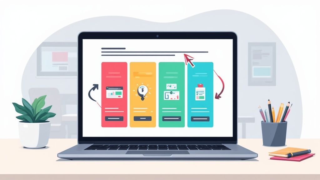
LinkedIn Carousel Ads are an interactive format that lets you stitch together multiple images or videos into a single, swipeable ad. They're incredibly effective for B2B marketing, mainly because they give you enough room to tell a real story, show off different product features, or even stack up customer testimonials in one neat package.
Why Carousel Ads Are a B2B Game Changer
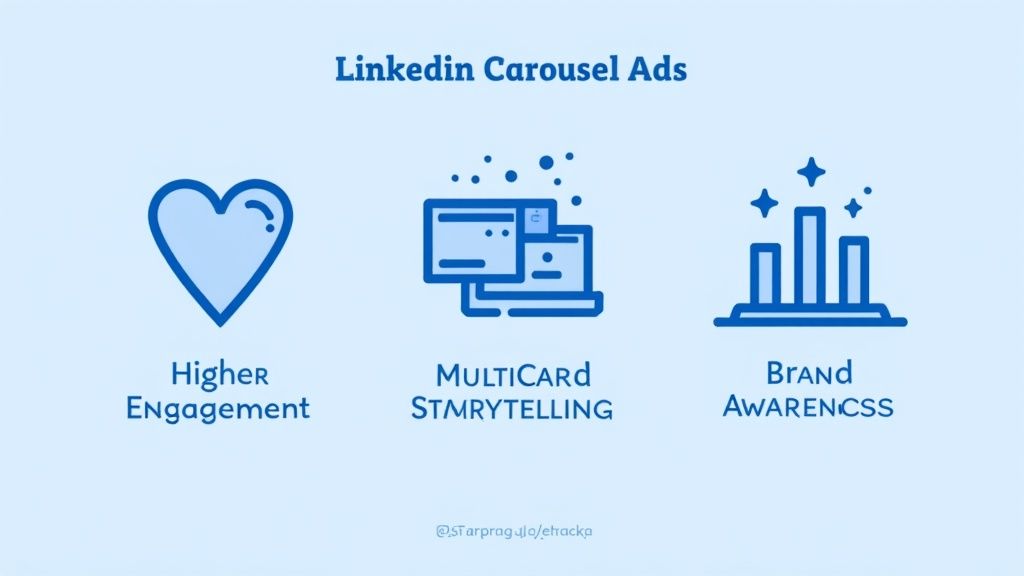
Before we get into the nuts and bolts of setting one up, it’s worth understanding why LinkedIn Carousel Ads are such a big deal in the B2B space. A static ad gives you one shot to get your message across. A carousel, on the other hand, creates a dynamic experience. It invites your audience to lean in, swipe, and actually engage with your brand on their terms.
This format is perfect for professional audiences. These are people who need more than a flashy image; they want context and solid information before making a move. With a carousel's multiple cards, you can:
- Tell a Compelling Brand Story: Take your audience on a journey. Start with a common pain point on the first card and reveal your solution by the last one.
- Showcase Multiple Product Features: Break down a complex product into bite-sized pieces. Dedicate each card to a specific feature or benefit.
- Present Customer Testimonials: Nothing builds trust like social proof. Feature a different customer success story or a powerful quote on each slide.
- Share Step-by-Step Guides: Walk your prospects through a process. It's a great way to demonstrate your expertise and build credibility.
The Power of Interactive Storytelling
The real magic of LinkedIn carousel ads is their ability to tell a story. B2B purchases are rarely impulsive. They’re considered, logical, and often involve a whole team of people. A carousel lets you guide a prospect through a logical sequence of ideas.
Imagine a cybersecurity firm using a carousel. The first card shows a common threat, the next few cards illustrate how their software neutralizes it, and the final card displays a glowing customer review. That narrative is far more persuasive than a single, static image could ever be.
The true value isn't just in showing more pictures; it's about creating a cohesive journey. Every swipe should build on the last, sparking curiosity and making the viewer want to see what's next.
For a look at how this plays out in the wild, check out these high-performing LinkedIn carousel post examples.
To give you a clearer picture of how carousels stack up against the old standby, here’s a quick comparison.
LinkedIn Ad Format Performance Snapshot
| Metric | Carousel Ads | Single Image Ads |
|---|---|---|
| Engagement Rate | Typically 30-50% higher | Baseline |
| Click-Through Rate (CTR) | Can see up to a 75% higher CTR | Lower on average |
| Cost Per Click (CPC) | Often lower due to higher relevance and engagement | Can be higher |
As you can see, the interactive nature of carousels often leads to better engagement and click-through rates, which can make your ad spend go a lot further. They simply give people more reasons to stop scrolling and pay attention.
Precision Targeting Meets Engaging Content
The other massive advantage is LinkedIn's laser-focused targeting. You can deliver these multi-card stories directly to the professionals who need to see them. You can build campaigns based on job title, company size, industry, or even specific skills, ensuring your message lands right on the desk of key decision-makers.
This one-two punch of an engaging format combined with hyper-specific targeting is what makes these ads such a formidable tool for B2B marketers. It simplifies how you showcase even the most complex solutions.
The platform is clearly built to support diverse marketing goals, from building awareness to driving conversions, with formats designed for every stage of the funnel.
To get the full picture of where LinkedIn is heading with its ad platform, it’s helpful to see how LinkedIn unveils innovative ad formats and features. By turning a simple ad view into a meaningful brand interaction, you can drive consideration and conversions much more effectively than with old-school ad formats.
Crafting a Compelling Carousel Narrative
The best LinkedIn carousel ads do more than just show off a few images. They tell a story. They pull your prospect in, guiding them from a moment of curiosity all the way to genuine consideration.
Think of it this way: a powerful narrative turns someone from a passive scroller into an active participant. They have to swipe to see what’s next.
This is where you stop just listing features and start creating a real journey. You have between 2 and 10 cards to work with, so treat each one like a chapter in a mini-story. The goal is to build momentum with every swipe, making your message more convincing as the user gets deeper into your ad.
Building a Story That Connects
First things first, you need to decide what story you're actually telling. A random collection of product shots or tips just won't cut it. You need a narrative arc that ties directly to your campaign goal.
For instance, a B2B SaaS company could build a classic problem-solution story. Card one hits on a common industry pain point, grabbing attention with a struggle everyone recognizes. The next few cards could then unpack how specific software features solve that exact problem, one by one. The final card? A killer testimonial or a can't-miss call-to-action.
Or, maybe a consulting firm could walk prospects through a successful case study. Each card would move through a stage of the project, from the initial challenge to the jaw-dropping final results. This approach instantly positions the firm as a trusted expert who gets things done.
The secret is structuring your carousel like a tiny storybook. Hook them with a problem they know all too well, build suspense in the middle slides, and deliver the "aha!" moment at the end. When you create that curiosity, people feel compelled to swipe all the way through, which is great for your engagement rates.
Whatever story you choose, every single card needs to have a clear purpose while still adding to the bigger picture.
Design and Copywriting for a Seamless Flow
A great story isn't just about the plot—it's about the execution. Your design and copy need to work together to create a smooth, cohesive experience. Visually, every card should feel like part of the same family. They don't have to be identical, but they need to share a common design language.
Here's how to create that seamless feel:
- Consistent Branding: Stick to your brand’s color palette, fonts, and logo placement on every card. This builds recognition and just looks professional.
- Visual Cues: Use subtle design tricks to encourage the swipe. Think about an arrow, a graphic that bleeds onto the next card, or even a numbered list that continues across slides.
- Balanced Visuals: Keep it interesting by mixing things up. You can combine sharp stock photos, custom illustrations, data charts, and even text-focused cards. The trick is to keep the overall aesthetic consistent.
Your copywriting is just as crucial for tying the narrative together. Headlines on each card should be short, punchy, and intriguing. Make them want to know what's next. We're talking captions, not paragraphs. Each headline should build on the last, leaving a trail of breadcrumbs that leads your audience right through your story.
To take it a step further, many of the same storytelling principles apply to other formats. Learning how to create AI video ads that convert can offer insights into messaging and flow that you can bring back to your carousels.
Proven Storytelling Frameworks for Carousel Ads
If you're looking for a place to start, try one of these battle-tested frameworks for your next LinkedIn carousel campaign. Each gives you a simple way to structure your content into a persuasive flow.
1. The Problem-Agitate-Solve (PAS) Model
- Card 1 (Problem): Hit them with a clear pain point your audience feels.
- Cards 2-4 (Agitate): Dig into why that problem is so frustrating.
- Card 5 (Solve): Introduce your product or service as the hero.
2. The Step-by-Step Guide
- Card 1: Introduce a process or a mini-tutorial.
- Cards 2-4: Use each card for a single, actionable step.
- Card 5: Show off the successful final result.
3. The Feature-to-Benefit Showcase
- Card 1: Hook them with a big, overarching benefit.
- Cards 2-4: Spotlight a specific feature and immediately tie it to a real-world benefit for the user.
- Card 5: Sum up the value and hit them with a strong call-to-action.
By using a clear narrative structure and backing it up with solid design and sharp copy, you can turn your LinkedIn carousel ads from basic slideshows into powerful storytelling machines that grab attention and get results.
Alright, you've got your story and your visuals all lined up. Now it's time to jump into LinkedIn Campaign Manager and bring your LinkedIn carousel ads to life. This is where the magic happens—where your creative ideas meet the technical side of things. Don't sweat it; the platform is pretty intuitive once you get the hang of it.
First things first, you'll need to create a new campaign. The very first choice you have to make is your campaign objective. This is a big one. You're essentially telling LinkedIn's algorithm what a "win" looks like for your ad, and that directly impacts who sees it and how your budget gets spent.
Trying to get your brand name out there? Brand awareness is your best bet. If you want to pull professionals to a new blog post or a specific product page, go with Website visits. And if you're all about gathering contact info for your sales pipeline, Lead generation is the way to go.
Selecting Your Ad Format and Audience
With your objective, budget, and schedule locked in, you’ll get to the ad creation part. This is where you officially choose the Carousel image ad format. From there, the interface guides you through building your ad, one card at a time.
This is also your chance to get surgical with your audience targeting. Seriously, LinkedIn's targeting options are a B2B marketer's dream. You can narrow down your audience based on things like:
- Job Title and Seniority: Want to reach "Marketing Directors" or "VPs of Engineering"? No problem.
- Company Industry and Size: You can target specific industries, from "Information Technology" to "Financial Services," and even filter by the size of the company.
- Member Skills and Interests: Find professionals based on the actual skills they list on their profiles, like "Project Management" or "Java."
Nailing your targeting is absolutely crucial. You could have the most amazing ad in the world, but if it's shown to the wrong people, it's going to flop. My advice? Start with a well-defined audience, but if you notice your reach is too small, don't be afraid to broaden it just a bit.
The process of arranging your carousel cards is designed to be visual and intuitive, allowing you to build your narrative slide by slide.
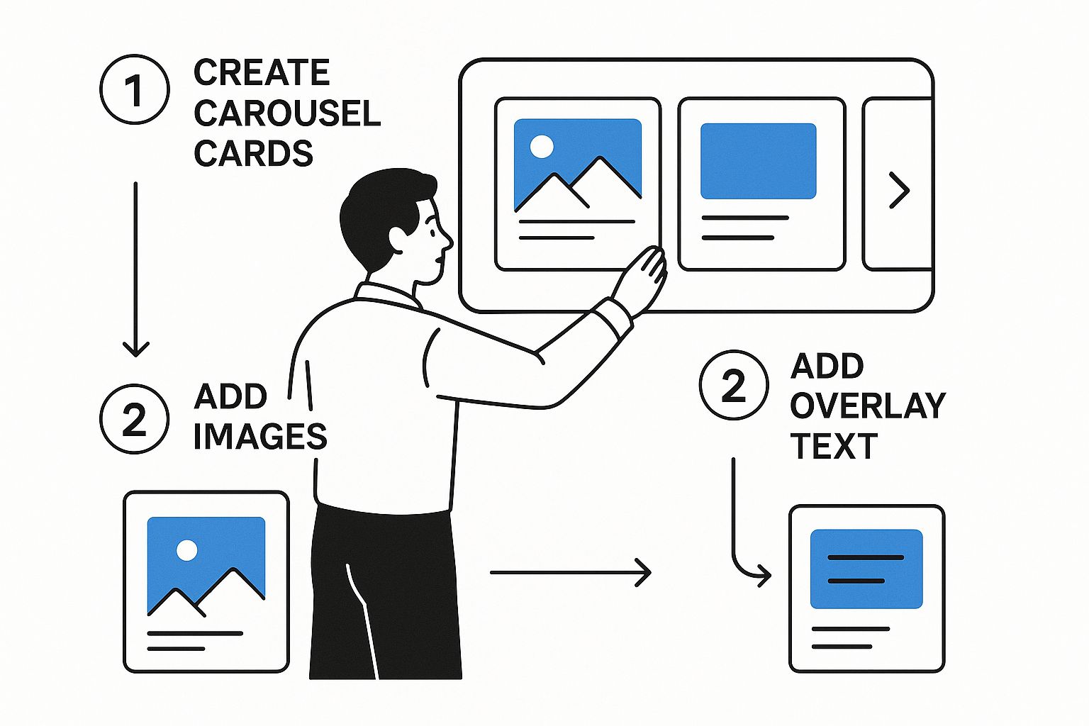 This visual approach really helps you see how the ad is coming together, making sure every single card adds to a story that flows and grabs attention.
Uploading Your Carousel Cards and Copy
Now for the fun part—uploading your creative. You can add anywhere from 2 to 10 cards to your carousel, and each one is a new chance to hook your audience. As you upload each image or video, you'll also get to add a unique headline and destination URL for every single card.
This is a real game-changer. Let's say you're showing off three different software features. You can link each card directly to its own landing page. That kind of specific, relevant experience can do wonders for your conversion rates.
Pro Tip: You can use up to 10 cards, but I've found the sweet spot is usually between 3 and 5. It gives you enough room to tell a compelling story without your audience getting swipe fatigue. And always, always make your last card a strong, clear call-to-action.
Keep these key specs in your back pocket:
- Image Format: JPG, PNG, or a non-animated GIF will work.
- Aspect Ratio: Stick with 1:1 (square). It just looks best.
- Resolution: Aim for at least 1080x1080 pixels.
- File Size: Make sure each image is under 10 MB.
- Card Headline: You've got up to 45 characters. Use them wisely.
- Introductory Text: This is your main ad copy. Keep it short and punchy—under 150 characters is ideal so it doesn't get cut off on mobile.
If you're looking to go even deeper on creating multi-slide posts that really resonate, check out our expert guide on how to make a carousel post.
Finalizing and Launching Your Campaign
Before you even think about hitting that "Launch" button, use the preview function. I'm serious—this is a non-negotiable step. It shows you exactly how your ad will look on both desktop and mobile. You're looking for any weird text cut-offs or awkward image cropping.
This is a step where a tool like Lumeo really shines. You can design your whole carousel there and then seamlessly upload the final assets right into Campaign Manager, knowing they already look perfect.
Once you’ve given everything a final once-over, you’re good to go. Hit launch, and your ad will head into review. Once it's approved, it'll start making its way to your target audience. But don't kick your feet up just yet—your work isn't done. Now it's time to watch the performance and start optimizing for even better results.
How to Measure and Optimize Your Ad Performance
Hitting "launch" on your LinkedIn carousel ads is a great feeling, but it’s just the beginning. The real magic happens next, in the optimization phase. This is where you listen to the data and turn a good campaign into a truly great one.
Think of your initial launch as the first draft. The data you collect in those first few days is pure gold. It provides the insights you need to make smart tweaks that can slash your costs and send your conversion rates soaring.
This isn’t about random guessing. It’s about building a feedback loop where you continuously learn and improve, letting the performance of one ad inform the next.
Key Metrics to Watch in Campaign Manager
Your first port of call is the LinkedIn Campaign Manager dashboard. It's easy to get overwhelmed by the sheer volume of data, so I always recommend focusing on the metrics that really matter for carousel ads.
For a high-level view of your campaign's health, keep a close eye on these four:
- Click-Through Rate (CTR): This is the clearest indicator of how well your creative and headline are grabbing attention. A low CTR means your hook isn't working.
- Cost Per Click (CPC): This tells you exactly what you're paying for each click. The goal is to drive this down without sacrificing the quality of the traffic you're getting.
- Engagement Rate: This is a broader measure that includes likes, comments, shares, and—crucially for carousels—swipes. High engagement shows your content is resonating, even with people who don't click through to your site.
- Conversion Rate: This is the ultimate bottom-line metric. It measures the percentage of people who clicked your ad and then took the action you wanted on your landing page.
Research shows that LinkedIn Carousel Ads are engagement powerhouses. The global average CTR is a solid 0.49%, often outperforming single-image ads. Performance can vary quite a bit by region, though.
Understanding regional performance helps set realistic expectations for your campaigns. This table shows average CTR and CPC across different markets.
Regional LinkedIn Carousel Ad Benchmarks
| Region | Average Click-Through Rate (CTR) | Average Cost-Per-Click (CPC) |
|---|---|---|
| North America | 0.45% | $5.58 |
| Europe, Middle East & Africa (EMEA) | 0.42% | $3.97 |
| Asia-Pacific (APAC) | 0.43% | $2.53 |
| Latin America (LATAM) | 0.74% | $1.81 |
As you can see, a campaign in Latin America might see a much higher CTR but a lower CPC compared to one in North America. This context is crucial for judging your own results.
Digging Into Individual Card Performance
Here’s where you get to use the real superpower of carousel ads. LinkedIn gives you a performance breakdown for each individual card, and this is where the biggest optimization opportunities are hiding.
Inside your Campaign Manager reporting, find the "Carousel" breakdown. You'll see CTRs and impression counts for every single card. This tells you exactly which parts of your story are pulling their weight and which ones are letting you down.
A common mistake is only looking at the overall ad's CTR. The magic is in the card-by-card data. If you see a huge drop-off in clicks after Card 2, you know exactly where your narrative is breaking down. That’s your cue to test a new image or headline for Card 3.
This granular data lets you diagnose problems with surgical precision. Is your opening card failing to hook people? Is your final call-to-action falling flat? The numbers will give you the answer.
A Practical Framework for A/B Testing
Once you've spotted the weak links in your carousel, it's time to start testing. The most important rule? Be systematic. Change only one thing at a time so you can confidently attribute any performance change to that specific element.
Here's a simple testing framework I use with my own campaigns:
- Test Your Creatives: Visuals are everything. If a card is underperforming, try swapping its image. Maybe a photo of a person works better than an abstract graphic, or a simple data chart is more compelling than a product shot.
- Test Your Headlines: That 45-character headline on each card is valuable real estate. If a card's CTR is lagging, rewrite its headline. Try posing a question instead of making a statement, or focus on a benefit instead of a feature.
- Test Your Card Order: The flow of your story is critical. Try reordering the cards to see if it improves engagement. I've often found that moving a compelling case study from the end to Card 2 can dramatically increase swipes.
- Test Your Call-to-Action: On your final card, experiment with different CTAs. Does "Download the Guide" perform better than "Get Your Free Ebook"? Sometimes a small wording change can make a massive difference.
Before you run any A/B tests, make sure your assets are correctly formatted. You don't want technical glitches skewing your results. For a full checklist, check out our guide on the proper LinkedIn carousel size.
Using a tool like Lumeo is a huge time-saver here, as it lets you create and resize all these test variations in minutes. That way, you can spend less time wrestling with design software and more time analyzing your results.
Alright, you've got the basics down. Your carousels are running, and you're seeing some traction. But "good enough" isn't what we're aiming for, right? Let's talk about how to take your LinkedIn carousel ads from simply running to truly crushing it. This is where we move beyond the standard setup and start thinking like a seasoned pro to squeeze every drop of ROI from your budget.
A seriously powerful tactic I love is using carousels for hyper-specific retargeting. Think about it: someone visits your site and browses three of your services. Instead of showing them a generic "Hey, remember us?" ad, you can serve up a carousel featuring those exact three services. Each card links directly back to the page they were already on. This doesn't feel like an ad; it feels like a genuinely helpful, personalized follow-up.
Another way to level up is to build an entire sales funnel within a single ad. Don't just show off your product—guide your audience through a journey. It could look something like this:
- Card 1: Start with a top-of-funnel offer, like a downloadable whitepaper.
- Card 2: Next, invite them to a related webinar (a classic mid-funnel move).
- Card 3: Then, hit them with a detailed case study to build trust.
- Card 4: Finish strong with a clear call-to-action for a demo or consultation.
Suddenly, your ad is doing the work of multiple touchpoints, catching people wherever they are in their buying journey.
Avoiding Costly Mistakes
Of course, the more you try to do, the more can go wrong. I've seen even experienced advertisers fall into some common traps that just torch their ad spend and kill any momentum they had. Knowing what these pitfalls are is half the battle.
The most common mistake I see? A weak or completely non-existent narrative. A carousel with random, disconnected images feels sloppy and confusing. Each card has to flow logically from the one before it, telling a cohesive story that pulls the user to the very end. If you don't have that clear arc, you'll see people drop off after the second card. Every time.
A carousel ad is not a random collection of single-image ads. It's a storytelling medium. If your cards don't connect to tell one compelling story, you're missing the entire point of the format.
Common Pitfalls and How to Fix Them
Let's break down the most frequent blunders and how you can sidestep them.
| Pitfall | The Fix |
|---|---|
| Inconsistent Branding | Someone should know instantly that all the cards belong to you. Stick to your Brand Kit—use the same fonts, colors, and logo placement on every single card. Tools like Lumeo make this incredibly easy to enforce. |
| Generic CTAs | "Learn More" is okay, but it's lazy. Be specific! If you're showing a tutorial, say "Try It Yourself." If you're sharing data, use "Get the Full Report." Your CTA should match the card's content. |
| Neglecting Mobile Users | The overwhelming majority of LinkedIn users will see your ad on their phone. Preview your ad on a mobile screen obsessively. Is the text readable without pinching and zooming? Are key visuals cropped out? Keep headlines under 45 characters so they don't get cut off. |
| Ignoring Card-Level Data | Looking only at the overall ad's CTR is a classic rookie mistake. You need to dive into the analytics for each individual card. If Card 3 has a horrible click-through rate, you've found the weak link in your story. Test a new image or headline for that specific card to fix it. |
One last subtle but expensive error is sending everyone to the same generic landing page. If your carousel showcases three different products, each card should link to the specific landing page for that product. It's a simple change that drastically improves the user experience and can give your conversion rates a serious lift by cutting out friction.
By steering clear of these common slip-ups and applying these more sophisticated strategies, you'll ensure your LinkedIn carousel ads are working much, much harder for you.
Your Questions About Carousel Ads Answered
When you start digging into LinkedIn carousel ads, it’s natural for questions to pop up. You’ve got the basics down, but now you’re wrestling with the details that can either make your campaign soar or see it fall flat. We’ve been there.
Over the years, we've heard just about every question in the book from fellow marketers. So, we've pulled together the most common ones to give you clear, straightforward answers and help you move forward with confidence.
What’s the Best Number of Cards for a Carousel Ad?
While LinkedIn gives you a canvas of 2 to 10 cards, we've found the magic number is usually between 3 and 5 cards. This range gives you enough space to tell a compelling story or highlight key features without your audience getting "swipe fatigue." It’s the perfect balance of informative and concise.
Your real goal is to build a tight narrative that keeps people hooked from the first swipe to the last. And speaking of the last swipe, always make sure your final card drives home a powerful, direct call-to-action. Don't leave them hanging!
Of course, the best approach is to test. Run a few simple A/B tests to see what your specific audience actually responds to.
Can I Put Video in My Carousel Ads?
Yes, you absolutely can—and you probably should. LinkedIn lets you mix and match static images and video on each card, which is a fantastic opportunity to create a rich, engaging experience.
Imagine this: you could lead with a scroll-stopping video on card one to grab attention, then follow up with static images to break down features or benefits. It's a powerful combo. If you do go this route, keep your videos short and punchy.
Our rule of thumb? Keep videos under 30 seconds. And most importantly, design them to work without sound. So many people scroll with their audio off, so use captions or on-screen text to make sure your message always gets through.
How Do I Know if My Carousel Campaign Is Actually Working?
Success isn't one-size-fits-all; it completely depends on the goals you set from the very beginning. There's no single "win" metric.
- For brand awareness campaigns: You'll be watching impressions, reach, and overall engagement—likes, comments, shares, and swipes.
- For driving website traffic: Your north star metrics are your overall click-through rate (CTR) and, just as critically, the CTR of each individual card.
- For lead generation: It all comes down to your conversion rate and cost per lead (CPL).
The key is to dive into the performance data for each card right inside Campaign Manager. This is where you’ll discover which parts of your story are resonating and which ones need a rethink.
What Are the Biggest Mistakes People Make?
Even experienced marketers can trip up on the small stuff. We see the same common mistakes derail carousel ad performance time and time again.
- A Weak Narrative: The cards feel like a random assortment of images, not a cohesive story that flows from one to the next.
- Inconsistent Branding: The look and feel—fonts, colors, logos—change from card to card, which comes across as unprofessional and confusing.
- Neglecting the Copy: The headline on each card is just as important as the visual, but it often feels like an afterthought.
- Using a Generic URL: Every card links to the same generic homepage instead of specific, relevant landing pages.
- A Missing CTA: Forgetting a strong, clear call-to-action on the final card is one of the biggest missed opportunities of all.
Ready to stop wrestling with designs and start creating stunning, high-performance carousel ads in minutes? With Lumeo, you can transform any content into a professional-looking carousel with just a few clicks. Our AI-powered tools and easy-to-use Brand Kit feature ensure every ad is perfectly on-brand and optimized for engagement. Try Lumeo for free and see the difference.