Your Guide to LinkedIn Carousel Size and Specs

If you want to get your LinkedIn carousel right, start with the dimensions. The sweet spot is a 1:1 square ratio (1080x1080 pixels) or a 4:5 portrait ratio (1080x1350 pixels). Nailing these specs is the first step to making sure your content looks sharp and professional on both desktop and mobile, without any awkward cropping.
LinkedIn Carousel Dimensions Quick Guide
Ever since LinkedIn introduced carousels as PDF uploads back in 2019, they’ve become a serious powerhouse for engagement. But if the sizing is off, you lose impact before anyone even reads your first slide. While LinkedIn gives you some wiggle room, sticking to the recommended specs is what separates a polished, professional post from an amateurish one.
This guide is your quick-reference for getting it right every time. I’ll walk you through the optimal pixel sizes, file requirements, and other critical details for both your regular organic posts and your paid carousel ads.
Here's a handy infographic that breaks down the core specs for a standard square carousel.
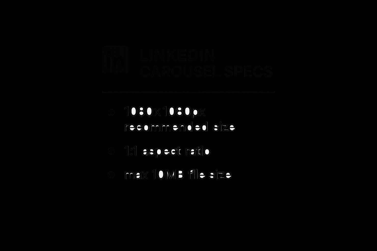
The main takeaway here? When in doubt, a 1080x1080 pixel design is your most reliable, go-to format. It just works.
However, don't just set it and forget it. Recent analysis shows that posts using optimized dimensions can get up to 62% higher engagement than those that don’t. While the square format is a safe bet, the 4:5 portrait format (1080x1350 pixels) is often the real MVP. Why? Because it commands more vertical real estate on mobile screens, making your post much harder for users to simply scroll past.
LinkedIn Carousel Specifications at a Glance
Navigating the differences between an organic carousel (which is really just a PDF or PPT file) and a paid carousel ad can be confusing. They look similar in the feed, but their technical requirements are completely different.
This table breaks down the essentials for you. Use it as a quick cheat sheet to make sure you're always using the right file type and dimensions for the job.
| Attribute | Organic Carousel (PDF/PPT) | Carousel Ad (Images) |
|---|---|---|
| Recommended Ratios | 1:1 (Square) or 4:5 (Portrait) | 1:1 (Square) |
| Recommended Size | 1080x1080px or 1080x1350px | 1080x1080px |
| File Type | PDF, PPT, PPTX, DOC, DOCX | JPG, PNG, GIF (non-animated) |
| Max File Size | 100 MB | 10 MB |
| Max Slide/Card Count | 300 pages | 10 cards |
Whether you're creating a deep-dive educational document for your followers or a punchy, direct ad campaign, referencing these specs first will save you a lot of headaches later on. It ensures your content is delivered exactly as you designed it.
Getting Your Organic LinkedIn Carousels Right
Unlike paid ads with their rigid guidelines, organic LinkedIn carousels—which you'll usually upload as a PDF—give you a ton of creative room to play. This is your chance to share deep, valuable content that really grabs attention in the feed. The trick is knowing how to use the format's specific requirements to your advantage.
Your first big decision is the LinkedIn carousel size. A standard 1:1 square (1080x1080px) is always a safe choice, but I've consistently seen better results with the 4:5 portrait ratio (1080x1350px). Why? It's simple: this taller format eats up more vertical screen space on phones, making your post much harder for people to just scroll past. Taking over that digital real estate is one of the easiest wins you can get.
Of course, the best specs in the world won't save a boring post. The real magic comes from learning how to write compelling content that actually connects with your audience.
Technical File Requirements
When you're putting your carousel document together, you have to work within LinkedIn's specific file limits. These aren't just suggestions; they directly shape what you can and can't do with your design.
- Maximum File Size: You get up to 100 MB. Honestly, this is pretty generous. It means you can pack in high-quality images and detailed graphics across multiple slides without worrying too much about heavy compression.
- Maximum Page Count: The limit is 300 pages. While it's hard to imagine anyone needing that many slides, it’s good to know you have the freedom to create incredibly detailed guides or visual stories if you want to.
Pro Tip: Don't get carried away with the page count. The sweet spot for engagement is almost always between 5 and 10 slides. That’s just enough to build a narrative but short enough to keep someone's attention until the end.
If you're using a tool like Canva, they make this whole process a lot easier. They have a ton of pre-sized templates built specifically for LinkedIn content, including carousels.

As you can see, you get a whole library of professionally designed templates to kickstart your work. This not only saves a bunch of time but also makes sure your carousel looks polished from the get-go. By grabbing a 1080x1350px template, you’re already setting yourself up for success on a platform where most people are scrolling on their phones.
Getting Your LinkedIn Carousel Ads Right
While you have some wiggle room with organic posts, LinkedIn’s paid carousel ads are a different beast entirely. They come with a much stricter set of rules, and for good reason—LinkedIn wants to guarantee a consistent, high-quality ad experience for everyone on the platform.
It's a common stumbling block. I've seen countless campaigns get delayed or rejected simply because they didn't follow these ad-specific requirements. It’s frustrating, but completely avoidable.
The biggest rule to remember? The mandatory 1:1 square aspect ratio. This isn't a friendly suggestion; it's a hard requirement for every single card in your carousel ad. This uniformity is what ensures your ad displays perfectly across every device, with no awkward or unexpected cropping.
Required Ad Dimensions and File Limits
To get your ad approved and running without a hitch, you have to play by the numbers. These technical constraints aren't just there to make your life difficult; they're in place to optimize ad performance and keep the user experience clean and professional.
Each card in your carousel ad must be a perfect square, using a 1:1 aspect ratio. The minimum dimensions are 1080 x 1080 pixels. I always recommend sticking to this size, as it keeps your visuals looking sharp and professional. For a deeper dive into how these specs can impact your campaigns, it's always a good idea to check out LinkedIn's own detailed guides.
On top of the dimensions, you’ll need to keep these technical limits in mind:
- Card Count: You must include at least two cards, but no more than 10 cards per carousel ad.
- Image File Size: Each individual image card has to be under 10 MB.
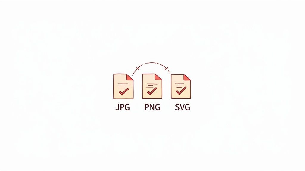
- Accepted File Types: You’re limited to JPG and PNG files. While you can use GIFs, they must be static, as animations aren't supported in this format.
My Key Takeaway: The single biggest mistake I see people make is trying to repurpose their organic 4:5 portrait content directly into a paid ad. It just won't work. You have to design your ad creative specifically for the required 1:1 format to avoid rejection and make sure your message actually gets seen as you intended.
By getting a handle on these distinct rules from the start, you can build your ad campaigns correctly from the ground up. This saves you the headache of troubleshooting formatting errors and lets you focus on what really matters: crafting a message that connects with your audience.
Design Principles for High-Engagement Carousels
Knowing the correct LinkedIn carousel size is only half the battle. How you actually design your slides is what will determine whether your audience mindlessly swipes past or stops to engage with your content. A truly successful carousel tells a cohesive story, guiding the viewer from one slide to the next with clear purpose.
Your first slide is by far your most valuable piece of real estate. It absolutely must have a powerful hook—this could be an intriguing question, a bold statement, or a surprising statistic that immediately grabs attention. This slide sets the tone and expectation for the entire carousel, so make it compelling enough to earn that next swipe.
From there, it's all about maintaining a seamless visual flow. Use consistent branding elements like colors, fonts, and logos across every single slide. Sticking to key UI/UX design principles is non-negotiable for creating content that looks professional and feels intuitive, not cluttered or confusing.
Create a Cohesive Narrative
Each slide should build logically on the last, creating a mini-story with a clear beginning, middle, and end. Think of it as taking your reader on a step-by-step journey.
- Introduce a Problem: Kick things off by highlighting a common pain point that your audience instantly recognizes and relates to.
- Provide Solutions: Use the middle slides to deliver the goods—offer up actionable tips, insightful data, or your unique perspective.
- End with a Call-to-Action: The final slide must tell the viewer exactly what you want them to do next. Be direct.
This narrative structure is what keeps people swiping and adds real value that goes far beyond a simple collection of random images. For a more hands-on approach, you can experiment with different layouts and story structures using a free LinkedIn carousel editor to see what performs best with your audience.
A great carousel doesn’t just present information; it takes the viewer on a journey. The goal is to make each swipe feel like a natural and rewarding next step.
Prioritize Readability and Clarity
You have to assume your design is being viewed on a phone, because that's where most LinkedIn users consume content. This means using large, legible fonts and embracing white space to avoid overwhelming your audience.
Don't try to cram a novel onto a single slide. Instead, break down your complex ideas into single, digestible points. When in doubt, remember that a clean, uncluttered design is always more effective than a busy one.
Common Carousel Mistakes and How to Fix Them
Even when you nail the LinkedIn carousel size, a few simple missteps can completely derail your hard work. I see it all the time. One of the most common errors is treating a carousel like a photo dump—just a random collection of images instead of a cohesive story. This is a surefire way to lose your audience's attention and get them to swipe away.
Another classic pitfall is using text that's way too small. It might look perfectly fine on your big desktop monitor, but on a mobile screen—where most people will see it—it becomes an unreadable mess. You've instantly lost a potential reader.
Similarly, I often see creators completely ignore the aspect ratio, which results in awkward, unprofessional cropping. Forcing a portrait-style PDF into a campaign that needs a square format will butcher your design before anyone even sees it.
The best carousels take the viewer on a journey. Each slide should naturally build on the last, creating momentum that keeps people hooked right up to your final call-to-action.
Quick Fixes for Top Carousel Errors
The good news is that avoiding these issues is pretty straightforward with just a little bit of planning. If you pay attention to a few key details during your design process, you can make sure your carousels always come across as polished, professional, and effective.
- Mistake: Disconnected Slides. Don't just list isolated tips. Build a narrative. Hook them on the first slide, pack the middle slides with value, and end with a strong, clear call-to-action. To see how the pros do it, check out these excellent LinkedIn carousel examples for a dose of inspiration.
- Mistake: Illegible Text. Always design for mobile first. That means using large, bold fonts and keeping the amount of text on each slide to a minimum. Let your visuals do the heavy lifting.
- Mistake: Wrong Aspect Ratio. Before you even start designing, double-check the required format. Organic posts look best with a 4:5 ratio, but carousel ads have a strict 1:1 square requirement. You absolutely cannot mix these up.
Frequently Asked Questions About LinkedIn Carousels

Even after walking through a complete guide, I find that a few specific questions about the ideal LinkedIn carousel size and best practices always pop up. Let's tackle some of the most common things creators and marketers ask.
Can I Still Post Organic Carousels on LinkedIn?
Yes, you absolutely can. It's true that LinkedIn technically removed the dedicated "carousel post" feature in late 2023, but the community figured out a workaround almost immediately. The standard method everyone uses now—and it works perfectly—is simply uploading a multi-page PDF document.
When you share a PDF, LinkedIn automatically turns it into a swipeable, carousel-style post. For all intents and purposes, it functions just like the old carousels and continues to be one of the best-performing content formats on the platform.
How Many Slides Should I Use in My Carousel?
A PDF can technically have up to 300 pages, but a great carousel is all about being concise. From what I’ve seen, the sweet spot for engagement is somewhere between 5 and 10 slides.
This gives you just enough room to do everything you need to:
- Hook your reader on the first slide.
- Deliver real value and insights in the middle.
- End with a strong call-to-action on the final slide.
If you go over 10 slides, you run the risk of your audience swiping away before they get to your final, most important point.
Why Does My Carousel Look Blurry or Low-Quality?
Blurry carousels are almost always caused by one of two things: incorrect dimensions or too much image compression. To keep your visuals looking sharp and professional, always start your design with the recommended LinkedIn carousel size—either 1080x1080px for square or 1080x1350px for a portrait layout.
The other culprit is your export settings. When you're saving your final PDF from a tool like Canva or Figma, choose the highest quality setting you can. I often find that exporting as a "PDF for Print" instead of "PDF for Web" gives a much crisper result without going over the 100 MB file size limit.
Key Insight: Don't just focus on the design itself; how you export the file is just as critical. A high-quality export preserves the sharpness of your text and graphics, making your content look far more professional in the feed.
Of course, nailing the technical details is only half the battle. A great carousel also needs a smart content strategy behind it. You can learn more about boosting your post's reach by checking out our guide on how to get more engagement on LinkedIn. It’s full of practical tips that work perfectly with a well-designed carousel.