Master Formatting LinkedIn Posts: Tips to Boost Engagement

Why Most LinkedIn Posts Die a Quiet Death (And What Winners Do)
Let's be honest, sometimes it feels like your LinkedIn posts just disappear into the void. You put in the effort, but the engagement just isn't there. Meanwhile, other people seem to effortlessly rack up likes and comments. What's the deal? I've spent a lot of time building my own LinkedIn presence, and I've noticed one thing that makes a huge difference: formatting.
It's not about sounding like a robot or following some rigid template. It's about presenting your authentic self in a way that's easy for people to connect with. Think about it: do you enjoy reading dense blocks of corporate jargon? Probably not. I know I don't! People respond to real stories and genuine voices.
So, how does formatting help with that? It makes your content accessible and enjoyable to read. Imagine scrolling through LinkedIn on your phone during your commute. Are you going to stop and read a massive wall of text? Probably not. That's where white space, short paragraphs, and bullet points come in. They make your posts visually appealing, especially on mobile.
Formatting isn't just about aesthetics; it directly impacts your engagement. For example, Socialinsider analyzed over a million posts and found that multi-image (carousel) posts had an average engagement rate of 6.60%, significantly higher than other formats. You can check out their findings here. This just shows the power of visual storytelling and smart formatting. So, if you want your LinkedIn posts to get noticed, pay attention to how you present your message. It's not just about what you say, but how you say it.
Carousel Magic: Creating Visual Stories That Get Shared
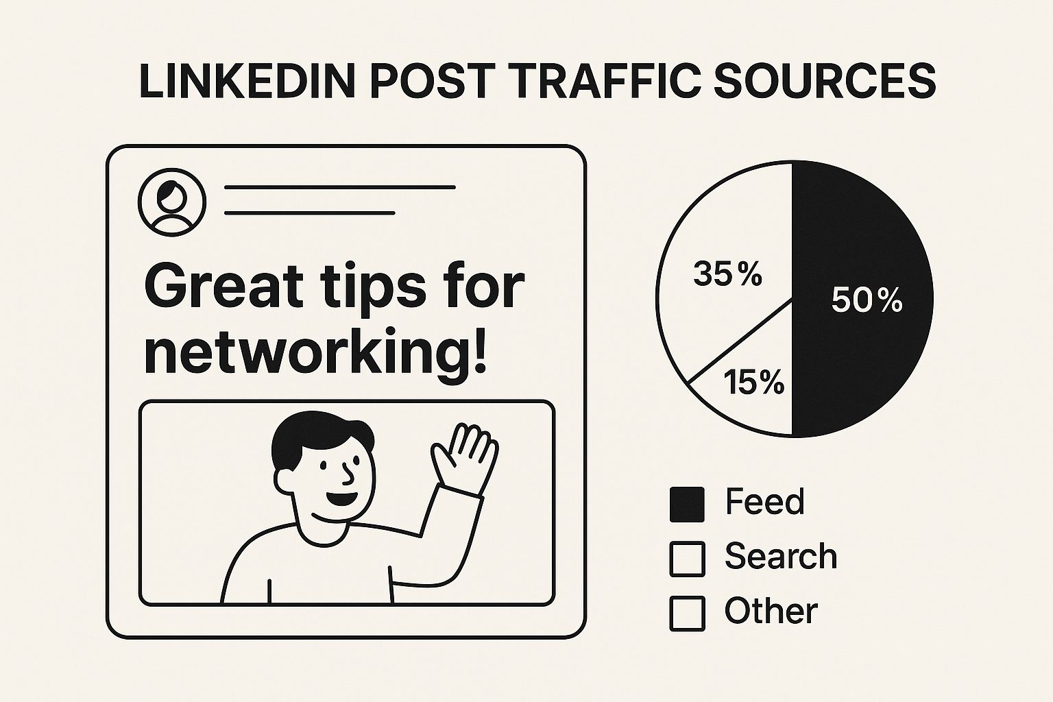
The infographic above shows how a strong headline grabs attention. The clear visual hierarchy and bold text really make key info pop. This pulls the reader in and makes them want to see more. Think of LinkedIn carousels as an extension of this – a way to keep that visual appeal going across multiple slides.
Think of a carousel like a mini-presentation. Each slide builds on the last, creating a narrative thread that keeps your audience hooked. That means your first slide needs to be killer—a compelling cover slide that makes people want to swipe. It's about crafting a visual story, not just slapping together random images. Lumeo's free LinkedIn carousel editor is a great tool for this.
One of my favorite tricks? Leverage the "curiosity gap." Tease some info on one slide and then reveal the answer on the next. This keeps people engaged and encourages them to swipe through the entire carousel to get the full story.
While carousels get a lot of buzz, don't count out other formats. Document posts (think scrollable PDFs) are surprisingly effective. In fact, according to some Socialinsider research from early 2025, document posts were the second most engaging format right after carousels! So, while strong visuals are key, experimenting with different formats can seriously boost your reach.
To help you visualize the different options and their strengths, I've put together a quick comparison table:
LinkedIn Post Format Performance Comparison
Engagement rates and best use cases for different LinkedIn post formats
| Post Format | Average Engagement Rate | Best Use Case | Time Investment |
|---|---|---|---|
| Carousels | High (variable, but generally highest) | Visual storytelling, step-by-step guides, product showcases | Medium-High |
| Document Posts | Medium-High | Sharing reports, data-driven insights, longer-form content | Medium |
| Text Posts with Images | Medium | Sharing quick tips, industry news, thought leadership | Low-Medium |
| Text-Only Posts | Low-Medium | Sharing opinions, asking questions, starting discussions | Low |
| Videos | Medium-High (highly dependent on content quality) | Sharing behind-the-scenes glimpses, expert interviews, product demos | Medium-High |
As you can see, different formats lend themselves to different purposes and require varying levels of effort. Carousels consistently perform well but take more time to create. Document posts are a great way to share in-depth information. And sometimes, a simple text post with a relevant image can be surprisingly effective. The key is to test and see what resonates best with your audience.
Text Formatting That Hooks (Even Speed Readers)
Let's be honest, formatting LinkedIn posts isn't just about aesthetics. It's about grabbing attention in a sea of content. Think about it – when you're scrolling through LinkedIn, do you pore over every single word? Nope, me neither. We skim. That's why white space is so important.
It's like giving your readers a visual breather. Short paragraphs—ideally two to three sentences max—make your content digestible. No one wants to wade through a wall of text, especially on mobile. And let's face it, most of us are on our phones.
Your opening line? That's your hook. It needs to stop someone mid-scroll. A question, a bold statement, or an interesting statistic can work wonders. For example, ditch the "I'm excited to announce..." and try "Did you know that 80% of marketers..." See how much more engaging that is? It sparks curiosity. You might find this helpful: LinkedIn post specs.
Emojis? They're like spices. A dash of personality can be great, but too much can be overwhelming. A well-placed emoji can draw the eye and add a touch of flair, but overuse can make your post look unprofessional. Interested in using carousel ads? Check this out: Carousel Ads on LinkedIn. The goal is simple: Make your LinkedIn posts easy to read and engaging. Turn those casual scrollers into active participants.
Interactive Content That Sparks Real Conversations
Want to turn your LinkedIn feed from a boring monologue into a buzzing conversation? One of my favorite ways to do this is with interactive content, especially polls. I’ve seen how even a simple poll can get people talking and give you valuable insights into what your audience is thinking. It's way more than just collecting likes; it's about building a real community.
Think about it: a quick question can be surprisingly powerful. Instead of generic comments like "Great post!", you spark real discussions and find out what your audience actually cares about. This is especially helpful for things like market research. For example, asking your connections about their biggest industry challenges can give you a treasure trove of information, far more valuable than just vanity metrics.
Polls are a low-effort way to boost your impressions and get people interacting quickly. In fact, recent data shows that polls are great for reach and easy engagement. You can find more interesting insights into LinkedIn post types at that link. While they might not get as many likes or comments as something like a carousel or video, they are incredibly easy to use and have a wide reach. They're perfect for getting a quick read on what your audience is thinking. You might also find this helpful: How to Get More Engagement on LinkedIn.
The trick is to ask questions that get people thinking, not just simple yes/no answers. Create polls that encourage people to share stories and experiences. This turns your content into a place for authentic connection and valuable exchange of information. By focusing on this kind of engagement, you’re not just building an audience; you’re building a community.
Mobile-First Formatting That Actually Works
This screenshot shows a typical LinkedIn feed on mobile. Notice how posts with good formatting, using short paragraphs and emojis, just pop? They’re visually appealing and invite you to click. Conversely, big blocks of text? They’re scroll-bait. Key insight: grab attention fast or get lost in the shuffle.
Think about your own LinkedIn habits. Most of us are scrolling on our phones, catching up during commutes or downtime. If your posts aren't mobile-friendly, you're missing out on readers. Trust me, I learned this the hard way! I used to write these beautifully crafted, long posts on my desktop, then cringe when they looked like a jumbled mess on my phone.
Short Paragraphs and Visual Cues
One simple trick? Short paragraphs. Two to three lines max. This creates white space, making your content more digestible. Use bold text for key takeaways and headings. It acts like a visual roadmap, helping readers quickly grasp the main points.
Images and Cross-Device Testing
Images are key, but ensure they're optimized for mobile dimensions. A distorted or badly cropped image can instantly scream “unprofessional.” Testing your posts on different devices is essential. I always check my posts on my phone and tablet after drafting them to ensure they look good across the board. It's a quick check with big returns.
Thumb-Stopping Power and Clear Calls to Action
Finally, consider "thumb-stopping" power. Is your content easy to engage with on a touchscreen? Are your calls to action clear and tap-friendly? These small details can seriously boost your results.
Content-Specific Formatting Strategies That Convert
Let's be real, crafting LinkedIn posts that actually get noticed takes more than just throwing words on a screen. Different content needs a different approach. Think of it like choosing the right outfit – you wouldn't wear a ball gown to the grocery store (unless you really wanted to make a statement!). The same goes for LinkedIn. A thought leadership piece needs a different vibe than a quick company announcement. Let me share some formatting tricks I’ve learned along the way to help you get the most out of your LinkedIn content.
Formatting for Thought Leadership
When you're sharing your expert insights, building trust is key. Use bold text for key takeaways and important stats. It’s like underlining the important bits in your notes. Also, break down those complex ideas into bite-sized chunks with bullet points and short paragraphs. Nobody wants to wade through a wall of text. Keep it clear, concise, and easy to follow.
Formatting for Company Updates
Company updates can often be a bit… dry. Let’s face it, most people scroll right past them. But here's the secret: visuals! Add images or short videos to spice things up. And don't forget to ask a question at the end. It's a simple way to turn a one-way announcement into a two-way conversation.
Formatting for Maximum Shareability
Want your posts to go viral? (Don't we all?) Make them easy to share! Emojis can add personality and guide readers through your key points. Short, punchy sentences and bold text for main takeaways make your content perfect for sharing on the go. Think "snackable content" – easy to digest and instantly shareable.
Formatting Long-Form Content
Long posts need a little extra love. To avoid overwhelming your readers, break up the text with H3 subheadings. This creates a clear visual structure, kind of like chapters in a book. Use bullet points and white space generously. It gives your readers visual breathing room so they can scan the content and find what's most relevant to them. Trust me, this can seriously boost your read-through rates.
Capitalizing on Trending Topics
When you're jumping into a trending conversation, your formatting should feel timely, not like you're just chasing clout. Use relevant hashtags to join the conversation and increase visibility. Keep your content concise and focused on why this trend matters to your audience. A personal anecdote or a unique perspective can really make your post stand out.
To help you visualize all of this, I’ve put together a quick guide:
| Content Type | Recommended Format | Key Elements | Expected Engagement |
|---|---|---|---|
| Thought Leadership | Clear, concise paragraphs, bold text for key takeaways, bullet points | Credibility, data, insights | Moderate to High |
| Company Updates | Visuals (images, videos), question at the end | Engaging, informative | Moderate |
| Shareable Content | Emojis, short sentences, bold text | Snackable, easy to digest | High |
| Long-Form Content | H3 subheadings, bullet points, white space | Structured, scannable | Moderate to High |
| Trending Topics | Relevant hashtags, concise content, unique perspective | Timely, relevant | High |
This table summarizes the best formatting strategies for different types of LinkedIn content. By tailoring your approach, you can significantly impact your reach and engagement.
By adapting your formatting to each content type, you can drastically increase its effectiveness. Remember, it’s not just what you say, but how you say it.
Your LinkedIn Formatting Transformation Plan
Alright, let's talk strategy. You've got the insights, now how do you actually use them on LinkedIn? Think of formatting your posts like a marathon, not a sprint. For a solid content strategy that works with LinkedIn's best practices, check out this guide: Como Hacer Video Marketing En Linkedin. A good first step is auditing your current LinkedIn presence. What’s hitting the mark? What needs a refresh? This helps you pinpoint your strengths and weaknesses.
Creating a Sustainable Workflow
You don't have to spend hours perfecting each post. Instead, build a simple checklist for the kinds of content you typically share. Let's say you often post thought leadership pieces. Your checklist might look like this:
- Bold key takeaways: Make those golden nuggets shine!
- Short paragraphs: Easier to digest, especially on mobile.
- Relevant image or video: Grab attention right away.
This approach saves you time and keeps your content consistent. You can even create templates to make things even smoother. This way, you maintain your unique voice while making your content more visually appealing.
Tracking Your Progress and Staying Motivated
Remember, Rome wasn't built in a day. Don't feel defeated if you don't see results immediately. Keep track of key metrics like engagement rate and click-through rates. This gives you real data to understand what connects with your audience. Benchmark against similar creators in your field to set realistic goals. And don’t forget to celebrate the small victories! This keeps you motivated when you hit those inevitable plateaus. Plus, it's a great feeling to see how far you've come.
Ready to give your LinkedIn a makeover? Lumeo makes creating eye-catching visual content a breeze. Turn your text posts into engaging carousels that people actually notice. Check out Lumeo today!