Your Guide to a Powerful Color Theory Course
A color theory course is much more than an art class. It's a deep dive into the science and art of using color—the foundational language of all visual communication.
Think of it less like memorizing the rainbow and more like learning to speak a new, powerful language. It’s about understanding how to create work that truly captivates an audience, expertly guides their attention, and makes them feel something specific.
Why a Color Theory Course Is Your Creative Superpower
Have you ever looked at a design and just known it was perfect, even if you couldn't put your finger on why? The secret ingredient is almost always a masterful use of color.
Enrolling in a color theory course is like learning musical scales before you try to compose a symphony. It gives you the fundamental structure you need to stop guessing and start creating with intention. This knowledge turns you from someone who just picks colors into a creator who truly communicates with them.
You’ll stop throwing colors at the wall to see what sticks. Instead, you'll learn a systematic way to build palettes that are not only beautiful but also emotionally resonant. It’s the difference between randomly tossing ingredients in a bowl and following a recipe perfected by a master chef. That structured understanding is what builds the confidence to make deliberate, impactful color decisions on any project you touch.
From Good to Unforgettable
A solid grasp of color is what elevates your work from competent to absolutely compelling. It hands you a massive advantage by giving you direct control over the story your visuals are telling.
The right palette can make a user interface feel intuitive, a brand logo unforgettable, or a piece of art emotionally devastating. Why? Because color has a direct line to our brains, influencing perception and even behavior.
Color is more than just a visual element; it's a powerful psychological tool. Mastering it means you can intentionally craft experiences, guide user actions, and tell richer stories through your work.
The Science of Seeing
The power of color isn't just a creative theory; it's backed by cognitive science. Research into how we learn shows that using color effectively can dramatically boost both engagement and memory.
One study found that color-coding information increased its use by 33% among students. The same study revealed that learners overwhelmingly preferred colorful multimedia, with 72% choosing video and 68% choosing animation.
This shows that a formal education in color doesn't just make things look pretty—it taps directly into how our brains are wired to see and process the world. You can explore the full findings on color in learning to see just how deep the cognitive benefits go.
Navigating the Color Wheel and Creating Harmonies
Think of the color wheel as the fundamental map for any visual creator. A solid color theory course takes this simple diagram from a static classroom poster and turns it into your most dynamic tool for building emotionally resonant and visually striking designs. At its heart, the wheel is just a logical way of organizing colors to show you how they relate to one another.
The whole journey starts with the three primary colors: red, yellow, and blue. These are the parents of every other color on the wheel—you simply can't create them by mixing others. But when you combine any two of them, you get the secondary colors: orange, green, and purple.
Take it just one step further. Mix a primary color with a secondary color right next to it, and you create the six tertiary colors, like yellow-orange or blue-green. Getting this simple hierarchy down is the first real step toward building sophisticated palettes with intention.
This infographic breaks down that basic structure perfectly.
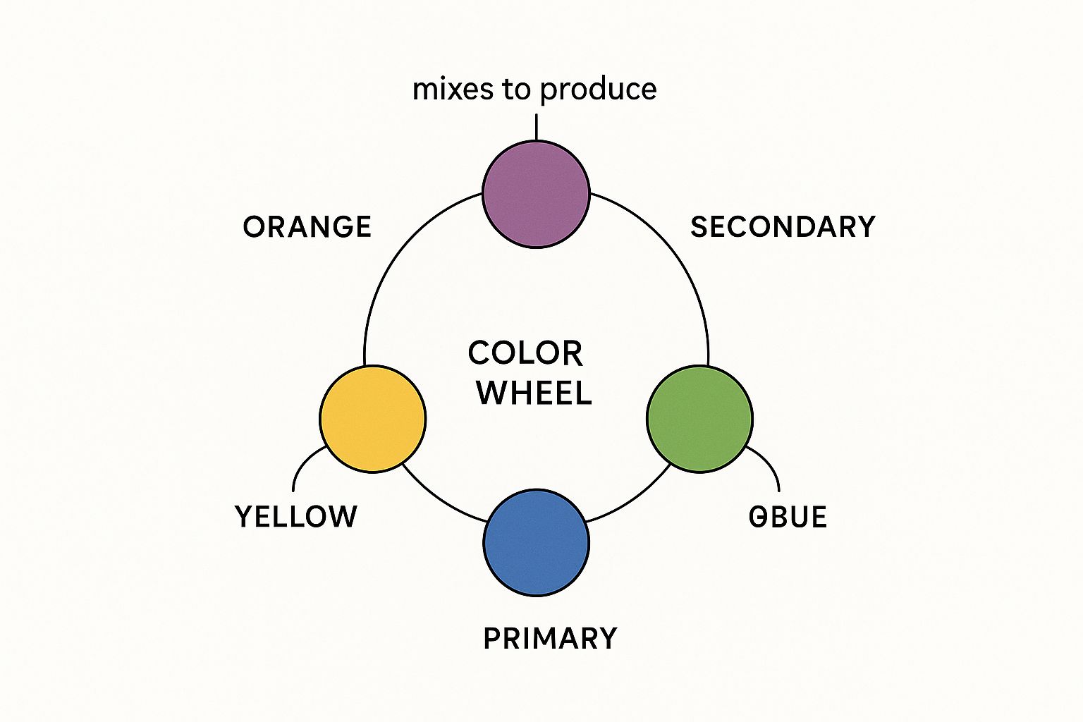
It’s a great visual for seeing how just a few foundational hues build the entire spectrum we use in our work every single day.
Building Powerful Color Harmonies
Once you've got the wheel’s structure down, you can start creating color harmonies—these are tried-and-true color combinations that are naturally pleasing to the human eye. They aren't just random pairings. They're formulas based on the wheel's geometry that consistently produce balance and visual punch. You can think of them as musical chords, but for your eyes.
These harmonies are the secret sauce behind memorable logos, stunning movie scenes, and beautiful interior designs. They give you a reliable framework for your color choices, taking the guesswork out of the equation and making sure your work feels cohesive and professional.
There are several key harmonies every creator should have in their back pocket:
- Complementary: This is a high-impact scheme using two colors directly opposite each other on the wheel, like red and green. It creates maximum contrast and is perfect for making specific elements pop.
- Analogous: This harmony feels much more serene. It uses colors that sit right next to each other on the wheel, like blue, blue-green, and green. You see this all the time in nature, and it creates a very comfortable, cohesive feel.
- Triadic: A triadic scheme pulls three colors that are evenly spaced around the wheel, forming a perfect triangle. This setup gives you strong visual contrast while still feeling balanced and rich.
A deep understanding of these harmonies allows you to move beyond just picking pretty colors. It empowers you to strategically choose palettes that guide attention, create a specific mood, and reinforce your message.
For example, a slightly more advanced but incredibly useful combination is the split-complementary scheme. It delivers high contrast but with a little less tension than a standard complementary pairing. If you want to go deeper, you can learn more about how to use split complementary colors in your own projects. Every harmony has its own personality, and knowing which one to pull out for the job is a true hallmark of a skilled designer.
Mastering the Three Dimensions of Color
To really unlock the power of color, you have to stop seeing it as a single choice. Instead, think of every color as having its own mixing board with three essential sliders: Hue, Saturation, and Value (often called HSV).
Any good color theory course will teach you that learning to adjust these "sliders" is what gives you total creative control. It's the key to moving beyond just picking colors and starting to build them with intention. Once you get a feel for these three dimensions, you can craft palettes with nuance, depth, and a professional finish that tells the viewer's eye exactly where to go.

Defining the Three Core Properties
Each dimension of color has a unique job in your visual toolkit. Understanding them one by one is the first step to making them work together beautifully.
Hue: This is what we typically think of as "color"—the pure thing itself. Red, green, blue, yellow... these are all distinct hues. Think of the hue slider as the one that cycles you through the entire rainbow.
Saturation: This slider controls the color's intensity. Push the saturation up, and the color becomes incredibly vibrant and punchy. Pull it down, and you mute it, making it appear more gray, subtle, and subdued.
Value: This determines how light or dark a color is. Adjusting the value takes a hue from a light tint (by adding white) to a deep shade (by adding black), which is your secret weapon for creating contrast and depth.
Mastering these three is fundamental for artistic control. This knowledge is what powers advanced techniques like photo color grading, where you set the entire mood and style of an image. If you're a photographer or videographer, a solid guide to photo color grading will show you exactly how these principles play out in the real world.
Putting It All Together
Let's say you've chosen a blue hue for a design. A fully saturated, light-value blue might feel energetic and optimistic—perfect for a tech startup's branding.
But by lowering the saturation and darkening the value, that same exact blue hue transforms. It becomes a deep, serious navy, far better suited for a financial institution or a luxury brand.
It's not just the hue that tells the story; it's the precise combination of Hue, Saturation, and Value that creates the final emotional impact.
This level of control is what separates amateur design from professional, polished work. When you can thoughtfully adjust each of these three sliders, you can build sophisticated color schemes that establish a clear mood, create a visual hierarchy, and add that layer of polish that makes your work truly stand out.
Applying Color Psychology to Influence and Persuade
Color does so much more than just make things look nice—it actively speaks to us and steers our decisions every single day. Any good color theory course will quickly move past simple color matching and dive deep into color psychology, which is all about how different hues affect human emotions and behavior.
This isn't about those tired, oversimplified rules like "red means anger." It's about learning the subtle, nuanced language of color. Once you understand this language, you stop using color as just a decorative afterthought and start wielding it as a powerful strategic tool to shape perception and hit your goals.
You can see it everywhere. An interior designer uses warm, inviting tones to make a house feel like a home. A marketer picks a vibrant, energetic palette to drive sales. Color is always there, quietly persuading. The right choices can make a website feel effortless to use or a brand's logo feel instantly trustworthy.
The Emotional Spectrum of Color
Different colors can trigger potent emotional responses, although these feelings can definitely be shaped by our personal experiences and cultural backgrounds. Still, there are some solid psychological principles that give designers a reliable place to start.
Warm Colors (Reds, Oranges, Yellows): These colors are all about energy, passion, and happiness. A splash of yellow can inject a sense of optimism, while red is famous for increasing heart rates and creating urgency—that’s why you see it on so many "Buy Now" buttons.
Cool Colors (Blues, Greens, Purples): Think calm, stability, and trust. Blue is a corporate favorite for a reason; it projects competence and security. Green, on the other hand, connects us to nature, health, and a feeling of peace.
Getting a handle on these associations is crucial if you want your designs to send the right message. For anyone building a brand, this knowledge ties directly into your visual brand strategy, ensuring your colors effectively communicate your core values.
Color in Action Across Industries
The real magic happens when you see color psychology applied in the real world. UX designers, for example, use color to build a visual hierarchy that guides your eye exactly where it needs to go on a screen—often without you even noticing. That bright, high-contrast button for a call-to-action isn't there by accident; it's a very deliberate, calculated decision.
In retail, color choices can make or break a sale. Fast-food chains frequently use red and yellow because those colors are thought to stimulate appetite and create a sense of speed. Luxury brands do the opposite, leaning on black, gold, or deep purples to signal sophistication and exclusivity.
By mastering color psychology, you gain the ability to shape the user experience, reinforce brand identity, and influence behavior. It's the unseen force that can make a design feel intuitive, trustworthy, or urgent.
To truly tap into this, a solid color theory course will teach you how to master color theory in marketing to boost sales and make your communication more persuasive. This knowledge elevates your creative process from subjective guesswork to a repeatable, strategic discipline that delivers real, measurable results.
How to Choose the Right Color Theory Course
Finding the perfect color theory course can feel like a huge task. With so many options out there, where do you even start? The trick is to break it down. The right program for you will be a perfect match for your budget, your career goals, and the way you learn best.
First up, think about the format. You can find everything from self-paced online modules you can knock out in a weekend to in-depth university programs. Institutions like the Royal Academy for Fine Arts in Antwerp and the Emily Carr Institute of Art and Design in Canada build color theory right into their foundational years, which shows you how critical this skill is. There's a whole world of options, which means there's definitely a course that fits your schedule.
Evaluate the Curriculum and Instructor
Okay, format is one thing, but what you actually learn is what really matters. A great course has to go beyond the basics of the color wheel and get into practical, real-world applications. Look for programs that are heavy on project-based learning.
Does the syllabus cover topics like these?
- Color Psychology: How to use color to trigger specific emotions and actions.
- Digital Color Systems: Getting a handle on RGB, CMYK, and other models you'll use daily.
- Practical Application: Actually building palettes for branding, UI design, or digital art.
The instructor’s background is just as important. Are they a working professional in your field—a graphic designer, a digital artist, or a UX specialist? Someone with recent, relevant industry experience can offer insights that a purely academic teacher might miss. They're the ones who can bridge the gap between abstract theory and what you'll actually do on the job.
A strong curriculum isn't just about what you learn; it's about what you do. Prioritize courses that make you build a portfolio. That’s the tangible proof of your new skills.
Aligning the Course with Your Goals
Finally, take a step back and ask yourself: what’s the end goal here? Are you a marketer trying to create campaigns that convert? A graphic designer who wants to build stronger brand identities? What you want to achieve will point you toward the right type of course.
A program for a fine artist will look very different from one designed for a UI/UX designer. For example, if your focus is on creating cohesive branding, you need skills that translate directly into practical documents. To see how these principles come together, take a look at our guide for creating a brand style guide template.
By carefully looking at the format, curriculum, instructor, and your own goals, you can confidently pick a color theory course that gives you a real return on your investment—arming you with skills that will truly elevate your work.
Turning Your Color Skills into Career Growth
Think of mastering color theory as less of an academic chore and more of a direct, powerful investment in your professional future. When you complete a formal color theory course, you’re not just learning abstract concepts; you're gaining a specialized skill set that immediately makes you more valuable in any creative field.
For graphic designers, this is the secret sauce for creating unforgettable brand identities that truly connect with people. For digital artists, it’s the difference between an illustration that’s technically good and one that’s emotionally powerful. And in the world of UX/UI, it’s how you build interfaces that feel intuitive, accessible, and just plain enjoyable to use.
From Portfolio to Profession
A certificate in color theory does more than just look good on a resume—it’s a clear signal to employers that you have a deep, strategic grasp of visual communication. It shows that your work is built on more than just subjective taste; it’s grounded in informed, professional design principles. That sophistication shines through in your portfolio.
This kind of specialized knowledge often unlocks doors to more senior roles. Once you have the principles down, the next step is learning how to apply them day-to-day. A great place to start is integrating your color skills into the graphic design process and making it a core part of your workflow.
A formal education in color theory doesn't just teach you the rules. It teaches you how to think critically about visual problems, making you a more versatile and valuable creative professional.
This isn't just theory, either. This kind of training creates real career momentum. Take the College for Creative Studies in Detroit, for example. They offer the world's only graduate-level Color and Materials Design program and reported a 100% placement rate for their 2023 graduates within 1.5 years. You can learn more about their impressive graduate outcomes and see the undeniable link between specialized color education and career success.
Still Have Questions About Learning Color Theory?
Got a few last-minute questions before you jump into a course? Totally normal. Let's tackle some of the most common concerns I hear, so you can move forward with confidence.
Do I Need to Be an Artist to Take a Color Theory Course?
Absolutely not. That’s a common myth. While artists certainly live and breathe this stuff, a solid color theory course is a game-changer for anyone who works with visuals. I'm talking to marketers, web developers, brand managers, and social media creators.
The principles are universal. They're about communication, not just painting.
Are Paid Courses Really Better Than Free Tutorials?
Look, free tutorials on YouTube are great for learning a specific skill, like how to create a certain effect in Photoshop. But a paid course is a different beast entirely. It offers a structured curriculum that builds from one concept to the next, often with expert feedback and a certificate to show for it.
It's a guided path to mastering the fundamentals, not just cherry-picking a few tricks.
A formal course makes sure you understand not just what works, but why it works. It's the difference between following a recipe and actually knowing how to cook. This deeper understanding connects the dots between abstract concepts and real-world results.
How Long Does It Actually Take to Learn This?
You can get a handle on the basics in just a few weeks of dedicated learning. But true mastery? That’s a lifelong journey. It comes from constantly practicing and applying these principles to every single project you touch.
The more you use it, the more it becomes second nature.
Ready to turn your ideas into visual stories that people can't ignore? With Lumeo, you can whip up stunning carousels for social media that grab attention and get results. Start creating for free and see for yourself.