8 Best Fonts for Flyers to Use in 2025 (Free & Paid)
In a world saturated with visual content, a flyer has mere seconds to capture attention. While compelling images and a sharp layout are crucial, the typography you choose is the unsung hero that sets the tone, communicates the message, and ultimately drives action. The right font can evoke elegance, urgency, or professionalism, while the wrong one can render your message unreadable, instantly undermining its credibility. This selection process is a critical design decision that directly influences perception and engagement.
Choosing the best fonts for flyers is about more than just aesthetics; it's about strategic communication. A well-chosen typeface ensures your headline is punchy and legible from a distance, while your body text remains clear and easy to read. To ensure your font choices consistently support your brand's image across all materials, it's beneficial to establish a well-defined brand style guide. This practice creates a cohesive and professional identity.
This guide cuts through the noise to showcase a curated selection of fonts and platforms perfect for creating impactful flyers. We will explore versatile options from trusted sources like Google Fonts and Adobe Fonts, helping you find the ideal typeface to make your message resonate. Forget endless scrolling; this list provides actionable insights to ensure your next flyer doesn't just get seen, it gets results.
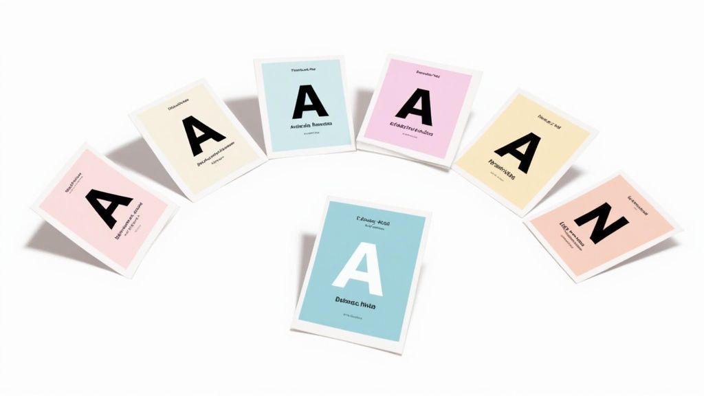
1. Google Fonts: The Gold Standard for Free, High-Quality Typography
For designers, marketers, and small business owners, Google Fonts is an indispensable resource. It’s an extensive library of over 1,400 open-source font families, making high-quality typography accessible to everyone at no cost. This makes it an ideal starting point for finding the best fonts for flyers, whether you need something bold and attention-grabbing or elegant and refined.
The platform's strength lies in its versatility and ease of use. You can easily browse, preview, and download fonts for local use in design software like Adobe Illustrator or Canva, ensuring your print-ready flyer looks exactly as intended. Its open-source license also means you can use these fonts for commercial projects without worrying about complex licensing fees. While Google Fonts is a powerhouse, designers often explore additional unmissable sources for free designer fonts to diversify their toolkit and discover unique typefaces.
Why Google Fonts Excels for Flyer Design
Google Fonts provides an incredible range of styles suitable for any project. For a modern corporate event, a clean sans-serif like Montserrat or Roboto offers excellent readability and a professional feel. For a more sophisticated occasion, like a gallery opening or a wedding invitation flyer, a classic serif like Playfair Display adds a touch of elegance. For high-impact promotions that need to grab attention from a distance, a condensed, bold font like Oswald is a superb choice.
This infographic summarizes the core benefits that make Google Fonts a top-tier choice for any design project.
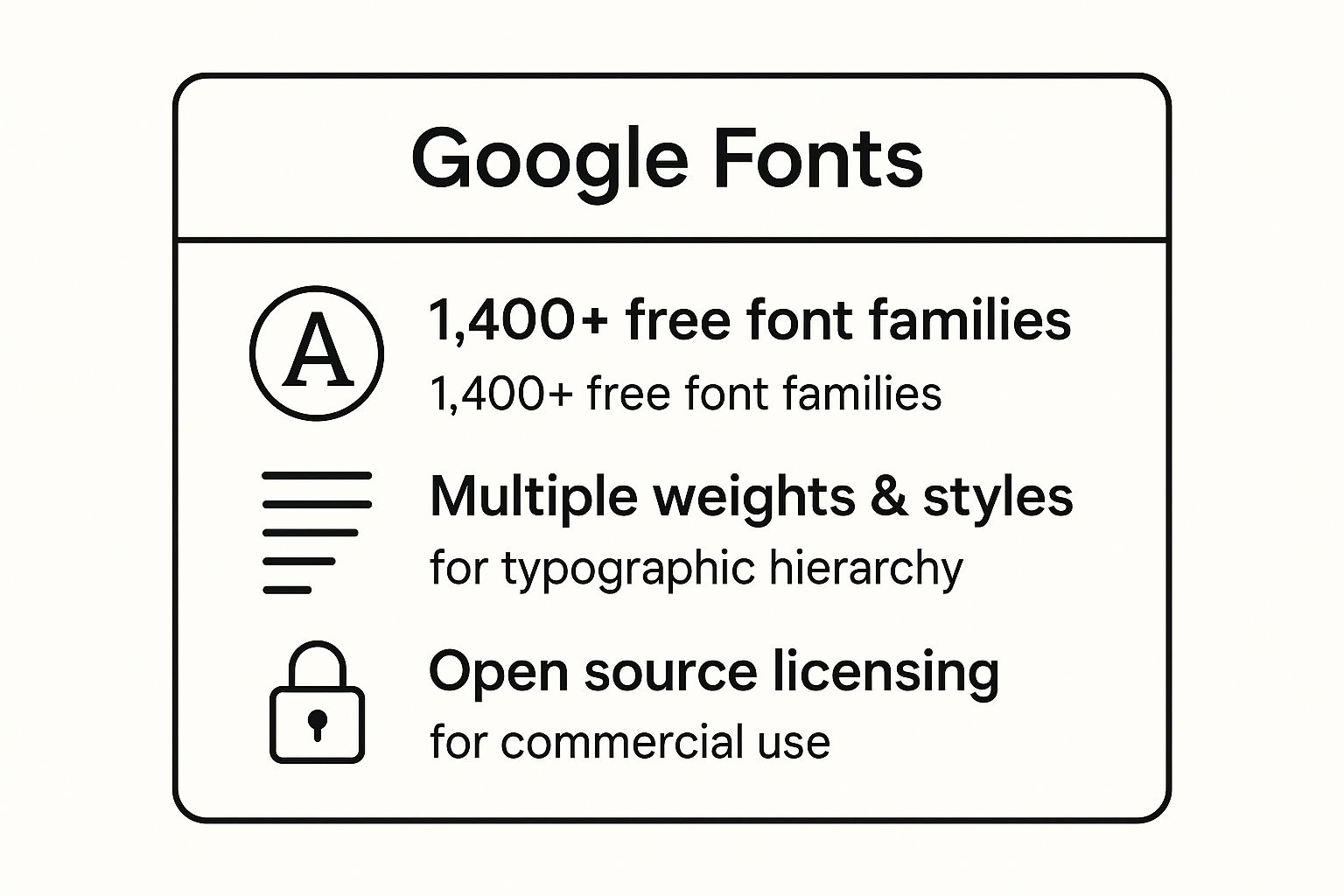
As the visualization highlights, having access to numerous font families with multiple weights and styles under a commercial-use license empowers you to create sophisticated designs without any budget constraints. The ability to effectively pair these typefaces is a crucial skill; for more guidance, you can learn about the principles of adding compelling text to your visuals.
2. Adobe Fonts (formerly Typekit): Premium Typography for Professional Polish
For designers and marketers seeking premium, high-quality typefaces, Adobe Fonts is the industry standard. Included with an Adobe Creative Cloud subscription, this service provides access to over 20,000 fonts from world-renowned foundries without any extra licensing fees for commercial use. Its seamless integration with apps like Photoshop, Illustrator, and InDesign makes it one of the best sources for professional-grade fonts for flyers.
The true advantage of Adobe Fonts is its curated collection of premium typefaces that can elevate a flyer from good to great. You simply activate the fonts you want, and they become instantly available across your Adobe applications. This streamlined workflow saves time and ensures brand consistency, a critical element discussed in depth when creating a comprehensive brand style guide. The quality and variety on offer are unparalleled for professional design projects.
Why Adobe Fonts Excels for Flyer Design
Adobe Fonts provides access to iconic typefaces that are both beautiful and highly functional. For a versatile business flyer, a powerhouse like Proxima Nova offers clarity and a modern feel. A trendy event promotion could benefit from the friendly yet geometric structure of Brandon Grotesque. For flyers with more text, a classic serif like Minion Pro ensures excellent readability, while Futura remains a timeless choice for both retro and modern aesthetics.
This video demonstrates how to get started with Adobe Fonts and activate new typefaces for your projects.
As shown, the platform’s direct integration and vast library empower creators to make sophisticated design choices. To maximize its potential, activate only the fonts you need to maintain software performance, and use Adobe’s powerful font pairing suggestions to create harmonious typographic layouts.
3. DaFont: A Treasure Trove for Unique and Themed Typography
For designers seeking distinctive and highly stylized fonts, DaFont is an legendary archive and a go-to resource. It hosts a massive, user-submitted library of over 60,000 fonts, making it an excellent place to find unique typefaces for themed flyers. While the quality can be mixed, its vast collection of decorative, script, and novelty fonts is unmatched for projects that require a specific, eye-catching aesthetic.
DaFont's main appeal is its extensive categorization, which allows you to quickly find fonts for specific occasions. The platform is free to browse and download from, but it's crucial to check the licensing for each font. Many are free for personal use only, while others may require a small donation for commercial projects. This makes it ideal for one-off creative projects where a unique look is more important than a cohesive font family.
Why DaFont Excels for Flyer Design
DaFont shines when you need a font with personality to capture a specific theme instantly. For a Halloween party flyer, you can find dozens of spooky or horror-themed fonts. For a wedding invitation, its script category offers elegant, handwritten styles. Similarly, you can find graffiti fonts for an urban music event or festive typefaces for a holiday sale.
The key to using DaFont effectively is to use its display fonts sparingly for headlines and pair them with a clean, professional font for body text to ensure readability. This approach guarantees your flyer is both attention-grabbing and easy to read. While flyers and presentations have different goals, many of the same design principles apply; you can review some effective presentation design tips to improve your overall visual hierarchy.
A few tips for navigating DaFont successfully:
- Always check the license before using a font for commercial purposes.
- Test the font thoroughly to ensure it includes all the characters and symbols you need.
- Read user comments for insights into the font's quality and completeness.
- Pair novelty fonts with a simple, readable body font like Lato or Open Sans.
4. Monotype Fonts: The Premium Choice for Professional Typography
When a project demands the highest level of typographic quality and brand consistency, Monotype Fonts stands out as a premier resource. As one of the world's most renowned type foundries, Monotype offers an extensive library of premium, professionally engineered fonts, including timeless classics and innovative modern designs. This collection is the go-to for corporations and design agencies seeking to establish a polished, authoritative visual identity.
Monotype's platform operates on a subscription or individual license basis, providing access to a vast and meticulously crafted library. This investment ensures that your flyer designs benefit from fonts that are optimized for both print and digital applications, guaranteeing flawless legibility and aesthetic appeal. For businesses aiming to build a strong, recognizable brand, using these premium typefaces is a strategic choice.
Why Monotype Excels for Flyer Design
Monotype provides the foundational typefaces that have shaped modern design, making them some of the best fonts for flyers in a corporate or high-end context. For a clean, universally trusted look on a corporate event flyer, Helvetica is an unparalleled choice. For more traditional and formal announcements, such as legal or academic events, the classic readability of Times New Roman lends an air of authority and seriousness.
For contemporary business materials that need to feel approachable yet professional, the geometric elegance of Avenir is a perfect fit. Furthermore, a font like Frutiger is specifically designed for exceptional clarity at a distance, making it ideal for informational flyers or wayfinding materials. Choosing a font from Monotype ensures your design is built on a foundation of typographic excellence, immediately signaling quality and professionalism to your audience.
5. Font Squirrel: A Curated Hub for Commercially-Safe Fonts
For designers and businesses who need high-quality free fonts without navigating complex licensing agreements, Font Squirrel is a go-to destination. Founded by Ethan Dunham, this platform distinguishes itself by offering a meticulously curated collection of typefaces that are 100% free for commercial use. This laser focus on commercial viability makes it an incredibly reliable resource for creating professional flyers, ensuring your designs are both beautiful and legally sound.
Unlike massive, unvetted font repositories, every typeface on Font Squirrel is hand-picked for its quality and licensing clarity. This saves you the critical step of verifying usage rights, which is invaluable for professional designers, small businesses, and startups on a budget. The platform offers a robust selection that rivals premium foundries, making it a powerful tool for anyone seeking the best fonts for flyers without the price tag.
Why Font Squirrel Excels for Flyer Design
Font Squirrel provides a versatile toolkit perfect for a wide range of flyer applications. For corporate communications or informational flyers, a workhorse sans-serif like Open Sans or Lato delivers exceptional clarity and a modern, friendly feel. For a more sophisticated or artistic event announcement, the elegant geometric forms of Raleway can create a stunning visual hierarchy. For projects requiring a clean, professional aesthetic, Source Sans Pro is a superb choice that ensures readability.
The platform also provides practical tools to enhance your design workflow. The "Font Identifier" can help you find a free alternative to a premium font you’ve seen elsewhere, while the Webfont Generator is perfect for creating digital versions of your flyers. By offering entire font families, Font Squirrel empowers you to maintain typographic consistency across headings, subheadings, and body text, resulting in a polished and professional final product.
6. MyFonts: The Ultimate Marketplace for Premium and Unique Fonts
When a project demands a specific, high-quality typeface that free resources can't provide, MyFonts stands out as the ultimate destination. As the world's largest digital font marketplace, it hosts an incredible library of over 130,000 fonts from both established foundries and independent designers. This vast collection offers unparalleled choice, making it a go-to for professionals seeking the best fonts for flyers that require a unique or premium feel.
MyFonts, owned by Monotype, provides powerful tools to streamline the font selection process. Its advanced search filters, in-browser text previews, and the popular "WhatTheFont" tool for identifying fonts from images make finding the perfect typeface efficient. While it primarily features paid fonts, the platform frequently offers sales, bundles, and affordable options, making premium typography accessible for various budgets.
Why MyFonts Excels for Flyer Design
MyFonts is the ideal choice when you need a font with a distinct personality to make your flyer truly memorable. Its extensive catalog includes typefaces suitable for every conceivable style. For a bold, modern corporate flyer, a geometric sans-serif like Gotham provides a clean, authoritative look. For a friendly, contemporary feel, a versatile font like Museo works beautifully in both headlines and body copy.
If you need to create a high-impact, attention-grabbing header, a condensed classic like League Gothic delivers powerful visual punch. For flyers that require extensive text, a highly readable and approachable serif such as Adelle ensures clarity without sacrificing character. Investing in a font family from MyFonts gives you a complete toolkit of weights and styles, ensuring design consistency and professional results across all your promotional materials.
7. FontSpace: A Diverse Hub for Independent Font Creators
For designers seeking a vast and eclectic collection of typefaces, FontSpace is a go-to destination. It hosts over 75,000 fonts, many of which are contributed by talented independent designers and small type foundries. This platform offers a treasure trove of unique and creative options, making it a powerful resource for finding the best fonts for flyers that need a distinct personality.
FontSpace stands out due to its user-friendly interface and, most importantly, its clear licensing information. Each font is explicitly labeled, allowing you to quickly filter for options that are free for commercial use. This transparency removes the guesswork and legal risks often associated with downloading free fonts, empowering you to create stunning flyers for professional projects with confidence.
Why FontSpace Excels for Flyer Design
The sheer diversity on FontSpace means you can find a font for nearly any flyer imaginable. For a flyer promoting a local indie music festival, a quirky display font can capture the event's artistic vibe. For a personal announcement like a baby shower or birthday party, an elegant script font adds a warm, celebratory touch. For a community outreach flyer that needs to be clear and informative, a clean sans-serif ensures maximum readability.
The platform is especially valuable when you want to move beyond mainstream choices and discover a typeface that makes your design truly original. Many designers build personal font libraries by curating their favorite finds from FontSpace, creating a unique toolkit for future projects. To get started, you can explore their extensive collection at FontSpace.
Pro Tip: Always check the full character set before downloading a font. Ensure it includes all necessary symbols, numbers, and punctuation for your flyer's content to avoid any last-minute design issues.
8. Fontspring: Worry-Free Licensing for Professional Designs
For projects where licensing clarity is paramount, Fontspring stands out as a premium font marketplace. It is renowned for its straightforward, "worry-free" licensing model, which simplifies the often complex process of securing fonts for commercial use. This makes it an invaluable resource for professional designers, corporate marketing departments, and businesses that need to ensure full legal compliance for their promotional materials.
Fontspring features a curated collection of high-quality typefaces from respected independent foundries and type designers. Unlike massive free libraries, its strength lies in quality over quantity, offering robust font families that are meticulously crafted for professional applications. The platform’s clear licensing terms cover most common uses, including print flyers, logos, and web, removing the guesswork and potential legal risks associated with ambiguous font licenses.
Why Fontspring Excels for Flyer Design
Fontspring is the ideal choice when a flyer project demands a unique, premium typeface that reflects a brand’s professionalism and quality. For modern corporate or industrial-themed flyers, a versatile workhorse like FF DIN provides exceptional clarity and a clean, technical aesthetic. For a more universal and friendly feel suitable for business communications, Proxima Nova is a go-to choice, bridging the gap between classic and contemporary styles.
When readability and elegance are key, such as in a flyer for a high-end service or event, a slab serif like Chaparral Pro delivers warmth and sophistication without sacrificing legibility. Meanwhile, Benton Sans offers a powerful and comprehensive sans-serif family perfect for contemporary corporate materials that require a polished look. Using Fontspring gives you access to some of the best fonts for flyers while guaranteeing your project is built on a solid, legally sound foundation.
Top 8 Font Sources Comparison
| Item | Implementation Complexity 🔄 | Resource Requirements ⚡ | Expected Outcomes 📊 | Ideal Use Cases 💡 | Key Advantages ⭐ |
|---|---|---|---|---|---|
| Google Fonts | Low - Easy web integration via CSS | Minimal - Free, internet access needed | High-quality typography for web & print | Digital & print flyers, startups | ⭐ Free, ⭐ Open source, ⭐ Wide variety |
| Adobe Fonts | Medium - Subscription and Adobe CC integration | High - Requires Adobe CC subscription | Professional-grade, premium fonts | Professional & creative design workflows | ⭐ Premium fonts, ⭐ Seamless Adobe sync |
| DaFont | Low - Direct downloads, no integration | Minimal - Free downloads, manual license checks | Variable quality, unique themed fonts | Themed, decorative flyers | ⭐ Vast, unique font selection |
| Monotype Fonts | High - Licensing and font management | High - Paid fonts, complex licensing | Industry-standard quality and consistency | Corporate branding, high-end promo | ⭐ Extensive library, ⭐ Professional use |
| Font Squirrel | Low - Curated free commercial fonts | Minimal - Free, verified commercial licenses | Reliable, professional-looking fonts | Business flyers needing commercial safety | ⭐ Commercial licenses, ⭐ Quality control |
| MyFonts | Medium - Marketplace with purchase options | Variable - Paid fonts, variable pricing | Large choice, professional versatility | All types of flyer design projects | ⭐ Largest selection, ⭐ Great discovery |
| FontSpace | Low - Free fonts with browsing tools | Minimal - Free, vary by license | Mixed quality, mix of professional & creative | Diverse flyer projects with licensing care | ⭐ Large free collection, ⭐ Clear licensing |
| Fontspring | Medium - Premium purchase with licensing clarity | Medium - Paid fonts, premium pricing | High-quality, worry-free licensed fonts | Professional design needing licensing clarity | ⭐ Clear licensing, ⭐ Professional support |
Transforming Your Flyers from Good to Unforgettable
Your journey through the world of typography has equipped you with a powerful arsenal of resources and insights. We've explored expansive libraries like Google Fonts and Font Squirrel, which offer incredible variety at no cost, and premium platforms such as Adobe Fonts and Monotype, which provide professionally curated typefaces for high-impact projects. The key takeaway is that the best fonts for flyers are not just aesthetically pleasing; they are strategic communication tools. The right choice can capture attention from a distance, convey the tone of your event in a single glance, and guide the reader’s eye effortlessly through your message.
Remember, font selection is an exercise in empathy. It’s about understanding your audience and the context in which they will see your flyer. A bold, condensed sans-serif like Oswald might be perfect for a high-energy music festival flyer, but it would feel out of place on an invitation to an elegant charity gala, where a sophisticated serif like Playfair Display would be more appropriate. Mastering this alignment between font, message, and audience is what separates a forgettable flyer from one that inspires action.
Key Principles to Carry Forward
As you move from inspiration to implementation, keep these core principles at the forefront of your design process. They are the foundation of effective typographic design and will help you make confident decisions.
- Prioritize Readability Above All: An ornate, beautiful font is useless if your audience cannot read the date, time, or location. Test your chosen fonts for clarity, especially for crucial details that will be printed in smaller sizes.
- Establish a Clear Visual Hierarchy: Use a strategic combination of font weights (bold, regular, light), sizes, and styles to create a clear path for the reader. The headline should grab attention, subheadings should organize information, and body text should be effortlessly legible.
- Embrace Strategic Pairing: Limit your flyer to two or three complementary fonts to avoid a chaotic or unprofessional look. A classic and effective strategy is to pair a striking sans-serif for headlines with a clean, readable serif for the body copy, or vice versa. This contrast creates visual interest while maintaining harmony.
- Reflect Your Brand's Voice: Your font choice is an extension of your brand identity. Whether your brand is modern and minimalist, playful and creative, or traditional and trustworthy, your flyer's typography should consistently echo that personality.
Ultimately, the power to create a truly effective flyer lies in your ability to blend artistic expression with strategic thinking. By leveraging the font resources discussed and adhering to these fundamental design principles, you can craft materials that not only look professional but also achieve their marketing objectives. You are now prepared to choose the best fonts for flyers that will captivate your audience and drive results.
Ready to put these principles into practice without the steep learning curve of complex design software? Lumeo offers a powerful yet intuitive video and design editor that simplifies the creation process. With access to a vast library of stunning fonts and professionally designed templates, you can create eye-catching flyers and promotional videos in minutes. Transform your ideas into unforgettable visuals by visiting Lumeo and start designing today.