Adding Text to Images: Tips for Eye-Catching Visuals

Why Text-Enhanced Images Rule Modern Visual Content
Let's be real: in the bustling online world, a plain image often isn't enough to grab attention. I've chatted with tons of social media managers and digital marketers, and they all agree: adding text to images is crucial. It's what separates brands that truly connect with their audience from those that just blend into the background noise. Why? It's all about how our brains work. We're naturally drawn to contrast and patterns, and strategically placed text on an image creates just that, interrupting that endless scroll.
Think about an ad you saw recently that really stuck with you. I bet it wasn't just a pretty picture. It probably had text that instantly conveyed the brand's message, making you curious and wanting to know more. Smart brands get this. They use text overlays not to just decorate images, but to tell concise stories, quickly explain complex ideas, and build emotional connections that lead to action.
This isn't just a passing fad; it's a fundamental change in how we consume visuals. The visual content market, especially the part about adding text to images, is exploding. It was worth $5.2 billion last year and is expected to hit $19.17 billion by 2032. That shows the real power of visually rich content. (Discover more insights) Mastering the art of adding text to images isn't just a bonus skill anymore; it's essential for anyone who wants to thrive in today's visual-first world. By using these techniques, you're not just keeping up; you're getting ahead of the competition, leaving them stuck in the static image days.
Adding text also makes images more accessible. Alt text, while important for SEO, can't always capture the nuances and feelings that well-placed text can. Think about the difference between alt text that says "woman smiling" and an image with the text "Pure Joy" overlaid. The text adds an emotional layer that resonates much more deeply with viewers. This is why more and more brands are using text to improve accessibility and create more inclusive visual experiences.
Finding Your Perfect Adding Text to Images Toolkit
I've tried so many tools for adding text to images, and let me tell you, seeing designers struggle with the wrong ones is painful! Your toolkit is absolutely key. Let’s ditch the generic comparisons and dive into the real-world pros and cons of popular options like Canva and Photoshop, plus some AI-powered alternatives that are seriously shaking things up. I'm talking practical advice for tight deadlines, tricky typography, and high-volume content creation.
This infographic, for example, shows how readability scores vary across different font types:
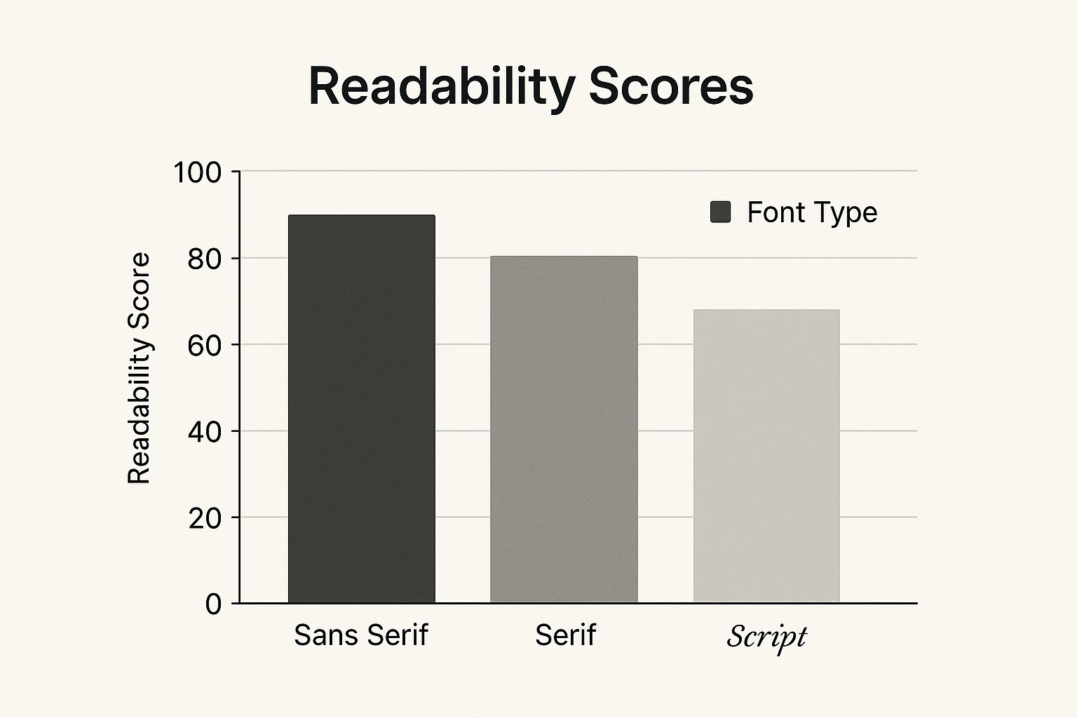
Sans Serif fonts come out on top at 90% readability—super important for clear communication. Even something as simple as a logo can leverage the power of text; check out this resource on creating a logo using text to see what I mean.
I want to help you find platforms that are actually worth the investment, handle various file types without a hitch, and give you the fine-tuned typography controls that separate the pros from the amateurs. We’ll also uncover some hidden gems that experienced designers swear by—tools that can completely transform your workflow.
Choosing the Right Tool for the Job
Knowing which tool excels in different situations—like whipping up a quick social media post versus crafting a detailed infographic—is a huge time-saver. It's like having the right wrench for the job; it just makes everything easier.
Here's a quick comparison table based on my own experiences:
Text-to-Image Tools: Real Performance Breakdown Honest comparison of tools based on actual user experiences, covering strengths, limitations, and ideal use cases
| Tool | Best For | Pricing | Key Strengths | Learning Curve |
|---|---|---|---|---|
| Canva | Quick social media graphics, presentations | Free & Paid plans | User-friendly, tons of templates, collaborative | Easy |
| Photoshop | Complex designs, photo editing | Paid | Powerful features, precise control, industry standard | Steep |
| Lumeo | AI-powered video editing | Paid | Automates tedious tasks, generates content quickly | Medium |
This table gives you a starting point for choosing the right tool based on your needs and skill level. Canva is great for beginners, while Photoshop offers maximum control for experts. Lumeo is a good middle ground if you're working with video and want to leverage AI.
Choosing wisely lets you focus on being creative instead of wrestling with your software. The right toolkit not only simplifies adding text to images, it elevates your entire visual content strategy.
Typography Mastery: Making Your Text Impossible to Ignore
So many people just slap some text onto an image and call it a day. Then they wonder why their content falls flat. But take a look at what actually goes viral – look at the designers who consistently get engagement – and you’ll notice something. They understand that adding text to images isn’t an afterthought; it's about visual communication. It's about picking fonts that resonate, creating contrast, and using visual hierarchy to guide the viewer's eye.
Think about it: a calming nature photo paired with a delicate script font in a muted earth tone reinforces that serene feeling. But that same photo with bold, bright red text? Completely different vibe. That’s the power of typography. For even more control, check out advanced Template Builder options for fine-tuning your text and image pairings.
Color Psychology and Spacing
Let’s talk color psychology. A vibrant yellow evokes joy, while a calming blue builds trust. Color profoundly impacts how your message is perceived. We also need to think about spacing. Squinting at tiny, crammed text on a phone? No thanks. Smart spacing makes for a better experience, regardless of the device.

Then there's placement. Where you put your text matters a lot. Even a subtle shift can dramatically change the visual impact. These aren't just theories; they’re proven techniques that separate shareable content from the stuff that gets ignored. For a deeper dive into the impact of visuals, Lumeo's guide on visual brand strategy offers valuable insights. These practical tips will help you level up your visuals from amateur to pro.
AI-Powered Text Integration: Your Competitive Edge
Adding text to images used to be a real chore. Remember nudging text boxes pixel by pixel, trying to get the alignment just right? Well, AI is changing all that. We're seeing AI tools pop up that can generate text based on the image, suggest placements, and even create entire text-image combos from a simple prompt. But are these features actually useful, or just marketing hype? I’ve been playing around with these tools, and I’m here to share what actually works.
One area where AI genuinely shines is font pairing. I've lost hours in the past trying to find the perfect font combination. Now, AI can whip up suggestions in seconds—combinations I never would have thought of. Automated text sizing is another game-changer. The text magically adapts to the image, ensuring readability without any manual tweaking. It frees you up to focus on the creative stuff, not the fiddly bits.
AI is also a lifesaver for complex backgrounds. Smart background adjustments help your text stand out, no matter how busy the image is. You know how text can sometimes get lost in a detailed background? AI analyzes the image and dynamically adjusts the text color, size, and even adds subtle shadows or outlines for better visibility. This stuff is constantly evolving, too. The market for AI image enhancers, including these text overlay tools, is expected to hit $2.45 billion by 2025, with a growth rate of 15.9%. (Discover more insights) That tells you something about how much demand there is for these tools. Early adopters are already getting a leg up. So, how can you use these AI-powered features to make your visuals really pop? Let's dive in.
Professional Workflows: From Concept to Conversion
Let's get real. Knowing the theory behind adding text to images is one thing, actually doing it effectively is another. Instead of rigid steps, let’s dive into the thought process behind professional image and text design. Think of this as a peek behind the curtain.
You might be interested in: visual content creation.
Imagine you're launching a new product aimed at young adults. Your visuals need to capture that youthful energy. Think bold sans-serif fonts, vibrant colors, and dynamic text placement that mirrors the product's vibe. It's all about creating a feeling.
Time is precious, right? For social media, Canva templates are a lifesaver. Pre-set fonts, colors, and even logo placement can shave hours off your workflow, especially if you're creating lots of content. From experience, I can tell you, this is a game-changer.
But for more complex projects like infographics, Photoshop's precision is essential. Think about explaining complex data visually. Precise text placement, clear visual hierarchy, and carefully selected fonts make all the difference in how easily people understand your message. Leveraging AI can significantly improve text integration within images. For example, consider using tools discussed in this article on AI for content creation.
Streamlining Your Process
Building a repeatable workflow is the secret to scaling your visual content creation. From choosing the right image and crafting compelling text to final quality checks, every step needs a clear process. This keeps your branding consistent across all your visuals and makes production way more efficient. It’s like an assembly line for your images, where each stage contributes to the final product. This consistency is vital for a strong, recognizable brand identity.
To help illustrate this further, let’s look at some project-specific examples. The table below breaks down different workflows tailored to specific project types, offering realistic timelines and pro tips based on my own experience.
To help visualize different approaches, the following table offers a breakdown of workflows tailored to various project types, providing realistic time estimates and expert advice gleaned from practical experience.
Project-Specific Text Addition Workflows
| Project Type | Time Investment | Recommended Tools | Critical Steps | Failure Points |
|---|---|---|---|---|
| Social Media Graphic | 30-60 minutes | Canva | Choosing a template, customizing text and image, ensuring brand consistency | Using low-resolution images, overcrowding the design, inconsistent branding |
| Infographic | 2-4 hours | Photoshop | Planning the layout, ensuring clear visual hierarchy, selecting appropriate fonts for readability | Poor data visualization, unclear messaging, overwhelming the viewer with too much text |
| Website Banner | 1-2 hours | Photoshop, Canva | Optimizing image size for web, crafting concise and impactful text, ensuring mobile responsiveness | Slow loading times due to large file size, text that is difficult to read on different devices, failing to capture attention |
| Product Mockup | 1-3 hours | Photoshop | Accurately placing text on the product image, choosing realistic fonts and styles, maintaining a professional look | Unrealistic text placement, fonts that don't match the product's aesthetic, making the mockup look amateurish |
As you can see, understanding the project’s needs dictates the tools and time you'll invest. From quick social media graphics to detailed infographics, a tailored approach leads to the best results. Choosing the right tool for the job, combined with a well-defined workflow, will significantly improve your efficiency and the quality of your final product.
Advanced Techniques That Separate Pros From Amateurs
Want to create visuals that truly pop? Here's where we dive into the tricks that take designs from "good" to "wow." Think text warping, where your words flow along the curves of an image, giving it an organic, natural vibe. Or how about adding 3D effects to make your text jump off the screen? This is killer for titles or calls to action. And finally, custom text paths let you ditch boring horizontal lines and craft truly unique layouts.
Integrating Text Seamlessly
Adding text isn't just about plopping it on top of an image. It's about weaving it into the visual narrative. Imagine a picture of a winding road. Instead of a straight line of text, you could warp it to follow the curves, guiding the viewer's eye and creating a sense of motion.
This screenshot from Adobe Photoshop shows the powerful tools you have at your fingertips:
Photoshop, as you can see, gives you amazing control over text placement, warping, and effects. This lets you really blend text and imagery seamlessly. Mastering techniques like masking, for example, can make text appear as part of the scene – maybe peeking through leaves or reflecting in water. And layering text with different opacities and blend modes adds depth and visual richness that many designers miss.
By the way, the text-to-image generation market is booming, projected to hit $20 billion by 2033, with a 35% CAGR from 2025. (Discover more insights) This just shows how important – and sophisticated – adding text to images has become. By mastering these advanced techniques, you’re not just adding text; you’re telling a story.
Your Growth Path: Building Lasting Success
So, you're ready to take your image-text game to the next level. Fantastic! Let’s ditch the generic advice and map out a realistic plan to help you truly shine. This is about building skills that last, not just a few quick wins. You might be interested in creating engaging content.
Building Your Skillset Step by Step
Think about your current design skills. Comfortable with the basics? If not, a quick refresher never hurts. Start with a user-friendly tool like Canva. Master the fundamentals – adding text, experimenting with fonts, and understanding layout. Don't feel pressured to learn everything at once. Focus on one technique, practice until it's second nature, then move on. It's like learning an instrument; you wouldn't attempt a concerto before mastering scales.
Creating Effective Practice Routines
Consistency is key. Even 15 minutes of daily practice makes a difference. Play with different font combinations, color palettes, and text placements. Try adding text to different kinds of images. A bustling cityscape will require a different approach than a tranquil landscape. The more you diversify your practice, the faster you'll develop a good eye for what works.
Developing Your Unique Visual Style
As you become more confident, start cultivating your own style. What makes your work unique? Do you lean towards minimalist designs or bold typography? Experiment! Find what truly resonates with you. A distinctive style makes your work memorable and strengthens your brand. Remember, it's about creating something authentic that also adapts to various client needs. Building a portfolio is vital. Showcase your best text-image work, tailoring it to the clients you want to attract. This builds credibility and demonstrates your expertise.
The power of community can’t be overstated. Join online forums, attend workshops, and connect with other designers using platforms like Photoshop. Sharing insights, receiving feedback, and learning from others will boost your growth. This constant learning separates successful designers. They don't just learn a few tricks; they’re always exploring new tools and trends. Find an accountability partner. Sharing your progress and brainstorming ideas keeps you motivated and on track. This isn't just about acquiring a skill; it’s an ongoing journey.
Ready to turn your content into captivating visuals? Lumeo helps you create amazing carousel presentations that grab attention and get results.