Split Complementary Colors: Boost Your Color Harmony

Discovering The Secret Behind Split Complementary Magic
Imagine strolling through a vibrant garden. Certain flowers just pop against the backdrop of green leaves, right? That visual magic often comes down to a split complementary color relationship. It's a bit more sophisticated than just using complementary colors (those directly opposite each other on the color wheel).
Instead, a split complementary scheme uses a base color and the two colors that flank its complement. This creates a triad of colors that's surprisingly harmonious yet full of contrast.
Understanding the Basics
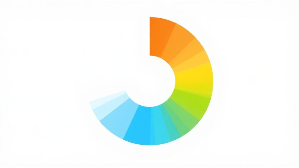
To grasp split complementary colors, let's refresh our color wheel knowledge. A good starting point is to review the fundamentals of color wheel theory. For instance, if blue is your base color, its direct complement is orange. But in a split complementary palette, you'd pair blue with yellow-orange and red-orange. This offers a more nuanced and dynamic feel than just blue and orange.
Why Split Complementary Works
This isn't just some arbitrary design rule. It's rooted in how our eyes perceive color. We're naturally drawn to contrast, but sometimes a direct complement can feel a bit jarring. Split complementary colors offer a gentler contrast. Think of it like adding a third person to a conversation – it adds depth and complexity.
The history of color theory sheds light on these relationships. Sir Isaac Newton's creation of the first color wheel in 1666, by splitting sunlight into its component colors, laid the groundwork. This discovery helped us understand color harmonies, including complementary and split-complementary dynamics. You can delve further into the history of split complementary colors and color theory.
Finding Balance and Harmony
Another benefit of the split complementary approach is its inherent balance. The two flanking colors support the base color without letting it dominate. They provide enough contrast to keep things visually interesting but not overwhelming. This built-in harmony makes it easy to create pleasing palettes without worrying about color clashes. That’s why split complementary schemes are so versatile, working well across different design projects—from branding and web design to engaging social media posts.
Building Split Complementary Palettes That Actually Work
Let's dive into the exciting part: creating stunning color palettes. This is where color theory comes to life. We'll start with the basics: finding your base color and its split complementary partners. Digital tools like Adobe Color and even a traditional color wheel can be incredibly helpful here.
Mastering the Split Complementary Process
Building a split complementary palette is a three-step process: choosing your base color, locating its split complements, and putting them all together. The infographic below provides a clear visual guide to this process.
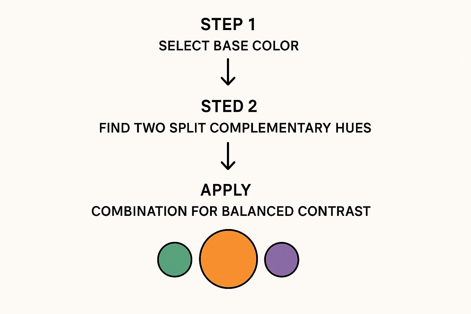
As the infographic shows, a structured approach is key to making your split complementary colors work. Starting with a defined base color sets the tone. Then, accurately finding the split complements on the color wheel ensures a nice balance of contrast. Finally, how you use these colors will determine the overall look and effectiveness of your design.
Fine-Tuning Your Palettes
After you've found your split complementary trio, the real fun begins. This is where skilled designers refine the palette to perfection. Here are two key adjustments to consider:
Saturation: Imagine saturation as the richness of a color. A highly saturated red is bold and almost luminous. A desaturated red looks softer, almost faded. Changing the saturation of your split complementary colors can dramatically shift the mood of your design. For a vibrant and energetic feel, go for higher saturation. For a calmer, more refined look, desaturate your colors.
Brightness: Brightness describes how light or dark a color appears. Playing with brightness helps create contrast and visual hierarchy. You might use a brighter shade of your base color to highlight a key element. Darker shades of your split complements can create a stable background.
Common Mistakes and How to Avoid Them
Even if you understand split complementary colors well, some pitfalls can trip you up. One common mistake is choosing split complements that are too similar to the base color. This leads to a palette that lacks contrast and feels dull.
Another trap is designing a palette that looks amazing on screen but disappointing when printed. This often happens because digital and print colors behave differently. Always test your palettes across different mediums to ensure consistency. By being aware of these potential problems, you can address them early on.
Let's take a look at some practical examples.
Split Complementary Color Combinations Guide
This table provides a quick reference for common base colors and their corresponding split complementary pairs, along with some ideas for how to use them.
| Base Color | Complement | Split Complement 1 | Split Complement 2 | Best Use Cases |
|---|---|---|---|---|
| Blue | Orange | Yellow-Orange | Red-Orange | Branding for tech companies, summery social media posts |
| Green | Red | Red-Violet | Red-Orange | Nature-inspired designs, eco-friendly branding |
| Yellow | Violet | Blue-Violet | Red-Violet | Creative industries, spring-themed visuals |
| Red | Green | Yellow-Green | Blue-Green | Food and beverage branding, festive designs |
| Violet | Yellow | Yellow-Orange | Yellow-Green | Luxury brands, mystical or ethereal themes |
This table shows how diverse split complementary palettes can be. Each combination offers a unique mood and potential application. Experiment with these combinations and see what resonates with your design goals.
How Top Brands Use Split Complementary Colors To Win
This screenshot from 99designs showcases a variety of logo designs. It really highlights how crucial color is to a brand's identity. Notice how contrast makes so many of these logos pop. A lot of these successful designs use split complementary colors to create visual balance that’s both attractive and harmonious.
Think about some instantly recognizable brands. Subway, for example, uses yellow and green (split complements of red-violet) in their logo and overall branding. This color combination brings to mind freshness and health, fitting perfectly with their brand message.
Fanta is another great example. They use orange with blue and violet accents, creating a vibrant and playful image that connects with a younger audience. This shows how split complementary colors can immediately communicate a brand’s personality.
The Psychology of Color in Branding
Split complementary color schemes offer a real advantage: they combine the visual interest of contrast with a sense of balance. This balance is key for brand recognition. Complementary colors can sometimes clash, but the split complementary approach offers a smoother, more appealing contrast.
This subtle difference can make a big impact on how customers perceive a brand. It helps create a sense of sophistication and professionalism, even for brands with a fun, playful image.
From Logos to Campaigns: Maintaining Consistency
Successful brands know consistency is essential. They carry their split complementary color palettes across every single brand touchpoint. This means everything from business cards and websites to social media posts and huge advertising campaigns.
This consistent use reinforces brand identity, making the brand instantly recognizable no matter where you see it. Think about how brands maintain their visual identity across different platforms like LinkedIn. For example, check out some effective LinkedIn carousel examples here. They illustrate how visual consistency translates across different digital formats.
Cultural and Demographic Considerations
It's important to remember that how people perceive color can differ across cultures and demographics. What works well for one audience might not resonate with another.
For instance, while red often represents excitement in Western cultures, it can symbolize good luck or prosperity in some Eastern cultures. Understanding these nuances is essential for crafting a brand message that truly connects with the target audience.
By carefully considering color psychology and adapting split complementary palettes accordingly, brands can make sure their visual communication hits the mark with their intended audience. This builds stronger emotional connections and boosts brand loyalty across different markets. It's about speaking the right visual language to the right people.
Creating Social Media Content That Stops The Scroll
In the busy world of social media, split complementary colors can make your posts truly pop. Think of them as a secret ingredient that experienced content creators use to grab attention and make their brand memorable. Let's dive into how you can use these palettes to get noticed and get results.
Platform-Specific Strategies
Different platforms attract different crowds, and each crowd responds to color in its own way. A look that's perfect for Instagram might not work on the more professional atmosphere of LinkedIn. For example, bright, highly saturated split complementary palettes often resonate with the younger demographic on Instagram, who are naturally drawn to bold visuals. However, a softer touch, using subtle split complementary pairings, might be more effective on LinkedIn.
Many brands are already using split complementary palettes to create visually appealing social media content. Now, tools like AI images for social media can enhance this process. This technology lets you quickly create eye-catching graphics, freeing up your time to focus on strategic color choices.
Adapting Your Palette for Diverse Content
Keeping your brand recognizable is key, even when your content changes across formats. Whether you're launching a new product or offering a behind-the-scenes peek, your split complementary palette should provide a consistent thread. For a product launch, you might use a bolder version of your split complementary scheme to generate excitement. For behind-the-scenes content, a softer, less saturated version of the same palette can feel more authentic and relatable. For more helpful tips, check out our guide on social media content creation.
Guiding Attention and Maximizing Impact
Think of your color palette as a visual guide, leading your audience's eyes exactly where you want them to go. Use your split complementary palette to highlight important messages and call-to-action buttons. A brighter shade of your base color can draw attention to a "Shop Now" button, while its split complements create an attractive background. Even the timing of your posts can affect how well your colors work. Some studies suggest that certain color combinations perform better at different times of the day, based on user activity.
The table below, "Platform-Specific Split Complementary Guidelines", summarizes optimization strategies for using split complementary color schemes across different social media platforms. It provides a quick overview of how to tailor your color choices for maximum impact on each platform.
| Platform | Recommended Base Colors | Engagement Impact | Best Content Types | Technical Considerations |
|---|---|---|---|---|
| Vibrant hues like coral, teal, or gold | High visual engagement | Product showcases, lifestyle imagery, stories | Optimize for mobile viewing | |
| Muted blues, greens, and grays | Builds trust and professionalism | Industry insights, thought leadership articles | Prioritize clear, readable text | |
| Variety of colors depending on target audience | Moderate engagement, broad reach | News updates, event promotions | Consider diverse age demographics | |
| Bold colors for quick attention grab | Drives clicks and retweets | Breaking news, witty commentary | Optimize for short-form content | |
| TikTok | Trending colors, often bright and playful | High engagement for visually appealing content | Short-form videos, challenges, dances | Fast-paced, attention-grabbing visuals |
As this table demonstrates, understanding the specific nuances of each platform is critical.
By understanding these platform-specific nuances and using these techniques, you can use split complementary colors to create social media content that truly stands out and elevates your brand.
Essential Tools For Split Complementary Color Success
Even seasoned color theory pros rely on tools to fine-tune their split complementary palettes. Knowing the right tools can dramatically improve your workflow. Let's explore the most effective options, from free online tools to premium software.
Digital Tools for Split Complementary Palettes
Several digital tools are specifically designed for creating color palettes, including split complementary ones. Adobe Color, for instance, offers a simple interface for exploring and tweaking these combinations. Lock in your base color and the tool automatically generates its split complements.
This screenshot shows how easy it is to select and adjust split complementary colors in Adobe Color. The visual color wheel and the ability to tweak individual color values make building and refining palettes a breeze. You can also adjust saturation and brightness for even more control.
Other online tools like Coolors and Paletton offer similar functionality, often with extras like gradient generation and exploration of other color harmonies. These tools are great for quickly experimenting with different combinations to find the perfect palette for your project.
Hidden Features in Design Software
Many popular design programs have built-in features for working with split complementary colors, too. Photoshop and Illustrator, for example, both offer color guide panels that generate split complementary palettes based on a chosen base color.
These features are real time-savers, allowing you to explore color options without leaving your design environment. This streamlined workflow makes for quick iterations and adjustments right within your project. For a broader perspective on branding, check out this helpful resource on creating a brand style guide template.
Traditional Tools for Color Exploration
While digital tools are undeniably handy, traditional methods offer a unique tactile experience. Physical color wheels and printed swatches can be especially helpful for understanding the tangible qualities of color.
This hands-on approach can train your eye and develop a more intuitive understanding of how split complementary colors interact. Think of it like learning an instrument: software can help, but sometimes you need the feel of the real thing.
Furthermore, printed swatches are invaluable for seeing how colors will actually look in print, as digital screens often don't accurately represent printed colors. This is key for making sure your carefully chosen palette translates effectively from the digital world to the printed page.
Advanced Split Complementary Techniques That Impress
So, you've got the basics of split complementary colors down. That's fantastic! Now, let's chat about how to really make these palettes sing and take your designs to the next level. These are the techniques that separate good design from truly memorable work.
Gradients and Layering for Visual Depth
Think about a beautiful sunset. That smooth transition from vibrant orange to a softer yellow-orange, then into a deeper red-orange. It's captivating, right? That's the magic of a natural gradient. We can mimic this effect with split complementary colors to create a similarly compelling visual experience.
In the digital world, tools like Adobe Photoshop make crafting these gradients a breeze. But even with traditional media like watercolor, you can build depth and luminosity by layering washes of color. This adds a touch of elegance to backgrounds, logos, and illustrations alike.
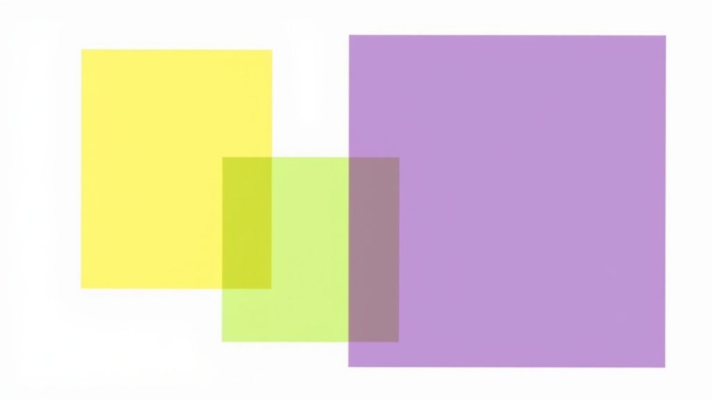
Layering semi-transparent elements, each using a different shade from your split complementary palette, adds another dimension. Picture overlapping shapes, each with a unique transparency. Where they overlap, the colors interact, creating new hues and a sense of visual richness. This works wonders in web design and digital art.
Complex Compositions and Cultural Considerations
Using split complementary colors in complex compositions can be a challenge, but a rewarding one. The trick is to be strategic. Assign each color a role: one as the dominant shade, another for accents, and the third for backgrounds or supporting elements. This creates a sense of balance and harmony, even in intricate designs.
But here’s something important to remember: color isn't perceived the same way everywhere. Cultural context plays a big role in how people interpret color. What symbolizes joy in one culture could mean something entirely different in another. So, if you're designing for a global audience, do your research. Understanding these nuances ensures your designs communicate effectively and respectfully across cultures. For professional assistance, consider services like product photo editing.
Accessibility and Color Temperature
Accessibility is crucial. Your designs should be enjoyable for everyone, including those with visual impairments. Adequate contrast between foreground and background is key for readability. Use online contrast checkers to ensure your designs meet accessibility guidelines. It's about making sure everyone can experience your work.
Finally, let's talk about color temperature. Split complementary palettes can lean towards a warm or cool feeling. This impacts the overall mood of your design. Think about how lighting conditions and viewing environments might influence how your palette is perceived. A design on a cool-toned screen could look different printed on warm-toned paper. Testing your design in different settings helps ensure your split complementary harmony translates effectively across various media.
Avoiding Split Complementary Color Mistakes That Can Ruin Your Designs
Even when you understand split complementary colors, there are some traps that can make your designs less effective. Knowing about these common issues is the first step to preventing them. Let’s explore some of these mistakes and how to fix them.
Contrast Catastrophes: When Colors Are Too Close
One common mistake is picking split complements that are too similar to your main color. This creates weak contrast, making the design feel boring and lifeless. Imagine a light yellow-green paired with an equally light yellow and a slightly more saturated yellow-orange. The result is bland and lacks the dynamic energy split complementary palettes are known for.
How do you fix this? Increase the color distance on the color wheel. Choose split complements that are further away from your base color to create more noticeable contrast. This adds visual interest and makes your palette much more lively.
Screen vs. Print: Bridging the Gap
Another problem is creating a palette that looks great on your computer screen, but dull when printed. This happens because colors are reproduced differently across media. A bright violet on your monitor could look much less vibrant on paper.
To avoid this, always test your split complementary palette on different media. Printed proofs are crucial for accurate color checks before you finalize your design. This simple step can save you from costly reprints and revisions.
Troubleshooting Flat or Overwhelming Palettes
Sometimes, a split complementary scheme just doesn’t work. It can feel either too flat or too intense. If your design feels flat, try changing the saturation or brightness of individual colors. Boosting the saturation of one of the split complements can add a needed pop of color. Or, darkening the base color can provide a stronger foundation for brighter split complements.
If the palette feels overwhelming, try toning down the saturation or brightness of the most intense colors. A little desaturation can create a calmer, more balanced feel. These small tweaks can make a big difference, bringing visual harmony back to your design.
For more help crafting effective social media posts and visual branding with split complementary colors, check out Lumeo. You can turn your content into eye-catching carousels that will boost your brand presence.