LinkedIn Graphic Size Guide 2025: Create Stunning Visuals
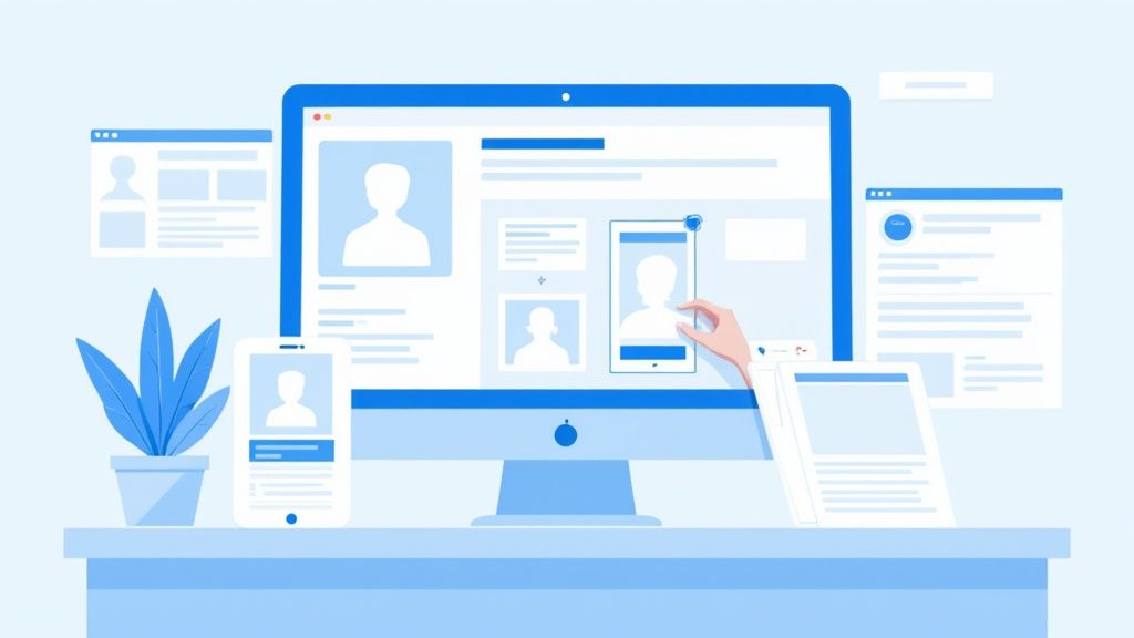
Unlocking the Power of LinkedIn Visuals
Maximize your LinkedIn presence with perfectly sized graphics. This listicle provides the essential LinkedIn graphic sizes you need for a professional and impactful profile. Knowing the correct LinkedIn graphic size, from your profile picture to shared images and videos, ensures your content displays optimally and attracts attention. This guide covers the ideal dimensions for: profile pictures, banner images, company logos, shared image posts, article cover images, and video posts. Get ready to elevate your visual content and boost your reach.
1. LinkedIn Profile Picture Size
Your LinkedIn profile picture is the first impression you make on potential connections, recruiters, and clients. It's a crucial element of your personal branding on the platform. This small, circular image appears not only on your profile, but also in search results, alongside your comments, and accompanying any content you share. Therefore, understanding the optimal LinkedIn graphic size for your profile picture is essential for presenting yourself professionally across all devices. This means choosing an image with the right dimensions and resolution to ensure your face is clearly visible and makes a positive impact.
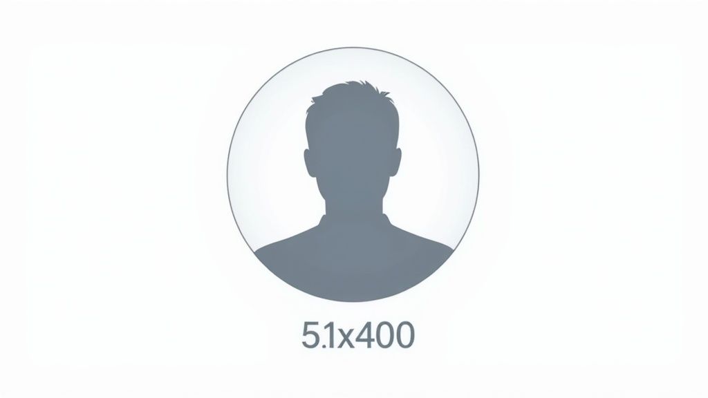
LinkedIn recommends a minimum profile picture size of 400 x 400 pixels, but 500 x 500 pixels is ideal for optimal clarity. The maximum file size is 8MB, and supported formats include JPG, PNG, and non-animated GIFs. While the image is uploaded as a square, it's displayed as a circle on most LinkedIn interfaces. It's important to note that LinkedIn scales down profile pictures to as small as 60 x 60 pixels in some areas of the user interface, like notifications and comments.
Features:
- Minimum resolution: 400 x 400 pixels (recommended: 500 x 500 pixels)
- Maximum file size: 8MB
- Supported formats: JPG, PNG, GIF (non-animated)
- Displayed as a circle (uploaded as a square)
- Scaled down to 60 x 60 pixels in some UI locations
Pros:
- Proper sizing ensures your face is clearly visible across all devices.
- Higher resolution appears sharper on high-density displays like Retina screens.
- The square upload format with circular display allows flexibility in composing your photo.
Cons:
- The circular crop can cut off the edges of rectangular photos.
- The small display size in notifications and comments can make details difficult to see.
- The limited size restricts the ability to include branding elements.
Examples of Successful Implementation:
- Richard Branson: His profile picture clearly shows his face centered in the frame, making him instantly recognizable.
- Melinda Gates: Uses a professional headshot with proper lighting and framing, projecting a polished and approachable image.
- Gary Vaynerchuk: Maintains consistent, professional imagery across all platforms, including LinkedIn, reinforcing his brand identity.
Tips for Optimizing Your LinkedIn Profile Picture:
- Center your face: Position your face in the center of the frame to avoid it being cut off by the circular crop.
- Use a neutral background: A simple background ensures the focus remains on your face and avoids distractions.
- Ensure good lighting: Even lighting illuminates your face without harsh shadows, creating a professional look.
- The 60% rule: Your face should occupy approximately 60% of the frame for optimal visibility.
- Test in thumbnail size: Before finalizing your image, check how it appears in smaller sizes to ensure it remains recognizable and clear.
Why This Matters:
Your LinkedIn profile picture is a key component of your online presence and personal brand. Using the correct LinkedIn graphic size ensures you project a professional image, making a positive first impression and enhancing your credibility on the platform. This is critical for social media marketers, content creators, digital marketing agencies, small business owners, and corporate professionals alike who leverage LinkedIn for networking, lead generation, and career advancement. This seemingly small detail can significantly impact how others perceive you and your brand on the platform. This is why optimizing your profile picture deserves its place at the top of this list.
Popularized By: LinkedIn Corporation, professional photographers specializing in corporate headshots, and personal branding experts like William Arruda.
2. LinkedIn Banner/Cover Photo Size
Your LinkedIn banner, also known as your cover photo, is the first visual element people see when they visit your profile. This prime piece of LinkedIn graphic real estate significantly impacts your professional branding and sets the overall tone for your presence on the platform. Think of it as your digital billboard – a crucial opportunity to showcase your professional identity, highlight your company's values, or simply add a splash of personality to your profile. Understanding the correct LinkedIn graphic size for this element is essential for maximizing its impact.
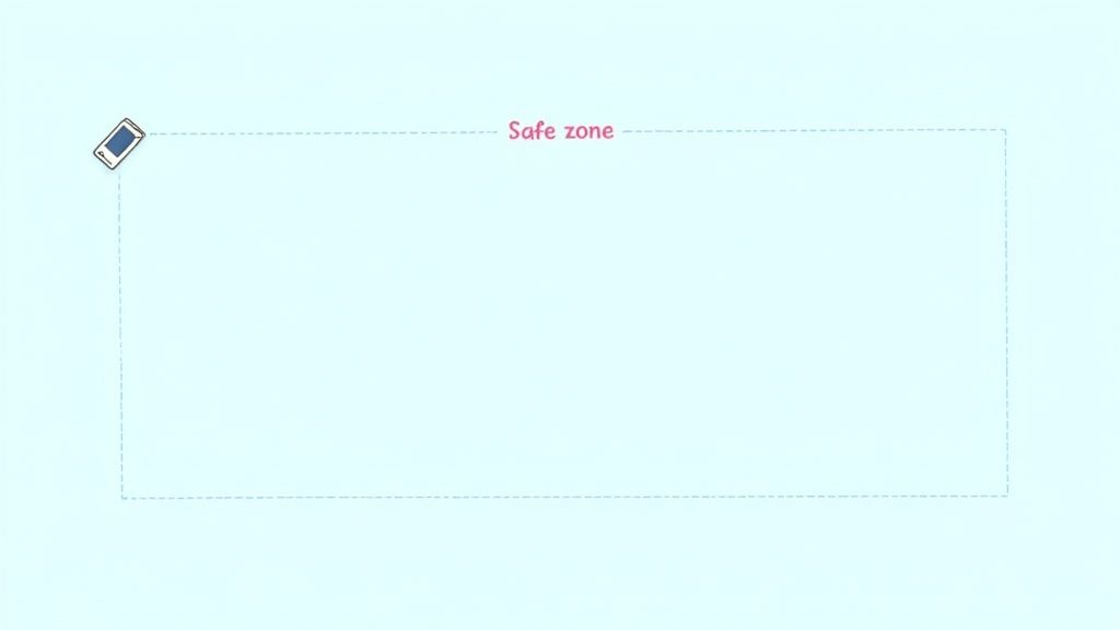
The optimal LinkedIn banner size for desktop display is 1584 x 396 pixels. This large canvas offers ample space for visual storytelling and branding. However, LinkedIn's responsive design means this image will adapt to different screen sizes. This adaptability presents a challenge, as certain areas of your banner might be cropped on mobile devices. To address this, consider a "safe zone" of approximately 1128 x 376 pixels for the most important visual elements and text. This ensures key information remains visible regardless of the device used to view your profile. Supported file formats include JPG, PNG, and non-animated GIFs, with a maximum file size of 8MB.
Pros of Utilizing the LinkedIn Banner:
- Large canvas for visual branding and storytelling: The banner provides a substantial visual area to communicate your professional brand message effectively.
- Prime visibility position on your profile: As the first visual element visitors see, the banner grabs attention and sets the stage for the rest of your profile.
- Opportunity to reinforce professional identity or company values: It's a great space to reinforce your personal brand or highlight your company's mission and culture.
- Can incorporate visual elements that complement your industry or expertise: Use relevant imagery to showcase your skills, experience, or industry focus.
Cons to Consider:
- Different parts may be cropped on mobile devices versus desktop: The responsive design necessitates careful planning to ensure key elements remain visible across devices.
- Text can become illegible when scaled down on smaller screens: Avoid using excessive text or small fonts in your banner.
- Frequent LinkedIn UI updates may affect how banners display: Stay updated on LinkedIn's design changes to ensure your banner continues to display correctly.
Examples of Effective LinkedIn Banner Implementation:
- Salesforce: Uses consistent branded imagery across employee profiles, reinforcing their brand identity.
- Tony Robbins: Features imagery from his speaking engagements, showcasing his expertise and dynamic presence.
- Designers: Often showcase their portfolio work directly in their banner, providing a visual representation of their skills.
- Microsoft: Uses product imagery that aligns with current campaigns, promoting their latest offerings.
Tips for Optimizing Your LinkedIn Banner:
- Keep important visual elements and text within the center safe zone: This ensures visibility on both desktop and mobile devices.
- Test how your banner appears on both mobile and desktop devices: Preview your banner on various devices to check for cropping and readability issues.
- Maintain consistent branding with your other professional platforms: Create a cohesive brand presence across all your online platforms.
- Update seasonally or when major professional changes occur: Keep your banner fresh and relevant to reflect your current professional status.
- Avoid cluttering with too many visual elements or excessive text: Keep it clean and visually appealing.
Learn more about LinkedIn Banner/Cover Photo Size for creating effective and impactful banners. This resource can help you generate visually appealing banners optimized for LinkedIn. Understanding and properly implementing LinkedIn graphic size for your banner image is a key factor in presenting a professional and engaging profile. Whether you're a social media marketer, content creator, or corporate professional, leveraging this space effectively can greatly enhance your LinkedIn presence.
3. LinkedIn Company Page Logo Size
Your LinkedIn Company Page logo is the face of your business on the platform. This crucial element serves as the primary visual identifier for your organization, appearing prominently on your company page, in search results, and alongside all company updates and shared content. Think of it as your business's profile picture – it's often the first visual impression you make on potential customers, partners, and employees browsing LinkedIn. This makes optimizing your LinkedIn graphic size for your logo absolutely essential for maximizing your brand's impact.
The recommended LinkedIn company page logo size is 400 x 400 pixels, although the minimum size accepted is 300 x 300 pixels. Maintaining a square format is vital, as the logo displays in various sizes across the platform, sometimes as small as 60 x 60 pixels in certain UI locations like notifications. The maximum allowed file size is 8MB, with supported formats including JPG and PNG. Choosing the right LinkedIn graphic size ensures your logo appears crisp and professional, regardless of where it's displayed.
Pros:
- Creates immediate brand recognition: A consistent logo across platforms strengthens your brand identity and makes your company easily identifiable.
- Visible on all company updates and activities: Reinforces your brand presence with every post, share, and interaction.
- Helps establish credibility and official presence: A professional-looking logo lends authority and trustworthiness to your company page.
- Simple square format makes implementation straightforward: Easy to create and upload, minimizing technical hurdles.
Cons:
- Limited space for detailed logos or text-heavy designs: Intricate details may be lost at smaller sizes.
- Must function effectively at very small sizes in notifications: Simplicity and strong visual contrast are key.
- Cannot be animated or include multiple frames: Stick to a static image for optimal display.
Examples of Successful Implementation:
- IBM: Uses its simplified blue logo for instant recognition.
- Adobe: Maintains consistent logo presentation across all platforms.
- Coca-Cola: Uses its iconic red disk for maximum brand recognition.
Tips for Optimizing Your LinkedIn Company Page Logo:
- Use your most simplified and recognizable logo version: Avoid complex designs that may become cluttered at smaller sizes.
- Ensure legibility at small sizes by avoiding fine details: Prioritize clear, bold elements.
- Maintain adequate contrast between logo and background: This ensures visibility across different LinkedIn interfaces.
- Use vector-based designs when possible for maximum clarity: Vector graphics scale without losing quality, ensuring a sharp image at any size.
- Test visibility at multiple sizes before finalizing: Preview your logo at different dimensions to confirm its effectiveness.
Why This Matters:
Your company page logo is often the first point of contact between your brand and potential connections on LinkedIn. Optimizing its size and presentation is crucial for making a strong first impression and ensuring consistent brand recognition across the platform. This element contributes significantly to your overall LinkedIn marketing strategy, helping you attract followers, generate leads, and build a strong professional presence. This is why understanding and implementing the correct LinkedIn graphic size for your logo is so vital.
4. LinkedIn Shared Image Post Size
LinkedIn shared image posts are the bread and butter of visual content on the platform. These posts appear directly in the news feed of your connections and followers, accompanying your text updates. They are crucial for boosting engagement, as posts with visuals consistently outperform text-only updates in terms of likes, comments, and shares. Choosing the correct LinkedIn graphic size ensures your content displays optimally across various devices, maximizing its impact. Leveraging the right dimensions is a cornerstone of effective LinkedIn marketing, making this a critical aspect of any LinkedIn strategy.
The optimal LinkedIn graphic size for shared images is 1200 x 627 pixels, which maintains a 1.91:1 aspect ratio. While LinkedIn supports a maximum file size of 5MB and formats like JPG, PNG, and GIF, sticking to the recommended dimensions prevents awkward cropping and ensures your visuals are presented in their best light. Keep in mind that while the image displays at approximately 350 pixels wide on mobile devices, it's expandable to full view when clicked, so maintaining high resolution is important. Learn more about LinkedIn Shared Image Post Size This resource offers further insights into optimizing your posts.
Several companies demonstrate successful implementation of this LinkedIn graphic size. HubSpot, for example, regularly uses data visualizations in their shared image posts, making complex information easily digestible. LinkedIn Learning leverages consistently branded templates for course promotions, reinforcing brand recognition. Influencers like Gary Vaynerchuk effectively use quote cards with consistent branding, creating a strong visual identity. These examples highlight the versatility and effectiveness of optimized shared images.
To maximize the impact of your LinkedIn shared image posts, consider these actionable tips:
- Center critical visual elements: This ensures key information isn't cropped out on different devices.
- High contrast text overlays: Maintain legibility, especially on smaller screens.
- Subtle branding: Incorporate your logo or branding discreetly in a corner for consistent brand reinforcement.
- Mobile testing: Always preview your posts on mobile devices to ensure readability and proper formatting.
- Consistent visual style: Develop a consistent aesthetic to strengthen brand recognition.
While shared image posts offer significant advantages, it's important to be aware of potential drawbacks. Images may be cropped differently across devices, and text overlays can become illegible on smaller screens if not optimized. The landscape orientation can also limit the effectiveness of certain types of visual content.
This approach is particularly valuable for social media marketers, content creators, digital marketing agencies, small business owners, and corporate professionals looking to increase engagement and brand visibility on LinkedIn. The LinkedIn graphic size for shared images plays a significant role in capturing attention in busy feeds, providing visual context for written content, and conveying complex information efficiently. Understanding and implementing these best practices is essential for anyone seeking to leverage the power of visual storytelling on LinkedIn.
5. LinkedIn Article Cover Image Size
Your LinkedIn articles deserve to be read. A compelling cover image is crucial for grabbing attention and driving clicks, making LinkedIn article cover image size a critical aspect of your content strategy. This graphic type appears prominently at the top of your published articles and as a smaller preview thumbnail when shared in the LinkedIn feed. Choosing the correct LinkedIn graphic size and creating a visually appealing image significantly impacts how your long-form content is perceived and how many people choose to engage with it.
What it is and How it Works: The LinkedIn article cover image serves as the visual gateway to your written content. Think of it as the book cover for your insightful article. It's the first thing people see, and it plays a significant role in enticing them to click and read further. LinkedIn maintains the aspect ratio of the image across various devices, ensuring a consistent visual experience whether viewed on desktop, mobile, or tablet.
Features and Benefits:
- Optimal Size: 1280 x 720 pixels (16:9 aspect ratio) – This LinkedIn graphic size provides ample space for visual storytelling while ensuring optimal display across different devices.
- File Size: Maximum 10MB – Large enough for high-quality images without significantly impacting loading times.
- Supported Formats: JPG and PNG – Common and easily accessible image formats.
- Dual Display: Appears as a thumbnail in the feed and full-width at the top of the article – Maximizes visibility in both browsing and reading contexts.
- Consistent Aspect Ratio: Maintains its proportions across various devices – Ensures visual consistency and avoids cropping or distortion.
Pros:
- Compelling Visual Storytelling: The large canvas allows for impactful visuals that draw readers in.
- Increased Click-Through Rates: A well-designed cover image significantly improves the likelihood of users clicking to read your article.
- Professional Impression: Reinforces your brand identity and positions you as a thought leader.
- Consistent Branding: Maintaining a consistent visual style across articles strengthens brand recognition.
Cons:
- Thumbnail Readability: Text overlays on the image may not be easily readable in the smaller thumbnail view in the feed.
- Limited Thumbnail Control: You have limited control over how the thumbnail is cropped and displayed in different feed contexts.
- Post-Publication Changes: The cover image cannot be changed after the article is published without republishing the entire article.
Examples of Successful Implementation:
- Harvard Business Review: Uses consistent branding and high-quality imagery in their article cover images, establishing a strong visual identity.
- Influencers like Melinda Gates: Leverage professional, impactful imagery to enhance their thought leadership pieces.
- Microsoft's Corporate Blog: Maintains a consistent visual style and branding across all their published articles.
Actionable Tips:
- Use High-Quality Imagery: Select visually appealing, relevant images that accurately reflect the article's content.
- Consider Text Overlays (Strategically): If you incorporate text, ensure it’s concise and readable, particularly considering the thumbnail view. Often, less is more.
- Key Element Positioning: Place important visual elements within the center of the image to ensure they remain visible even when cropped for thumbnail previews.
- Consistent Visual Style: Maintain a consistent visual style across all your articles to reinforce your brand identity.
- Preview Before Publishing: Always preview how your cover image appears both as a full-width image and a thumbnail before publishing your article.
When and Why to Use This Approach:
Use a professionally designed LinkedIn article cover image every single time you publish an article. It’s a non-negotiable element for maximizing your content’s reach and impact. This approach is essential for anyone seeking to establish thought leadership, build brand awareness, and drive traffic to their long-form content on LinkedIn. Remembering the optimal LinkedIn graphic size is a must for social media marketers, content creators, and anyone leveraging the platform for professional purposes. By understanding the importance of this LinkedIn graphic size and implementing these best practices, you can significantly enhance the performance of your articles and establish a stronger presence on the platform.
6. LinkedIn Video Post Size
Optimizing your LinkedIn graphic size is crucial for grabbing attention and maximizing engagement. And when it comes to dynamic content, understanding the ideal LinkedIn video post size is paramount. LinkedIn has increasingly prioritized video content, making it a powerful tool for reaching your target audience. These videos autoplay (silently) within the feed, making the correct LinkedIn graphic size even more critical for stopping the scroll. Proper formatting ensures your video looks professional, plays smoothly, and encourages viewers to watch until the end.
LinkedIn video posts appear directly in the user's feed, providing an excellent opportunity to capture attention and convey your message effectively. By using the optimal LinkedIn video post size, you ensure your content is displayed correctly and provides the best possible viewing experience. This section will delve into the specifics of LinkedIn video dimensions, best practices, and why this format deserves its place in your LinkedIn content strategy.
Features and Specifications:
- Resolution: 1920 x 1080 pixels (16:9 aspect ratio) is the recommended LinkedIn graphic size for video.
- File Size: Maximum 5GB.
- Duration: 3 seconds to 10 minutes.
- Supported Formats: MP4 is the most common and reliable.
- Frame Rate: 30fps is recommended for smooth playback.
- Audio Format: AAC or MPEG4.
Pros:
- Higher Engagement: Videos consistently outperform image and text-only posts in terms of engagement.
- Autoplay: The autoplay feature (without sound) captures attention as users scroll through their feed.
- Effective Communication: Video allows you to convey complex information and evoke emotion more effectively than static content.
- Algorithm Preference: The LinkedIn algorithm currently favors video content, giving it increased visibility.
Cons:
- Resource Intensive: Video production often requires more time, equipment, and resources than creating static content.
- Mobile Viewing Challenges: Network connectivity and device limitations can sometimes affect video quality on mobile devices.
- Sound-Off Viewing: While autoplay increases visibility, most users initially view videos without sound. The first 3-5 seconds are crucial for grabbing attention visually.
- Limited Vertical Video Support: While LinkedIn is gradually improving vertical video support, the platform still prioritizes horizontal (16:9) formatting.
Examples of Successful Implementation:
- Thought leaders like Simon Sinek leverage short-form videos to share insightful leadership principles, generating massive engagement.
- Companies like Salesforce use product demonstration videos optimized for LinkedIn to showcase their offerings and drive leads.
- Organizations like TED regularly share optimized speaker clips that perform exceptionally well on the platform.
Tips for Creating Engaging LinkedIn Videos:
- Captions are Essential: Since 85% of LinkedIn videos are watched without sound, adding captions ensures your message reaches everyone.
- Compelling Visual Hook: Create a visually engaging first 3 seconds to stop users from scrolling past your video.
- Keep it Concise: Aim for videos under 2 minutes for optimal completion rates.
- Clear Call-to-Action: Include a clear call-to-action within the video to guide viewers towards the desired action.
- Custom Thumbnails: Always use a custom thumbnail image rather than relying on auto-generated frames. This gives you more control over the first impression.
Who Popularized This?
Early adopters of LinkedIn Live, corporate video production teams, and influencers like Goldie Chan (who built her brand on consistent LinkedIn video content) have all demonstrated the power of video on this platform.
Learn more about LinkedIn Video Post Size
By understanding the nuances of LinkedIn video post size and implementing these best practices, you can leverage the power of video to expand your reach, boost engagement, and achieve your marketing goals on LinkedIn.
LinkedIn Graphic Size Comparison Guide
| Specification | Implementation Complexity 🔄 | Resource Requirements ⚡ | Expected Outcomes 📊 | Ideal Use Cases 💡 | Key Advantages ⭐ |
|---|---|---|---|---|---|
| LinkedIn Profile Picture Size | Low - Simple upload and cropping needed | Low - Small file size, basic image editing | Clear, professional personal branding across devices | Personal profiles, professional identity | Sharp appearance, flexible square with circular crop |
| LinkedIn Banner/Cover Photo | Medium - Must consider responsive design | Medium - Larger file size, design tools needed | Strong visual branding and storytelling on profile header | Profile branding, company value showcasing | Large canvas for branding, prime profile location |
| LinkedIn Company Page Logo | Low - Square format, minimal editing | Low - Small to moderate size logo files | Strong brand recognition across company updates and search | Business pages, official brand presence | Simple format, immediate brand credibility |
| LinkedIn Shared Image Post | Medium - Image optimization for feed display | Medium - Frequent content creation tools | Increased engagement and feed visibility | Content marketing, engagement boosting posts | Higher interaction, enhances text posts visually |
| LinkedIn Article Cover Image | Medium - High-quality image design | Medium - Larger files, design consistency | Improved click-through rates and professional impression | Long-form content, thought leadership articles | Visually compelling, consistent aspect ratio |
| LinkedIn Video Post | High - Video production and editing needed | High - Larger files, video editing software | Higher engagement and algorithm preference | Video marketing, demos, thought leadership via video | Autoplay, superior engagement, effective communication |
Elevate Your LinkedIn Game with Lumeo
Mastering LinkedIn graphic sizes is a fundamental step towards creating a compelling and professional presence. From your profile picture to shared images and video posts, using the correct dimensions ensures your content looks polished and engaging, ultimately maximizing its impact. Remember, a visually appealing LinkedIn profile attracts more views, builds credibility, and helps you stand out from the competition. Knowing the ideal sizes for each type of content, whether it's your banner image, company logo, or article cover, ensures your visuals are displayed optimally and contribute to a cohesive brand experience.
Creating stunning LinkedIn visuals often requires going beyond the basics. Consider using specialized tools like image personalization software to add that extra flair and stand out from the competition. This type of software, as highlighted in Top Image Personalization Software for 2025 | Boost Your Marketing from OKZest, allows for advanced customization, ensuring your visuals resonate with your target audience.
By implementing these best practices for LinkedIn graphic size, you're not just posting content – you're building a powerful brand narrative, expanding your network, and opening doors to new opportunities. Start optimizing your visuals today and watch your LinkedIn engagement soar. Ready to streamline your LinkedIn content creation? Lumeo simplifies the design process, ensuring your graphics are perfectly sized for maximum impact. Visit Lumeo and transform your content into captivating carousels that boost your LinkedIn presence.