8 Amazing Carousel Ad Examples That Convert in 2025

Beyond the Static Image: Unlocking the Power of Carousel Ads
Grabbing and holding audience attention is the ultimate marketing challenge. While single-image ads have their place, the interactive format of carousel ads offers a unique opportunity to tell a deeper story, showcase a wider range of products, and guide users on a visual journey. This dynamic format consistently outperforms static ads in engagement and conversion, making it an essential tool for any savvy marketer. But what separates a carousel that gets ignored from one that drives massive results? The secret lies in strategy and execution.
This guide moves beyond generic advice and dives deep into specific carousel ad examples, breaking down the tactics and psychological triggers that make them so effective. You won't just see what works; you'll understand why it works. We'll analyze everything from product showcases and storytelling journeys to user-generated content and step-by-step tutorials. While many platforms like Instagram and Facebook are primary channels for these ads, the principles of engagement and sequential storytelling apply across networks. To see specific applications in a professional networking context, explore these compelling LinkedIn carousel examples.
Ultimately, this article provides you with actionable, replicable strategies to elevate your own advertising campaigns and turn swipes into sales.
1. Product Showcase Carousel
The Product Showcase is the quintessential carousel ad, and for good reason. It’s a direct, effective format for e-commerce and retail brands to display multiple products, feature variations of a single item, or highlight different benefits in a single, interactive ad unit. Instead of creating separate ads for each product, marketers can bundle them, giving users a virtual window-shopping experience directly in their feed.
This approach is particularly powerful for showcasing a new collection or a range of best-sellers. For example, a brand like ASOS might use this format to feature a complete outfit across several cards, while a company like IKEA could show a piece of furniture in different room settings to help customers visualize it in their own space. The interactive nature encourages engagement, as users actively swipe to see what's next, increasing their time spent with the brand.
Strategic Analysis
The core strategy behind a product showcase is maximizing the value of a single ad impression. By presenting multiple options, you increase the chances of a user seeing something that resonates with them. This format directly addresses a key challenge in digital advertising: capturing attention and catering to diverse tastes with limited screen real estate. It turns a static ad into an exploratory journey.
The most effective carousel ad examples using this technique often tell a subtle story or follow a logical sequence. A common tactic is leading with the most popular product or the most eye-catching image to hook the user and entice them to swipe. Each subsequent card then builds on the first, either by showing complementary products or different features, creating a cohesive and compelling narrative.
Actionable Takeaways and Best Practices
To create a high-performing product showcase carousel, focus on a clear and strategic assembly.
- Lead with Strength: Always place your best-performing or most visually appealing product on the first card. This is your hook; its job is to stop the scroll and encourage the first swipe.
- Maintain Visual Consistency: Use a consistent aesthetic across all cards. This includes similar lighting, backgrounds, photo angles, and branding. A disjointed look can feel jarring and unprofessional.
- Provide Clear Information: Overlay essential details like the product name and price directly onto the images. This reduces friction and allows users to make quicker decisions.
- Link Each Card Individually: Ensure each carousel card links directly to its corresponding product page. Sending a user to a generic homepage after they clicked on a specific item is a guaranteed way to lose a sale.
The following infographic illustrates a simple yet powerful process for structuring your product showcase carousel ad.
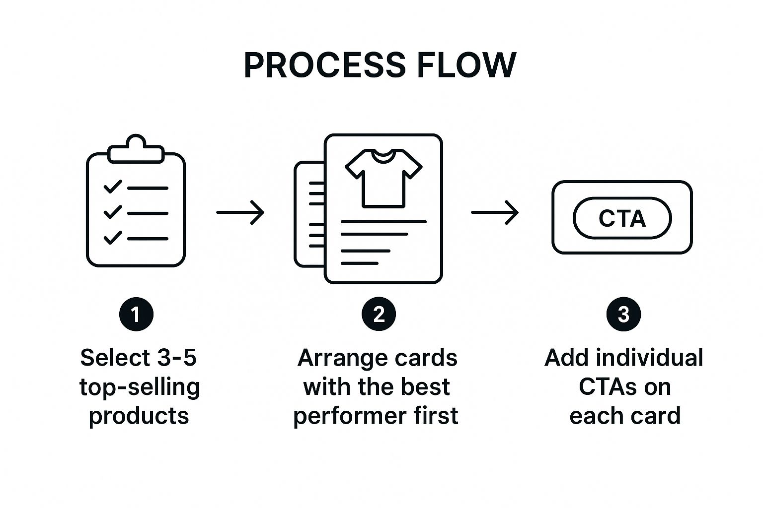
This process emphasizes a data-driven approach, starting with proven winners and ensuring each element is optimized for conversion, from card order to the final call-to-action.
2. Storytelling Journey Carousel
The Storytelling Journey Carousel transforms an ad from a simple promotion into a compelling narrative. This format uses a sequence of cards to guide users through a story, step-by-step tutorial, or brand journey. Each card is a chapter that builds upon the last, creating a cohesive and immersive experience that draws the user in and keeps them swiping to see the conclusion.
This technique is incredibly versatile. A brand like Adobe can use it to demonstrate a complex design process in simple, digestible steps. Similarly, a service like Airbnb could feature a host's success story, with each card revealing a new part of their journey. This narrative approach moves beyond selling a product; it sells an experience, an outcome, or a brand ethos, fostering a deeper emotional connection with the audience.
Strategic Analysis
The core strategy here is to leverage the human brain's natural affinity for stories. A well-told narrative captures attention more effectively than a list of features, creating suspense and curiosity that drive engagement. The sequential format of the carousel is a perfect vehicle for this, turning passive scrolling into active participation. Users are not just seeing an ad; they are following a plot.
The most powerful carousel ad examples of this type establish a clear beginning, middle, and end. The first card acts as a hook, presenting a problem or an intriguing premise. The middle cards develop the story, showcasing the solution or the journey. The final card delivers the resolution and a strong call-to-action, capitalizing on the emotional investment the user has built up. To dive deeper into this concept, you can learn more about storytelling in marketing and how it creates memorable brand interactions.
Actionable Takeaways and Best Practices
To craft a successful storytelling journey carousel, focus on narrative structure and visual flow.
- Start with a Strong Hook: The first card is critical. It must present a relatable problem, a captivating question, or a stunning visual that makes swiping irresistible.
- Maintain Narrative Cohesion: Ensure each card logically follows the one before it. Use consistent branding, colors, and design elements to create a seamless visual flow that guides the user through the story without interruption.
- Build Anticipation: Use text and visuals to create "mini-cliffhangers" on each card. Phrases like "But then..." or "The next step is..." encourage users to keep swiping to get the full picture.
- End with a Clear Resolution and CTA: The final card should provide a satisfying conclusion to the story and clearly direct the user on what to do next, whether it’s "Shop the Look," "Start Your Trial," or "Learn More."
3. Before-and-After Transformation Carousel
The Before-and-After Transformation carousel is a visually compelling format that taps into a core human desire: seeing tangible results. It leverages the swiping motion to create a dramatic reveal, showing a problem state in the "before" card and the ideal solution in the "after" card. This narrative structure is incredibly effective for services and products that deliver a clear, visible change.
This format is a staple for industries like fitness, beauty, and home renovation. A fitness app, for instance, might show a user's physique before and after a 12-week program, while a skincare brand could display the reduction in blemishes over a month of use. The power lies in its simplicity and authenticity. It provides instant visual proof that the product or service works, making the advertised benefit feel attainable and real.

Strategic Analysis
The strategy behind the transformation carousel is to build credibility and desire through social proof. By showcasing genuine results, you move beyond mere claims and provide concrete evidence. This format effectively answers the consumer's primary question: "Will this work for me?" The visual comparison creates a powerful psychological impact, anchoring the value of your offer in a clear, demonstrable outcome.
Effective carousel ad examples of this type often go beyond a simple two-card comparison. They might use subsequent cards to detail the process, highlight key features that enabled the transformation, or add customer testimonials for an extra layer of trust. The narrative structure is simple yet profound: problem, solution, and proof. This makes the ad less of a sales pitch and more of a mini-case study, inviting users to imagine their own successful transformation.
Actionable Takeaways and Best Practices
To execute a compelling transformation carousel, authenticity and clarity are paramount.
- Prioritize Authenticity: Use genuine, unedited user photos whenever possible. Overly polished or stock-like images can breed skepticism and undermine trust. Real results, even if imperfect, are far more persuasive.
- Establish a Clear Timeline: Context is crucial. State the timeframe of the transformation (e.g., "After 6 weeks," "One session later"). This manages expectations and makes the results seem more achievable.
- Maintain Visual Consistency: For the most impactful comparison, keep the lighting, angles, and framing as similar as possible between the before and after shots. This isolates the change and makes it the undeniable focus.
- Enhance with Testimonials: Add a quote from the customer on a later card. Pairing the visual proof with a positive testimonial creates a powerful combination of social proof that can significantly boost conversion rates.
4. Tutorial Step-by-Step Carousel
The Tutorial Step-by-Step Carousel transforms an ad into a valuable educational resource. This format breaks down a process, recipe, or set of instructions into a series of easily digestible steps, presented sequentially across the carousel cards. By guiding users through a task, brands position themselves as helpful experts, building trust and authority while subtly integrating their products as essential components of the solution.
This approach is highly effective for brands whose products are used in a process. For instance, a food brand like Tasty can walk a user through a recipe, with each card representing a step. Similarly, a beauty brand like Sephora can demonstrate a complex makeup technique, or a DIY retailer like Home Depot can simplify a home improvement project. The format adds immense value, shifting the ad from a simple promotion to a functional, save-worthy piece of content.
Strategic Analysis
The core strategy here is value-based marketing through education. Instead of directly selling, you are teaching, which fosters a deeper connection with the audience. This format taps into the user's desire to learn new skills, solve problems, or achieve a specific outcome. By providing a clear, step-by-step guide, you lower the barrier to entry for trying something new, making your product feel more accessible and necessary.
Some of the best carousel ad examples using the tutorial format create a sense of accomplishment for the user. The journey from the first card to the last mirrors the user's own potential journey from beginner to success. The final card often serves as a powerful call-to-action, showcasing the finished result and listing the products needed to achieve it, turning inspiration directly into a potential purchase.
Actionable Takeaways and Best Practices
To create an effective tutorial carousel, focus on clarity, sequence, and a satisfying conclusion.
- Number Each Step Clearly: Use bold text or graphic overlays to number each card (e.g., "Step 1," "Step 2"). This provides a clear roadmap and encourages users to swipe through to the end.
- Use High-Quality Visuals: Each card should feature a crisp, well-lit photo or video that clearly illustrates the action being described. Confusion at any step can cause the user to drop off.
- End with a Strong Payoff: The final card is crucial. It should showcase the beautiful end result and provide a clear call-to-action, such as linking to a product bundle or a full tutorial page.
- Keep Text Concise: Use short, action-oriented text on each card. Let the visuals do most of the talking and reserve detailed instructions for the caption or landing page.
The video below demonstrates how a simple process can be broken down visually, a key principle of the tutorial carousel.
Mastering this format can significantly boost engagement and establish brand credibility. For a more in-depth look, you can learn more about how to make a carousel post in this expert guide on lumeo.me.
5. User-Generated Content (UGC) Carousel
The User-Generated Content (UGC) Carousel leverages the power of social proof by featuring authentic content created by real customers. Instead of polished brand photography, this format showcases products in genuine, real-world scenarios, building a powerful layer of trust and relatability. It transforms an advertisement from a corporate message into a community showcase, driven by peer recommendations.
This approach is highly effective for brands whose products are part of an experience. For example, GoPro has famously built its marketing around thrilling adventure footage captured by its users, while a brand like Lululemon might feature photos of customers in various workout poses. This method not only provides a steady stream of authentic content but also fosters a strong sense of community, making customers feel like they are part of the brand's story.
Strategic Analysis
The core strategy here is to build authenticity and credibility at scale. Modern consumers are increasingly skeptical of traditional advertising, but they trust recommendations from their peers. A UGC carousel taps directly into this psychology, presenting your product not as something to be sold, but as something already loved and used by a community of real people. This format is one of the best carousel ad examples for turning customers into brand advocates.
By curating and featuring customer content, brands can demonstrate their product's value in diverse, unscripted ways that a professional photoshoot could never fully capture. The variety inherent in UGC also keeps the ad fresh and engaging, as each card can present a different person, setting, and use case. To dive deeper into the power of authentic content, explore how user-generated content ads can build trust and connections.
Actionable Takeaways and Best Practices
To launch a successful UGC carousel, focus on curation and ethical collaboration with your audience.
- Always Secure Permissions: Never use a customer's content without their explicit consent. Reach out directly for permission and be clear about how and where you intend to use their photo or video.
- Credit the Creator: Publicly tag and credit the original creator on each carousel card. This not only is ethical but also encourages more submissions by showing your community you value their contributions.
- Curate for Brand Alignment: Select content that reflects your brand’s values and aesthetic. Your curation should reinforce your brand identity, even though the content is user-generated.
- Launch a Branded Hashtag: Encourage submissions by creating and promoting a unique, branded hashtag (e.g., #ShotOniPhone). This simplifies the process of finding and organizing potential content for your ads. You can learn more about building a successful framework with a solid user-generated content strategy on lumeo.me.
6. Collection/Catalog Carousel
Building on the foundation of the product showcase, the Collection/Catalog Carousel organizes products into a cohesive, themed group. This format is ideal for launching seasonal lines, highlighting designer collaborations, or curating items around a specific use case, like “Holiday Entertaining” or “Back to School.” It acts as a digital lookbook, guiding users through a thoughtfully assembled set of products that work together.
This approach allows brands to tell a more focused story than a simple multi-product ad. For instance, a fashion retailer like Zara can use a carousel to unveil its new autumn/winter collection, with each card featuring a different outfit that embodies the season's aesthetic. Similarly, a home goods store could create a "Summer Patio" collection, showcasing everything from outdoor furniture to dinnerware, creating a powerful sense of context and desire.
Strategic Analysis
The strategy behind the Collection/Catalog Carousel is to sell a lifestyle or a solution, not just individual products. By grouping items thematically, brands tap into consumer intent and seasonal trends, making the offer feel more relevant and timely. This format elevates marketing from a simple transaction to an inspirational experience, helping customers envision how the products fit into their lives.
These types of carousel ad examples excel at creating a strong narrative. The first card introduces the collection's theme, often with a title like "The Holiday Gift Guide." Subsequent cards then present the products that make up that collection. This structure helps manage a large inventory by breaking it down into digestible, appealing categories, preventing choice paralysis and guiding the customer's shopping journey.
Actionable Takeaways and Best Practices
To execute a successful Collection/Catalog Carousel, focus on curation and cohesive storytelling.
- Define a Strong Theme: Your collection must have a clear, compelling theme. Whether it's based on a season, a holiday, a color palette, or a specific activity, the theme is the glue that holds the ad together.
- Brand the Collection: Give your collection a name and feature it prominently on the first and last cards. This reinforces the theme and makes the ad feel like an exclusive, curated event.
- Ensure Visual Harmony: All products and images within the carousel must align with the collection's aesthetic. Use consistent lighting, backgrounds, and styling to create a polished, lookbook-quality experience.
- Create a Dedicated Landing Page: Link the final card's call-to-action to a landing page that features the entire collection. This creates a seamless transition from ad to shop and encourages users to explore further.
7. Feature Highlight Carousel
The Feature Highlight Carousel is designed to deconstruct a single, often complex, product or service into digestible, compelling benefits. Instead of showcasing multiple products, this format dedicates each card to a different feature, use case, or technological advantage. It’s a powerful tool for brands whose value proposition isn’t immediately obvious from a single image, transforming a product into a multi-faceted solution.
This approach is a favorite among tech, automotive, and high-end appliance companies. For instance, a brand like Apple might use each card to demonstrate a specific iPhone camera capability, like Night mode or Cinematic video. Similarly, a car manufacturer could dedicate cards to safety features, performance specs, and interior technology, giving potential buyers a comprehensive virtual tour. The format educates consumers, building a stronger case for purchase by revealing the full depth of the product’s value.
Strategic Analysis
The core strategy here is education-driven persuasion. For products with a higher price point or a steeper learning curve, justifying the investment is crucial. This format breaks down barriers to understanding by isolating and magnifying each key benefit. It allows marketers to control the narrative, guiding the user through a logical progression of features that collectively build an undeniable argument for the product’s superiority.
Some of the most compelling carousel ad examples using this technique address specific customer pain points with each card. The first card might introduce the problem, and subsequent cards present features as the direct solution. This problem-solution storytelling framework creates a powerful connection, making the user feel understood and positioning the product not just as an item, but as an essential tool for improving their life.
Actionable Takeaways and Best Practices
To build a feature highlight carousel that effectively educates and converts, focus on clarity and demonstrating tangible value.
- Prioritize by Impact: Order your features based on what matters most to your target audience. Start with the most significant benefit or the one that solves the biggest pain point to capture immediate interest.
- Show, Don't Just Tell: Use visuals, short videos, or GIFs within your cards to demonstrate the feature in action. Seeing a feature work is far more convincing than reading a text description of what it does.
- Focus on One Idea Per Card: Avoid cluttering a single card with multiple features. Dedicate each slide to one core benefit to ensure the message is clear, memorable, and easy to absorb.
- End with a Powerful Summary: Use the final card to summarize the key benefits or provide a call-to-action that directs users to a landing page where they can explore the product in even greater detail.
8. Multi-Location/Multi-Service Carousel
The Multi-Location/Multi-Service Carousel is an essential format for businesses operating across multiple geographic areas or offering a diverse suite of services. This ad type allows franchises, hotel chains, and service providers to showcase their breadth and accessibility in a single, targeted unit. Instead of creating distinct ads for each location or service, marketers can consolidate them, speaking directly to different customer segments within one cohesive ad.
This strategy is exceptionally effective for national or global brands that need to maintain a consistent brand identity while also appealing to local tastes and needs. For example, a fitness franchise like Planet Fitness could use a carousel to feature its various gym locations in a specific metro area, while a hotel group like Marriott might showcase different properties, from city-center hotels to beachside resorts, to appeal to a wider range of travelers. It’s about demonstrating scale and convenience simultaneously.

Strategic Analysis
The core strategy here is localization at scale. This carousel format leverages geotargeting to deliver highly relevant content to users based on their location, increasing the ad's relevance and effectiveness. By showing nearby stores, available local services, or region-specific offers, brands can create a powerful sense of presence and convenience, transforming a broad national campaign into a personal invitation.
These carousel ad examples work by addressing the user’s immediate context. Someone in New York sees locations in their borough, not irrelevant ones in California. This precision significantly boosts click-through rates and foot traffic. Each card in the carousel acts as a dedicated portal to a specific location or service, allowing for customized messaging, imagery, and calls-to-action that resonate more deeply with the local audience.
Actionable Takeaways and Best Practices
To successfully deploy a multi-location or multi-service carousel, focus on relevance and clarity.
- Leverage Dynamic Geotargeting: Use the ad platform's location-based targeting to automatically show users the most relevant locations or service offerings. This is the cornerstone of the strategy.
- Highlight Unique Features: Dedicate each card to a specific location or service and showcase what makes it unique. Use high-quality photos of the actual storefront, local team, or service in action.
- Include Location-Specific Information: Overlay key details like the address, phone number, or operating hours directly on each card. Make it as easy as possible for users to take the next step.
- Customize Calls-to-Action: Tailor the CTA on each card. For example, use "Get Directions" for a physical store, "Book Now" for a specific service, or "View Menu" for a restaurant location.
8 Carousel Ad Types Comparison
| Carousel Type | Implementation Complexity 🔄 | Resource Requirements 🔄 | Expected Outcomes 📊 | Ideal Use Cases 💡 | Key Advantages ⭐ |
|---|---|---|---|---|---|
| Product Showcase Carousel | Medium: Requires multiple high-quality images and catalog integration | Moderate: Needs quality images for 3-5 cards, product data | Increased product discovery, higher engagement, better storytelling | E-commerce brands showcasing product range or variations | Cost-effective multi-product promotion, better user engagement |
| Storytelling Journey Carousel | High: Needs careful narrative planning and creative resources | High: Storyboarding, design, and sequential content creation | Strong emotional engagement, improved information retention | Brands telling stories, tutorials, or complex explanations | Creates brand connection, builds anticipation |
| Before-and-After Transformation Carousel | Medium: Requires authentic, high-quality before/after visuals | Moderate: Needs genuine transformation examples and testimonials | High conversion rates, strong social proof | Businesses with visible results like fitness, beauty, renovations | Builds credibility via visual proof, emotionally compelling |
| Tutorial Step-by-Step Carousel | Medium-High: Requires expertise and stepwise content design | Moderate-High: Research, detailed imagery or video | Builds trust, high saves/shares, organic reach growth | Educational content, how-tos, recipes, DIY, and beauty tutorials | Positions brand as expert, drives engagement and loyalty |
| User-Generated Content (UGC) Carousel | Low-Medium: Content curation with rights management | Low: Relies mostly on existing customer content | High trust and authenticity, community engagement | Social proof-focused marketing using real customer content | Cost-effective, increases brand credibility |
| Collection/Catalog Carousel | Medium: Requires thoughtful curation and seasonal planning | Moderate: Visual styling and product grouping | Increases average order value, simplifies discovery | Seasonal or themed collections in fashion, home goods, retail | Drives bulk purchases, enhances product organization |
| Feature Highlight Carousel | Medium: Needs deep product knowledge and focused messaging | Moderate: Visual demos and feature explanations | Educates customers, reduces objections, supports complex sales | Complex products with multiple features (tech, automotive) | Comprehensive education, addresses varied customer needs |
| Multi-Location/Multi-Service Carousel | Medium-High: Location-specific content and updates needed | Moderate-High: Geotargeting and customized info per location | Builds trust through presence, appeals to dispersed customers | Businesses/franchises with multiple locations or service types | Demonstrates scale, customizable for local markets |
From Inspiration to Implementation: Your Next Steps
We've journeyed through a diverse landscape of powerful carousel ad examples, moving beyond simple product displays to explore the strategic depth this format offers. From showcasing dramatic before-and-after transformations to guiding users through intricate step-by-step tutorials and leveraging the authenticity of user-generated content, a clear pattern emerges. The most successful carousel ads are not passive slideshows; they are active, persuasive conversations with the audience.
The common thread weaving through all these high-performing examples is a commitment to strategic storytelling. They understand their audience's pain points, aspirations, and curiosities, and they use the multi-card format to create a coherent and compelling narrative that guides the user from initial interest to a final, decisive action. This is the fundamental shift in mindset required to excel with this ad type.
Distilling the Core Strategies
To turn these insights into tangible results, let's recap the foundational principles that drive effective carousel ad creation:
- Clarity of Purpose: Every great carousel starts with a single, clear objective. Are you telling a story, showcasing a collection, highlighting features, or demonstrating a process? Choosing one primary goal, like those seen in the feature highlight or storytelling journey examples, prevents a confusing and unfocused user experience.
- Narrative Flow: Treat the cards as chapters in a micro-story. The first card must be an irresistible hook, the middle cards must build value and desire, and the final card must provide a clear and compelling call to action. This structured progression is what makes the ad feel complete and satisfying.
- Visual and Textual Harmony: The synergy between your images, videos, and copy is non-negotiable. Text should be concise, adding context and direction that the visuals alone cannot convey. Each card should feel like a deliberate and necessary part of a larger, cohesive message.
Your Action Plan for Creating High-Converting Carousels
Now, it’s time to move from inspiration to execution. Don't just aim to replicate the carousel ad examples we’ve analyzed. Instead, adapt their underlying frameworks to fit your unique brand voice, product offerings, and campaign goals.
Start by identifying the strategy from this article that best aligns with your immediate marketing objective. Is your goal to educate? A tutorial carousel might be perfect. Looking to build social proof? A UGC-focused ad is your best bet. Once you have a direction, begin mapping out your ad card by card. Remember, this is an iterative process. To ensure your carousel ads consistently convert, incorporate A/B testing strategies to pinpoint the most effective designs, copy, and calls to action. Continuous testing and refinement are what separate good campaigns from unforgettable ones.
The power of carousel ads lies in their versatility and their unique ability to engage users on a deeper level. By mastering these strategic approaches, you're not just creating another ad; you're building a powerful tool for connection, education, and conversion that can significantly elevate your marketing impact.
Ready to build stunning, high-impact carousels without the design headaches? Lumeo leverages AI to help you transform your existing content into on-brand, platform-optimized carousels in minutes. Streamline your creative process and start building ads that convert today.