7 Brand Consistency Examples from Top Global Brands in 2025
Why Consistency Is Your Brand’s Secret Weapon
Brand consistency examples from Apple, Coca-Cola, Nike, Starbucks, McDonald’s, IKEA and Netflix reveal how a unified visual identity, messaging and experience drive recognition and loyalty. In this article, you’ll see how each brand applies consistent color palettes, typography, tone and customer touchpoints. You’ll also get practical tips on applying these lessons to your own strategy, plus tool recommendations like Lumeo’s Brand Kit to streamline your visual assets across channels. Whether you’re a social media marketer, content creator, agency professional or small business owner, these brand consistency examples will equip you to strengthen your brand’s impact, build trust with your audience and stand out in competitive markets. Get ready to transform your branding approach with real-world brand consistency examples and clear, actionable guidance.
1. Apple’s Visual and Experience Consistency
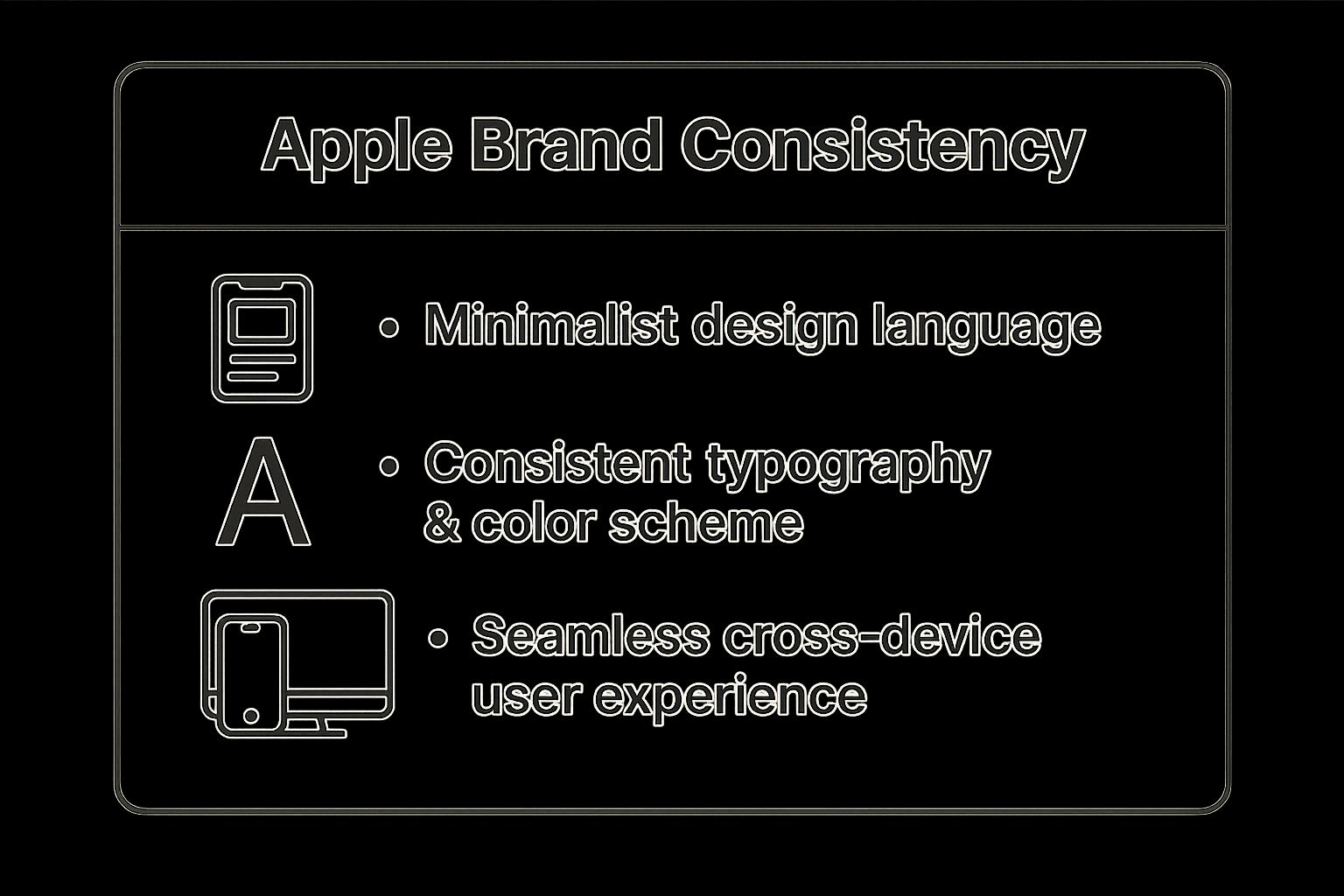
Apple’s brand consistency example starts with a deeply ingrained philosophy: every product, store, ad, and interaction reflects the same minimalist, intuitive design language. By aligning visual elements (color palette, typography, photography) with user-experience principles (seamless cross-device integration, intuitive interfaces), Apple delivers a cohesive brand experience that customers instantly recognize worldwide.
What makes this approach so powerful is consistency at every touchpoint—from unboxing to in-store visits to the digital environment—reinforcing a premium perception and building loyalty over time.
To illustrate Apple’s consistency across key metrics, here’s a quick reference summarizing how the brand’s visual and experiential elements align globally:
The infographic highlights:
- 98% package recognition rate with minimalist white design
- Uniform typography (San Francisco) across all devices
- Over 500 Apple Stores following the same layout in 25 countries
- 90%+ keynote recall for consistent presentation format
- Cross-platform UI elements for instantaneous user familiarity
These data points demonstrate why Apple’s brand consistency examples stand out: they not only look unified but also function cohesively, creating an unmistakable identity.
Key Features
- Minimalist design language across all products
- Consistent typography (San Francisco) and color schemes (white space emphasis)
- Unified user experience across iOS, macOS, watchOS, and tvOS
- Distinctive product photography: high contrast, shallow depth of field
- Cohesive retail store design: Genius Bar, Genius Grove, Genius Bar stools
Pros and Cons
Pros
- Extremely high brand recognition; products identifiable even without a logo
- Creates a premium perception and fosters strong customer loyalty
- Simplifies marketing efforts across global markets
- Enables seamless cross-product integration and ecosystem lock-in
Cons
- Can lead to design stagnation if over-relied upon
- High consistency expectations mean any deviation faces intense scrutiny
- Requires significant resources to maintain alignment across all touchpoints
When and Why to Use This Approach
Use Apple’s model of visual and experience consistency when you need:
- A unified, premium brand image across diverse products or services
- Strong ecosystem lock-in that rewards customers for staying within your platform
- Simplified global marketing by reusing core assets and design templates
This approach works best for brands investing in long-term customer relationships, deep product ecosystems, and high-value touchpoints like flagship retail experiences.
Actionable Tips
- Create comprehensive brand guidelines covering typography, color, imagery, and tone of voice.
- Establish approval processes for every asset—ads, packaging, social posts, presentations.
- Train all departments (product, marketing, sales, support) on brand standards.
- Regularly audit brand consistency across touchpoints and markets.
- Allow design evolution—but keep core identity elements intact.
- For ensuring visual consistency across your brand’s online presence, try using Thumbnail Creator, a tool designed to help you produce on-brand thumbnails quickly and easily.
By adopting Apple’s disciplined approach to brand consistency, you’ll create one of the most powerful brand assets: a visual and experiential signature that customers immediately trust and remember.
For more inspiration on cohesive design and experience, visit Apple’s official site: https://www.apple.com.
2. Coca-Cola's Color and Typography Consistency
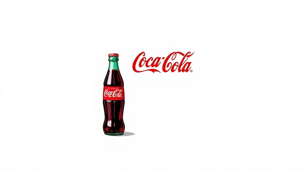
Consistent brand identity is built on visual cues that trigger instant recognition—Coca-Cola’s use of its signature red and Spencerian script logo is a classic brand consistency example. By locking in a precise color palette (#F40009 red and white), a distinctive script typeface and its unique contour bottle design, Coca-Cola ensures every touchpoint—from a billboard in Tokyo to a TV spot in São Paulo—feels unmistakably theirs.
Coca-Cola’s approach works by codifying its core visual assets into strict style guidelines. The red hue is specified precisely in Pantone, CMYK and RGB, while the Spencerian script has remained virtually unchanged since 1887. These elements extend across packaging, in-store displays, digital ads and even the signature “ho-ho-ho” soundtrack in their holiday spots. As a result, the Coca-Cola brand triggers emotional connections—nostalgia, joy, refreshment—no matter the demographic or geography.
Features (Iconic Brand Triggers)
- Iconic Red and White Color Scheme (#F40009)
- Distinctive Spencerian Script Logo (since 1887)
- Contour Bottle Shape Recognized Worldwide
- Sound Branding (“Taste the Feeling” audio cues, holiday jingles)
- Unified Seasonal Campaigns (Santa Claus, polar bears)
Why It Works
- Instant global recognition across cultures
- Strong emotional connections spanning generations
- Versatile across print, digital and experiential formats
- Deters competitor imitation through trademarked assets
Examples of Successful Implementation
- Consistent use of Coca-Cola red across packaging, point-of-sale and digital ads
- The Spencerian script logo with minimal tweaks in campaigns worldwide
- Contour bottle silhouette used as unbranded iconography
- Holiday campaigns since 1931 (Santa Claus, polar bears)
- 2014’s “Share a Coke” personalized bottle series, blending local names without diluting core visuals
Actionable Tips
- Identify Your Signature Assets: Choose a color, typeface or shape that can become as recognizable as Coca-Cola red.
- Create a Detailed Style Guide: Document exact color codes (Pantone, CMYK, RGB) and typography rules for all media.
- Balance Tradition and Evolution: Allow subtle refinements but avoid overhauls that break recognition.
- Test Across Channels: Validate color and type consistency in print, web, mobile, video and environmental graphics.
- Localize Thoughtfully: Permit minor cultural adaptations (language, messaging) while keeping core visuals intact.
When and Why to Use This Approach
If your goal is to build or maintain a brand that cuts through global markets with high recall, consistent color and typography is indispensable. This approach is ideal for companies seeking long-term equity, emotional resonance and defense against mimicry. By anchoring your brand in a few immutable elements, you create powerful triggers that speak louder than words.
Pros
- Instant global recognition
- Deep emotional resonance
- Cross-media adaptability
- Strong defense against imitations
Cons
- Risk of stagnation without subtle updates
- Limited flexibility for radical rebrands
- Requires tight governance of sub-brands
Popularized By: Roberto Goizueta, Asa Griggs Candler, James Quincey
Learn more at the official Coca-Cola website: https://www.coca-cola.com/
3. Nike’s Consistent Brand Voice and Messaging
Nike’s mastery of brand consistency is one of the most celebrated brand consistency examples in marketing history. By weaving its core values of empowerment, performance, and innovation into every touchpoint—from the iconic “Just Do It” slogan to athlete sponsorships—Nike has built a cohesive brand ecosystem that resonates globally.
What It Is and How It Works
At its core, Nike’s approach hinges on three pillars:
- Unified Voice & Tone: A bold, inspiring narrative that challenges consumers to push their limits.
- Signature Messaging Platform: The “Just Do It” slogan, introduced in 1988, serves as an emotional rallying cry in all ads.
- Consistent Visual Identity: The swoosh logo, with zero variation in shape or color use, anchors product design, packaging, retail environments, and digital channels.
By applying these elements uniformly—whether you’re scrolling through Nike’s Instagram feed, visiting a Nike Town retail store, or watching a TV commercial featuring an Olympic athlete—the brand feels instantly recognizable and trustworthy.
Examples of Successful Implementation
- Swoosh Across Product Lines: From running shoes to yoga mats, the swoosh appears in the same orientation and proportion.
- “Just Do It” Campaigns: High-profile spots starring Serena Williams, Colin Kaepernick, and everyday athletes keep the slogan relevant and culturally resonant.
- Nike Town Retail Experiences: Flagship stores in cities like New York and Shanghai feature the same graphic walls, interactive screens, and minimalist fixtures.
- Digital Consistency: Social posts, email newsletters, and the Nike app all adhere to a unified color palette, typography, and motivational copy.
- Athlete Partnerships: Long-term deals with top athletes reinforce the empowerment narrative through authentic, behind-the-scenes storytelling.
When and Why to Use This Approach
Use a consistent brand voice and messaging strategy when you need to:
- Build Emotional Connection: A single, powerful narrative helps consumers form an enduring bond.
- Expand Product Lines: A clear brand framework simplifies decisions for new categories or collaborations.
- Enter New Markets: Consistent identity transcends language and cultural barriers.
- Drive Long-Term Loyalty: Repetition of key messages and visuals fosters recognition and trust.
Actionable Tips for Your Brand
- Define your brand purpose, values, and key messaging pillars in a single playbook.
- Create voice and tone guidelines—covering word choice, sentence length, and personality traits—for all teams.
- Audit every channel (web, social, retail, packaging) to ensure on-brand execution.
- Train spokespeople and agency partners on storytelling principles and legal/legal compliance.
- Build templates (email, social posts, ad layouts) that embed your logo, fonts, and taglines automatically.
Pros and Cons
Pros:
- Strong emotional connection with consumers
- Clear, transcendent brand positioning
- Easier expansion into new categories
- Simplified creative approvals and faster go-to-market
- Cultural and demographic resonance
Cons:
- Elevated scrutiny of every brand action
- Risk of sounding inauthentic if over-scaled
- Localization challenges without diluting core messaging
Why it deserves its spot: Nike’s unwavering dedication to brand consistency not only drives sales but cements its status as a cultural icon. By studying these brand consistency examples, marketers can learn how to craft a unified brand story that endures for decades.
Learn more about Nike’s Consistent Brand Voice and Messaging
Visit Nike: https://www.nike.com
4. Starbucks’ Experiential Brand Consistency
Starbucks has perfected a holistic approach to brand consistency examples by delivering a unified, sensory-rich experience across more than 33,000 stores worldwide. Rather than relying solely on its iconic green mermaid logo, the coffee giant synchronizes store design, product quality, customer service protocols, and even curated music playlists and signature aromas to ensure that every visit feels familiar yet contextually adapted to its locale.

What It Is and How It Works
Starbucks’ experiential brand consistency is the practice of standardizing not only visual identity (green and white color palette, mermaid emblem) but also operational and sensory touchpoints. From the layout—featuring warm wood accents and comfortable seating—to the aroma of freshly ground coffee, every detail is governed by comprehensive design and operations guidelines. Barista training at the Starbucks Coffee Academy reinforces precise beverage preparation methods and a uniform customer service script, guaranteeing that “Your usual?” feels like a promise kept from Seattle to Shanghai.
Examples of Successful Implementation
- Store Design Elements: Consistent use of natural materials (wood tables, leather chairs, earth-toned walls) creates a cozy “third place” environment.
- Barista Training: The Starbucks Coffee Academy curriculum ensures every barista masters espresso extraction timings, milk frothing techniques, and order delivery etiquette.
- Mobile App Experience: A uniform interface, rewards program, and in-app ordering process make digital touchpoints as consistent as brick-and-mortar visits.
- Seasonal Cups & Decor: Limited-edition cup designs and holiday decor follow a global theme while incorporating subtle local motifs (e.g., cherry blossoms in Japan).
- Starbucks Reserve Locations: These upscale outposts maintain core brand cues but introduce premium brewing methods (siphon, pour-over) to elevate the customer journey.
Why This Deserves Its Place
As a premier example of brand consistency examples, Starbucks’ model proves that unifying every sensory and operational detail deepens customer loyalty, streamlines global expansion, and supports a premium pricing strategy. Its success underscores the power of experience-driven branding—an invaluable lesson for marketers and small business owners aiming to differentiate in crowded markets.
Features and Benefits
- Recognizable Green & White Visual Identity: Immediate brand recall and shelf presence.
- Consistent Store Layout & Atmosphere: Familiar “third place” feel fosters repeat visits.
- Standardized Preparation Methods: Uniform taste and quality reinforce trust.
- Uniform Customer Service Approach: Predictable, friendly interactions boost satisfaction.
- Seasonal Product & Decoration Cycles: Drive excitement while preserving brand equity.
Pros and Cons
Pros:
- Creates a strong sense of familiarity and comfort globally
- Builds customer loyalty through predictable experiences
- Simplifies expansion into new markets
- Enables effective training and operations standards
- Supports a premium pricing strategy
Cons:
- Can create perception of corporate uniformity
- Balancing global standards with local relevance requires constant attention
- Demands extensive training and quality control systems
Actionable Tips for Your Brand
- Develop Detailed Brand Guidelines: Document visual, auditory, and service standards in a single playbook.
- Invest in Comprehensive Training Programs: Teach employees not just tasks, but the “why” behind your brand rituals.
- Implement Rigorous Quality-Control Audits: Regularly review store performance against your brand checklist.
- Blend Standardization with Local Flair: Allow subtle regional design or menu customizations to resonate locally.
- Monitor and Iterate: Collect customer feedback and update your experiential guidelines every season.
When and Why to Use This Approach
Use experiential brand consistency when you’re scaling across regions or channels and need to maintain a trustworthy, high-quality reputation. It works best for brands that position themselves as premium or lifestyle-oriented, where customer emotions and sensory cues are central to the value proposition.
For more inspiration, visit Starbucks’ official site: https://www.starbucks.com
5. McDonald’s Multi-Channel Brand Consistency
McDonald’s is a masterclass in brand consistency examples, seamlessly weaving its iconic identity through every customer touchpoint. Whether you’re walking into one of its 38,000 restaurants worldwide, ordering through the mobile app, or spotting its ads on TV, you instantly recognize the golden arches, the red-and-yellow color palette, and the familiar tone of its messaging.
What It Is and How It Works
Multi-channel brand consistency means delivering the same core experience, look and feel, and messaging across all channels—physical locations, digital platforms, packaging, social media, outdoor ads, and more. McDonald’s achieves this by:
- Standardizing restaurant layouts, signage, uniforms and operational procedures.
- Implementing a unified packaging design system that evolves seasonally yet remains unmistakably McDonald’s.
- Creating global marketing campaigns (e.g., “I’m lovin’ it”) that can be adapted for local markets without diluting the brand essence.
- Ensuring digital ordering, kiosks, drive-thrus and delivery partners all reflect the same user interface and brand voice.
Why It Belongs on This List
As one of the world’s largest franchised brands, McDonald’s delivers over a trillion customer interactions annually. Its ability to maintain brand integrity at scale makes it a premier brand consistency example. Every time you see the arches, you know exactly what to expect—quality standards, menu favorites like the Big Mac and fries, and a familiar in-store atmosphere.
Successful Implementation Examples
- Restaurant Exterior & Interior: From Tokyo to Toronto, the Golden Arches silhouette is uniform, as are the digital menu boards and staff uniforms.
- Packaging Evolution: Limited-edition packaging (e.g., seasonal promotions, movie tie-ins) uses the same color cues and typography.
- Global Campaigns, Local Flavors: The “I’m lovin’ it” jingle remains constant while local celebrities or region-specific foods (e.g., McSpicy Paneer in India) get spotlighted.
- Digital Platforms: The McDonald’s app UX/UI shares consistent iconography, tone, and navigation with the in-restaurant kiosks.
When and Why to Use This Approach
Use multi-channel consistency when you:
- Operate across multiple markets or platforms and need to build instant recognition.
- Want to instill customer confidence through predictable quality and experience.
- Plan to scale via franchising or partnerships, requiring clear brand guardrails.
By harmonizing look, feel and messaging, you reduce consumer confusion, accelerate decision-making, and strengthen brand loyalty.
Actionable Tips for Your Brand
- Develop tiered brand guidelines for global, regional and local teams.
- Create modular design systems (colors, icons, typography) so every adaptation stays on-brand.
- Establish clear approval workflows to vet local marketing materials.
- Balance standardization with market-specific customization (e.g., menu items, language).
- Regularly audit touchpoints—digital and physical—to ensure compliance and relevance.
Learn more about McDonald’s Multi-Channel Brand Consistency
Features and Benefits
- Globally recognized golden arches logo
- Standardized restaurant layouts and designs
- Consistent packaging design system
- Uniform operational procedures
- Recognizable advertising campaigns and characters
Pros and Cons
Pros:
- Instant brand recognition across cultures
- Customer confidence in consistent food quality and experience
- Efficient franchising model supported by brand standards
- Economies of scale in marketing and packaging
- Simplified global expansion through established systems
Cons:
- Slow adaptation to rapidly changing consumer preferences
- Challenges in appealing to premium or niche segments
- Difficulty balancing innovation with consistent brand delivery
By studying McDonald’s multi-channel brand consistency, marketers and business owners can learn to craft and enforce robust brand systems that drive recognition, loyalty and growth.
6. IKEA’s Comprehensive Brand System Consistency
IKEA is a textbook example of how to build and maintain “brand consistency” at a global scale. By weaving its Swedish heritage, minimalist design philosophy, and customer-centric approach into every touchpoint—from store layouts and product names to catalogs and café menus—IKEA delivers a unified, instantly recognizable experience in more than 50 markets around the world.
What It Is and How It Works
IKEA’s brand system consistency is a holistic framework that aligns:
- Visual Identity: The signature blue (#0058A3) and yellow (#FFCC00) color palette appears on storefronts, packaging, signage, and digital platforms.
- Store Experience: A standardized “maze-like” floor plan guides customers through showroom vignettes, market halls, and self-serve warehouses, ensuring a predictable journey.
- Product Naming: Every product carries a Swedish name (e.g., “BILLY” bookcase, “POÄNG” armchair), reinforcing origin and simplifying cross-market cataloging.
- Design Philosophy: Flat-pack packaging, clean lines, and modular solutions reflect IKEA’s commitment to affordability and sustainability.
- Communication Style: Warm, conversational copy and simple iconography unify print ads, online banners, assembly instructions, and restaurant menus.
Why It Works
- Global Recognition: Customers immediately recognize IKEA’s colors, fonts, and layouts—even in unfamiliar markets.
- Operational Efficiency: Standardized processes for naming, design, and store setup reduce complexity and cost.
- Scalability: A consistent system allows IKEA to open new stores quickly while preserving brand integrity.
- Customer Trust: Predictability in navigation and product quality fosters loyalty, regardless of language or culture.
Real-World Examples
- Maze-Like Store Layout: Whether you visit IKEA in Stockholm, Singapore, or Toronto, you’ll follow a similar path: showrooms → marketplace → warehouse → checkout → restaurant.
- Decades-Old Catalog Design: The annual IKEA catalog maintains a clean, photo-first layout with minimal text, ensuring clarity across dozens of languages.
- Unchanging Assembly Instructions: Universally understood pictograms replace written directions, minimizing translation errors and frustration.
- Consistent Food Offering: The IKEA restaurant menu features trademark meatballs, lingonberry jam, and Swedish pancakes in every country.
- Advertising Style: Campaigns focus on real-life home hacks—short, colorful videos or print ads that highlight affordable everyday solutions.
When and Why to Use This Approach
Use a comprehensive brand system consistency strategy if you:
- Operate across multiple regions or channels and need a unified identity
- Offer a wide range of products that must feel part of one cohesive collection
- Want to build strong brand equity that transcends language and cultural barriers
- Seek operational efficiencies through standardized processes
Actionable Tips
- Build a Centralized Design System: Beyond logos and colors, include UI components, icon sets, tone-of-voice guidelines, and packaging templates.
- Map the Customer Journey: Draft end-to-end flowcharts—from discovery to purchase and post-sale—ensuring each touchpoint aligns with your brand principles.
- Standardize Naming Conventions: Develop clear product categorization and naming rules that work in multiple languages or regions.
- Balance Consistency with Local Relevance: Allow for minor cultural adaptations (e.g., localized imagery or promotions) without diluting the core brand.
- Document and Distribute Brand Principles: Create a living brand manual and conduct regular training across marketing, operations, and retail teams.
Features & Benefits
- Feature: Distinctive blue and yellow visual identity
Benefit: Instant brand recognition in any market - Feature: Consistent store layout and customer journey
Benefit: Predictable, frustration-free shopping experience - Feature: Standardized product naming system
Benefit: Simplified global inventory management and searchability - Feature: Uniform product design aesthetic
Benefit: Cohesive catalog and online catalog presentation - Feature: Consistent tone of voice in communications
Benefit: Builds trust and emotional connection
Pros and Cons
Pros:
- Strong global recognition despite language differences
- Simplified customer experience across countries
- Efficient marketing and communication systems
- Clear differentiation from competitors
- Scalable business model
Cons:
- May feel too standardized or impersonal in niche markets
- Hard to adapt to unique living spaces or cultural preferences
- Complexity in maintaining consistency with a vast product range
Why This Deserves Its Spot
IKEA’s brand consistency system is a masterclass in balancing global uniformity with local flexibility. Its success shows that when every element—from store signage down to the meatball recipe—aligns under one brand umbrella, customers know exactly what to expect, fostering loyalty and simplifying operations at massive scale.
For more inspiration, visit IKEA’s website: https://www.ikea.com/
7. Netflix's Digital Brand Consistency
Netflix sets the gold standard for brand consistency examples in the digital realm. From onboarding screens on mobile phones to branded trailers on smart TVs, Netflix’s cohesive identity ensures that every touchpoint feels unmistakably “Netflix.”
What It Is and How It Works
Netflix’s digital brand consistency is a unified design and communication system that spans:
- A red and black color scheme that instantly signals “Netflix.”
- A clean, sans-serif typography (Netflix Sans) that adapts seamlessly across languages and scripts.
- The iconic “tudum” sound cue that opens every piece of original content.
- A modular interface built on a centralized design system, ensuring consistent navigation, thumbnails, and preview behavior on TVs, mobile apps, and web browsers.
- A person-first tone of voice in email notifications, in-app messages, and marketing campaigns.
By combining these elements, Netflix creates a global platform that feels personalized yet cohesive, whether you’re in São Paulo, Seoul, or Stockholm.
Examples of Successful Implementation
- Cross-Device UI Consistency
The Netflix home screen, menu layout, and playback controls look and behave the same on PlayStation, iOS, Android, Roku, and desktop browsers. - Netflix Originals Branding
Every Netflix Original title displays a uniform “Netflix” logo lockup, standardized end credits, and the familiar “tudum” audio sting—reinforcing brand recognition worldwide. - Standardized Thumbnails & Previews
Consistent aspect ratios, hover-preview animations, and language-specific text overlays ensure that content discovery feels intuitive across regions. - Unified Communications Tone
From “Your Top Picks” push notifications to “We Miss You” re-engagement emails, Netflix’s friendly yet succinct copywriting maintains brand voice consistency.
Why and When to Use This Approach
Brands with digital-first offerings—or those scaling internationally—should adopt a Netflix-style system to:
- Build Instant Recognition
A signature color palette, sound, and typography create mental shortcuts for users. - Ensure Seamless UX
Users appreciate predictability; a familiar interface reduces friction and boosts engagement. - Streamline Global Expansion
A centralized design system accelerates localization without sacrificing brand integrity.
Use this method when you’re launching or consolidating apps, websites, and digital experiences across multiple platforms and markets.
Actionable Tips for Your Brand
- Develop a Centralized Design System
Create reusable UI components, color tokens, and typography styles that your entire organization can access. - Document Brand Guidelines
Include rules for logo usage, audio cues, motion standards, and copy tone to keep everyone on the same page. - Balance Personalization with Consistency
Use dynamic recommendation widgets, but wrap them in your established visual framework. - Implement a Global-Local Framework
Define which elements are sacrosanct (e.g., primary colors, logo placement) and which can be adapted for local markets (e.g., hero imagery). - Establish Sound Branding Guidelines
If you use audio logos (sonic branding), specify length, mixing levels, and context of use.
Features & Benefits
- Consistent red and black color scheme → Instant visual recall
- Distinctive UI across devices → Intuitive, low-learning-curve experience
- Recognizable “tudum” sound → Emotional engagement and brand shorthand
- Uniform original content branding → Stronger promotion of in-house productions
- Cohesive communication tone → Builds trust and brand affinity
Pros and Cons
Pros:
- Seamless cross-platform user experience
- Strong recognition in a crowded streaming market
- Efficient promotion of original content
- Predictable UX that builds user trust
- Simplified global rollouts via a unified digital ecosystem
Cons:
- Maintaining consistency amid rapid content expansion can be resource-intensive
- Balancing a global brand identity with local cultural nuances requires careful governance
- Strict guidelines may limit creative expression for third-party or acquired properties
This item earns its spot among top brand consistency examples because Netflix demonstrates how to marry global scale with local relevance—while delivering a frictionless, memorable digital experience.
Learn more about Netflix's Digital Brand Consistency
For direct access, visit Netflix: https://www.netflix.com.
7 Brand Consistency Examples Compared
| Brand | 🔄 Implementation Complexity | 🛠️ Resource Requirements | 📊 Expected Outcomes | 💡 Ideal Use Cases | ⭐ Key Advantages |
|---|---|---|---|---|---|
| Apple (Visual & Experience) | High: Requires alignment across all touchpoints | High: Design, training, audits | Premium perception, high recognition | Premium tech products, global markets | Seamless cross-product integration |
| Coca-Cola (Color & Typography) | Medium: Focused on core visual elements | Medium: Color guides, typography | Instant global recognition, emotional connection | Legacy brands, maintaining tradition | Strong protection of iconic brand assets |
| Nike (Brand Voice & Messaging) | Medium-High: Consistent messaging and partnerships | Medium-High: Content creation, training | Strong emotional connections, clear positioning | Lifestyle branding, diverse markets | Simplifies brand extensions globally |
| Starbucks (Experiential) | High: Store design, customer service | High: Training, quality control | Familiarity, loyalty, premium pricing | Retail chains, customer experience focus | Effective training supports consistency |
| McDonald's (Multi-Channel) | Very High: Operations, design, campaigns | Very High: Global standards, modular systems | Global recognition, consistent quality | Large franchises, global fast-food markets | Efficient franchising and scalability |
| IKEA (Comprehensive System) | High: Stores, product naming, communication | High: Systems, guidelines, training | Strong global identity, scalable model | Global retail with diverse product range | Clear differentiation, efficient scaling |
| Netflix (Digital Brand) | Medium: Digital platforms & content | Medium-High: Design systems, sound branding | Seamless UI, strong recognition | Digital-first brands, content platforms | Unified digital user experience |
Putting These Examples into Action
As we’ve seen through these seven standout brand consistency examples—from Apple’s sleek visual identity and seamless experience to Coca-Cola’s signature color and typography, Nike’s unified voice, Starbucks’ immersive environments, McDonald’s synchronized multi-channel presence, IKEA’s all-encompassing brand system, and Netflix’s flawless digital execution—consistent branding is far more than a nice-to-have. It’s the cornerstone of trust, recognition, and lasting customer loyalty.
Key Takeaways
- Define a clear visual language (colors, fonts, imagery) and stick to it across every touchpoint.
- Craft a distinctive brand voice and messaging framework that resonates with your audience.
- Deliver cohesive experiences—whether in-store, online, or through social media—to reinforce familiarity.
- Leverage a centralized brand system or toolkit to streamline assets and guidelines.
- Monitor and adapt: Audit your channels regularly to ensure brand consistency examples remain fresh and relevant.
Actionable Next Steps
- Conduct a brand audit: Gather all existing logos, color palettes, fonts, and messaging templates for review.
- Document your guidelines: Create a living brand guide that outlines visual styles, tone of voice, and channel-specific best practices.
- Empower your team: Train stakeholders and freelancers on your brand standards to maintain alignment.
- Implement tools: Use a collaborative platform to house and update your brand assets in real time.
- Track performance: Measure customer engagement and brand recall to fine-tune your approach.
Mastering these principles not only elevates your marketing efforts but also builds a unified identity that customers instantly recognize—driving deeper engagement, higher conversion rates, and sustainable growth. By putting these brand consistency examples into practice, you’ll position your business to stand out in a crowded marketplace.
Ready to take the next step? Lumeo’s Brand Kit centralizes your logos, color systems, and messaging guidelines into one intuitive platform—so you can recreate the brand consistency examples you admire without the hassle. Explore Lumeo today and start building a rock-solid, memorable brand.